Body outlines

The 1950-60s television courtroom drama, Perry Mason, is said to have been the first detective show to feature either a tape or a chalk outline to mark the spot where a murder victim’s body had been found. The body outline made its first appearance in the episode ‘The case of the perjured parrot’. The writer of the show, Erle Stanley Gardner, had actually used this idea much earlier in the book, ‘Double or quits, which he wrote in 1941 under the pen name A.A.Fair (see Perry Mason TV series).

Ever since then the body outline has not only been used regularly in murder stories and television shows, but it is very often adaptively reused in illustrations alluding to all sorts of crime and fatality. It is a symbol — based on a fiction —  that is continually modified, re-invented and re-purposed. We recognise it in newspaper cartoons, TV commercials and political protests and we understand what is meant.

In New York I came across two instances of the symbolic body outline, both associated with the New York Public Library. The first was in an exhibition, Why we fight: remembering AIDS activism, which recently opened at  the New York Public Library on Fifth Avenue. One of the exhibits was this poster from the library’s archives. It was produced in 1988 by ACT UP (the AIDS Coalition to Unleash Power), a deliberately confrontational organisation that was formed to challenge government inaction over AIDS.

Poster_OneAidsDeath

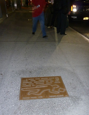
The other body outline was on one of the plaques along the section of 41st Street known as Library Way. These sidewalk plaques carry inspirational quotes about reading, writing, and literature. The one I photographed reads:

… a great book should leave you with many experiences, and slightly exhausted at the end. You live several lives while reading it. William Styron (1935 –  ), Writers at Work.

To me, the embossed illustration on the plaque seems very odd. The reader of the book looks, not exhausted, but dead (presumably in a hiatus between two of those ‘several lives’).

13r-ncP1030817_LibraryWay


Tunnel crossing

Tunnels are favourite locations for graffiti, not only tags and ‘writing’ but also creative — though unofficial –  public artworks. The ephemeral nature of these makes them more interesting than the durable commissioned murals that are sometimes painted or tiled on tunnel walls. However charming or sophisticated the official works might be, they can become boring for people who pass that way day after day.

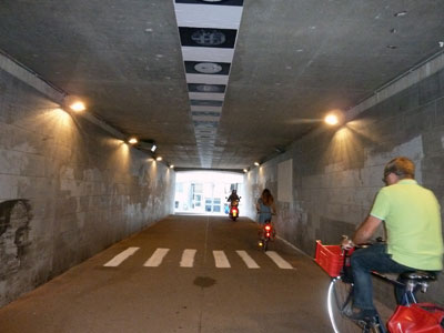
In Antwerp there is a pedestrian tunnel underneath the railway line between Centraal Station and Berchem. It has several artworks painted, pasted or projected on the walls, floor and even the ceiling.

13n-ncP1020988_TunnelRide

Naturally I like the zebra crossing, given my interest in the symbolism of crosswalks. Perhaps, given the amount of bicycle and even motorcycle traffic in the tunnel, the artist had in mind that pedestrians needed assistance to cross safely from one side to the other, should they wish to do so. Or perhaps the artist wanted to encourage people to go against the flow, although going against the flow in this case would only bring you up against a brick wall.

13n-ncP1020983-TunnelWalk

My thanks to Duncan, a fellow participant at the Visual Methods Seminar at the University of Antwerp, for finding this pedestrian crossing for me. Thanks also to Alan for demonstrating the use of the crossing for the photo.

Pilgrim trail

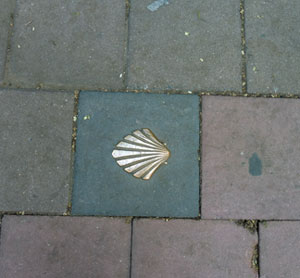
In some of the streets and squares of Antwerp I have spotted what I thought were brass cockle shells fixed to the cobbles.

13n-ncP1020790_Scallop


A colleague explained what they meant and I have since found out more about them. The scallop shell is the emblem of Compostela pilgrims. Scallop shells on the ground guide them on the various routes that take them  to the Way of St James, which leads to Compostela in Spain where the remains of apostle Saint James are supposedly buried.

Pilgrims whose route to the Camino de Santiago de Compostela  takes them through Antwerp can visit the main sights in this city by following the Scallop Shell Trail, which runs from Saint Jacob’s Church to Saint Julian’s Inn (Sint-Julianusherberg) where they can find overnight accommodation.

Scallop shell on the footpath outside the entrance to St Jacob's Church in Lange Nieuwstraat, Antwerp, Belgium.

Scallop shell on the footpath outside the entrance to St Jacob’s Church in Lange Nieuwstraat, Antwerp, Belgium.

The University of Antwerp, where I have been taking part in a summer school is scattered over a number of buildings, new and old, in the narrow cobbled streets near the centre of Antwerp. It just so happens that the building where most of the classes were held is directly opposite Saint Jacob’s  Church.

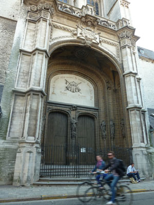
The entrance to St James Church in Sint Jacobs-straat, opposite Building M of the University of Antwerp. There are scallop shells decorating the cloak in the frieze above the door.

The entrance to St Jacob’s Church in Sint Jacobs-straat, opposite Building M of the University of Antwerp. There are scallop shells decorating the cloak in the frieze above the door.

In my next blog post I will reveal another footpath trail in Antwerp.


Points and boundaries (Guest spot)

13iP1020383-SurveyPred

Photo: meganix

When I blogged about a chiselled, painted and Post-it noted survey mark recently, I invited Scott Taylor to comment and tell us more about survey marks. Scott is a surveyor who hosts the website Global Surveyors. This is what he had to say:


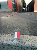
The red and white Post-it is actually called a Red and White!!! We aim our surveying instrument at the centre or join between the two colours, which we have positioned centrally over the survey mark.

There are many marks surveyors use, some placed in kerbs, rocks, trees, or buried under ground (hidden), and all on public record noted on a Deposited Plan.

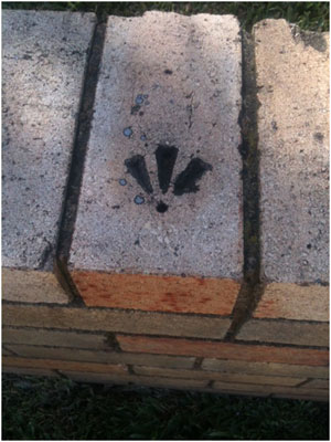
Here are a couple of survey marks I happened to have on my phone. They are  called Drill Hole and Wings. Like the blue mark in your photo, they are used for boundaries and are noted on a plan as being at a corner, or being a certain bearing and distance from a corner. They assist the surveyor to re-establish a boundary corner when that corner has disappeared or been destroyed.

Photo: Scott Taylor

Photos: Scott Taylor

 We paint almost every mark we place. Surveyors have no particular colour. I use whatever is available and feel as though I’m a graffiti artist most of the time.

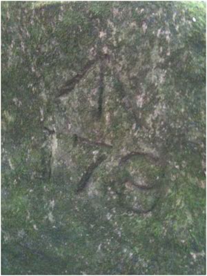
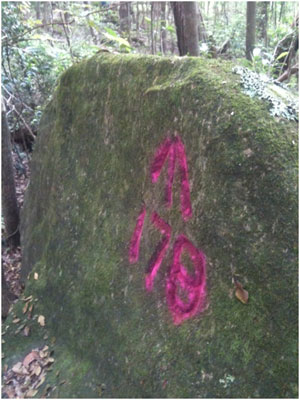
Here is a rock mark from the 1800s, before and after it’s been painted. It’s referred to as a Broad Arrow. For those interested in survey marks there is a great publication called Marking the landscape: a short history of survey marks in New South Wales.

Taylor_BroadArrow1


Photos: Scott Taylor

Photos: Scott Taylor


Three degrees of permanency

13iJUN29-ncP1020383-SurveyP

Some time in the past this arrow-shaped survey mark has been chiselled into the concrete kerb of Regent Street, Redfern (Sydney). It will last as long as the kerb does. But to make it more visible it has been painted blue. Eventually the paint will be weathered away. Last week there was a man surveying the boundaries of a property that adjoins the pedestrian laneway off Regent Street. So that he could see where the survey mark was through his theodolite, he had stuck a red and white post-it note next to it. The post-it note was probably gone by the next day, blown away by the wind.

I have only presumed that’s what the post-it note was for. I don’t really understand survey marks. I wish I had thought to ask the surveyor about this one. But anyway, I have contacted Scott Taylor at the Global Surveyors website and invited him to comment on this Pavement Graffiti post. According to a blog post by Scott about ‘Interesting survey marks’, surveyors like him are magnetically attracted to survey marks in kerbs, roads and bridges, and drive their friends crazy saying, “Look, there’s a level datum”. Here at Pavement Graffiti we understand this level of fanaticism.

Christian graffiti

13i-ncP1020357-PraiseGodBus

Following on from my earlier post about Eternity, I’ve noticed that someone regularly chalks Praise God! on kerbs in Glebe Point Road (Sydney), often at bus stops. It’s not the only piece of Christian graffiti I’ve come across on the ground, although I have more frequently found graffiti that mocks religion. Photos of these jokes and snide remarks are posted in my Pavement Appreciation gallery.

13i-nc-P1020358-PraiseGodMa

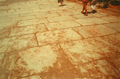
People have used the pavement for affirmation of their Christianity from very early times, as evidenced at the remains of the formerly important Roman city of Ephesus, located in the east of what is now Turkey. Ephesus is mentioned in the Book of Revelations in the Bible. Among the archaeological finds are symbols carved into the paving stones of the Arcadian Way. These symbols are made up of a set of Greek letters that have been interpreted by classics scholars as standing for ‘Jesus Christ Saviour Son of God’.

The following photograph was posted by aaron60 in his Ephesus Travel Page on the Virtual Tourist website. At least two of these segmented circular Christian symbols can be seen.

2231833-Christian_graffiti_


Vale Jeffrey Smart 26 July 1921 – 20 June 2013

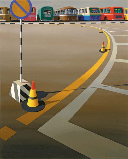
'Bus terminus', Jeffrey Smart, 1973

‘Bus terminus’, Jeffrey Smart, 1973

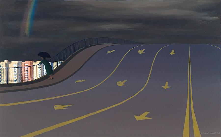
Traffic marks occur frequently in Jeffrey Smart’s precisionist pictures of the built landscape, their sharp outlines and piercing colours marshalling into order the compositions of tarmacs, car-parks and autobahns that he was driven to paint. In his work, wrote Mark Ledbury, we see a celebration of the road marking as a painterly object.

With his depictions of hard-edged and perfect  roads signs on even and unblemished asphalt, Smart drew our attention to a property of the pavement that we might overlook if we only concentrated on the flaws in its pocked, patched and scarred surface. For the fact is that, prosaically functional though the pavement may be, it is an edifice of monumental proportions, stretching horizontally further than the eye can see and intruding on our everyday lives in ways that we barely acknowledge.

In an interview with journalist Janet Hawley, Smart once said that he was happy if the public was stimulated by his work, ‘and if they see Jeffrey Smart paintings everywhere in the urban landscape, it means I’ve helped educate their eyes, so I’ve done them a favour’.

Thank you, Jeffrey Smart.

'The rainbow', Jeffrey Smart, 1965

‘The rainbow’, Jeffrey Smart, 1965

Ledbury, Mark. 2011. Mute eloquence: the art of Jeffrey Smart. Sydney University Museum News (25): 12-14.

Hawley, Janet. 1989. Jeffrey Smart made simple. The Sydney Morning Herald (Good Weekend), 13 May 1989, 14-20.

© Megan Hicks 2013

The symbolism of pedestrian crossings

In built-up areas the pedestrian crossing is a familiar feature of the horizontal signscape. William Phelps Eno, sometimes known as the ‘father of traffic safety’ is credited with introducing the cross-walk to New York streets in the early 1900s. Once motorized vehicles became popular, something had to be done to protect pedestrians from reckless drivers.

Sydney was one of many cities that soon followed suit. As early as 1912 lines were painted on the road at busy Circular Quay to provide a safe crossing area.  Within a few years designated pedestrian crossings in the rest of the city were being marked out with metal studs or pairs of white lines. Designs for crossings have continued to change over the years.

A stopping line at the intersection of Market and Pitts Streets in Sydney, marked out with metal studs, 1929 (City of Sydney Archives photograph, SRC7806, file 034\034213).

A stopping line at the intersection of Market and Pitts Streets in Sydney, marked out with metal studs, 1929 (City of Sydney Archives photograph, SRC7806, file 034\034213).

For some people, pedestrian crossings represent order, civilization and safety. For others they represent repression and regimentation of people’s behaviour.
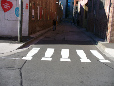
Fake pedestrian crossing, ‘Design saves lives’, an entrant in the Eye Saw exhibition in Omnibus Lane, Ultimo during Sydney Design Week, 2006 (photo by meganix).

Fanciful pedestrian crossing, ‘Design saves lives’, an entrant in the Eye Saw exhibition in Omnibus Lane, Ultimo during Sydney Design Week, 2006 (photo by meganix).

Some pedestrian crossings have achieved iconic status. The most famous is the crossing featured on the cover of the Beatle’s 1969 LP Abbey Road. Photographed by thousands of fans and tourists emulating the Fab Four crossing the road near their recording studio in single file, this ‘modest structure’ (to quote an official of English Heritage) has been given heritage listing for its ‘cultural and historical importance’.

The original photograph has been recently used in a pedestrian safety campaign in the Indian City of Calcutta.

Road safety poster using Ian Macmillan’s famous 1969 photograph, issued by the Kolkata [Calcutta] Traffic Police in February 2013.

Road safety poster using Ian Macmillan’s famous 1969 photograph, issued by the Kolkata [Calcutta] Traffic Police in February 2013.

And then there’s the Rainbow Crossing at Taylor Square in Sydney’s gay precinct of Darlinghurst. When it was removed by the State Government some people were glad, with one newspaper letter-writer declaring that ‘compulsory pieces of public infrastructure should not force upon pedestrians political views which contravene their religious or moral conscience’.
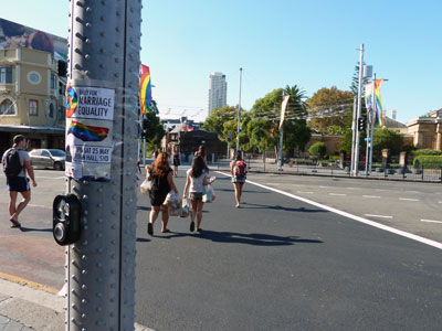
The disappeared Rainbow Crossing at Taylor Square and a notice about a rally for marriage equality, April 2013 (photo by meganix).

The disappeared Rainbow Crossing at Taylor Square and a notice about a rally for marriage equality, April 2013 (photo by meganix).

However such views were drowned out by the groundswell of outrage that manifested itself in the DIY Rainbow Crossing protest. It is significant that this is all going on at the same time as the parliament of Australia’s neighbour  New Zealand had done what no Australian government will do and legalised same-sex marriage.
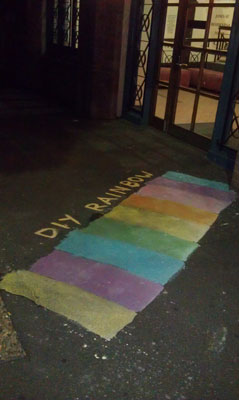
A painted DIY Rainbow Crossing in Jones Street, Ultimo (Sydney), April 2013 (photo by meganix).

A painted DIY Rainbow Crossing in Jones Street, Ultimo (Sydney), April 2013 (photo by meganix).

Mind you, as Lawrence Gibbons in City News points out, having created a public relations coup with the DIY Rainbow Crossings, Lord Mayor Clover Moore is left with a dilemma. Under policies implemented during her nine-year tenure, any street art, graffiti or posters in the City of Sydney must be removed from any highly visible site within twenty four hours. Under this ruling, the council’s scrubbing machines should be out there right now removing the rainbows.
 

Hearts

I spotted this heart – or rather, cardioid shape – on a road in Glebe (Sydney) a week ago. As I drove towards it I thought it must be a very clever piece of hot rubber graffiti, but when I took a closer look I wasn’t too sure. It might be paint or some tarry substance.

Anyway because it’s Spring, the season for romance, I thought I’d go back through the archives and share a few more photographs of love-hearts tattooed on the pavement.

‘I (heart) U BEC’, near Temora in southern New South Wales (Australia).

‘SKR + BKR’, Stanmore (Sydney), 2008.

‘I (heart) you lots anb losts’, Enmore (Sydney), 2010.

A heart on the corner of one man’s Epicenter of Love in Fitzroy (Melbourne), 2011.

Bluestone symbols (Guest spot)

Melbourne footpath enthusiast Dimitrios Kianidis took the photographs for today’s post

I have found another person who likes to keep his camera pointing downwards – or at least, he has found me through the Pavement graffiti website. When Dimitrios Kianidis posted a comment on this site in 2011 he had already self-published a book called Footpath graffiti: Coburg & Brunswick. It contains nearly 400 photographs, mostly inscriptions in wet concrete. Leafing through them is like reading a funny little book of very short poems. Dimitrios wanted to capture the social commentary scratched in concrete. “Most are so-and-so loves so-and-so,” he tells me, “But there are other messages and drawings as well. My favourites are:  ‘The Aborigines own this land’, ‘Santo and the Corinthians’, ‘I love Harrison Ford’, ‘RIP Blair 2006’, ‘RIP Cliff’, and ‘Dan is average!’  to mention just a few.” There are only a few copies of his book, but one of them is in Brunswick Library if you’re interested in seeing it.

But Dimitrios’s latest discovery is, as he puts it, ‘a whole language of numbers, letters and symbols carved into bluestone pavers’. The purpose of these inscriptions remains a mystery, although Dimitrios suspects they indicate the location of underground utility pipes and junctions. Any suggestions from knowledgeable blog followers would be welcome.

The ‘EA’ is particularly striking. “It is my favourite because it’s unlike any other that I have found. It’s beautifully carved and takes up the width of the paver and is visible from a short distance even to the casual observer. It’s in Albert Street on the pavement beside my favourite church too, St Patrick’s Cathedral.”