The name

I am researching the history of a nineteenth century row of houses in Sydney’s inner west. It’s not my usual kind of writing gig but it has been interesting following the money. Wealth accumulated in good times by an enterprising immigrant from Yorkshire, shared with his son as a business partner, lost when the son’s extravagant ventures are caught out by a national financial depression.  What’s left is a smattering of properties that have been salvaged for heritage listing by repurposing – gentlemen’s residences divided into flatettes, a wool store fitted out as university outpost campus, a private mansion transformed into a Catholic educational institution.  

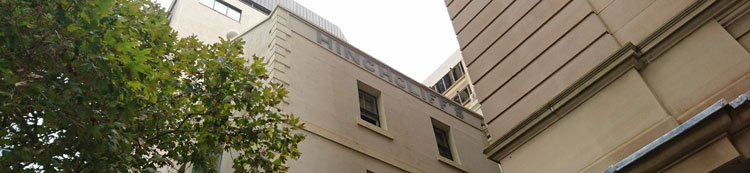
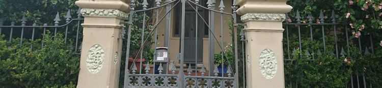
The buildings are notable for the need these colonial nouveau capitalists had to monogram their possessions. The firm’s name is embossed on the wool store – an understandable commercial imperative. But on the gateposts of the father’s 1860s villa his initials AH are stuccoed in botanical calligraphy so elaborate that they are barely legible.


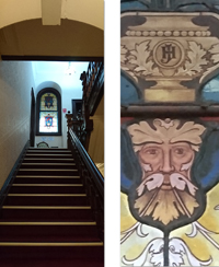
The son’s entwined initials JH in more restrained but authoritative capitals decorate the interior of his opulent 1880s mansion. I can imagine the thrill of self-satisfaction this sleek young mayor experiences as he glimpses the stained glass panel on his way upstairs from the expansive vestibule of his domicile.


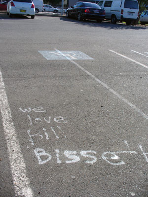
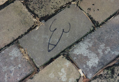
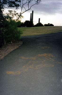
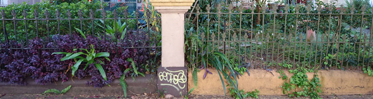
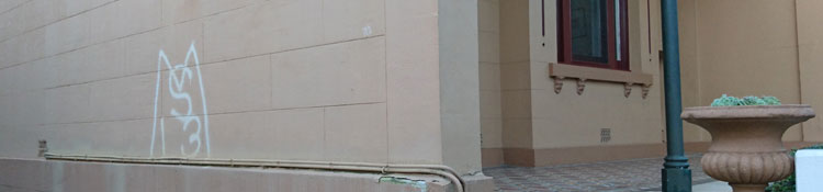
Fast forward to the late twentieth century and an upsurge of the monogram for marking property – though more likely someone else’s property or else a piece of public infrastructure. Taggers appropriate territory with marks that are generally illegible except to themselves or to cohorts that matter.

 I came across a graffiti supplies website recently, and this comment from a user:  ‘ I wrote the name test when i was in high school. I liked it cause every time i  saw the word test in a context totally unrelated to graff i creamed a little’.

 Here is the thrill of self-affirmation. This graffitist has gone for ordinariness over illegibility for his tag, and finds satisfaction when he sees,  not only the property he has marked,  but every single item where his moniker ‘test’ happens to appear – books, advertisements, notices, school whiteboards. His mind (and his member) believe that all these base are belong to him.

 At least what you don’t really own and have not mortgaged will not send you bankrupt.

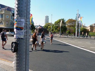
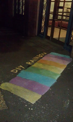
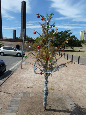
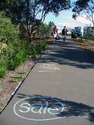
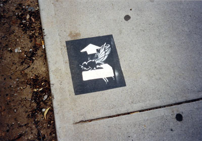
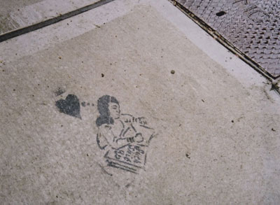
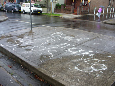
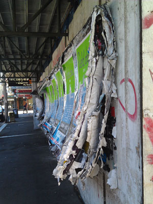
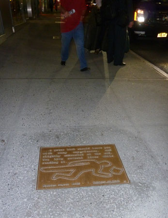
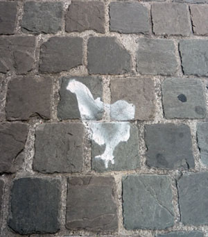
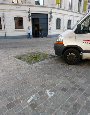
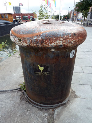
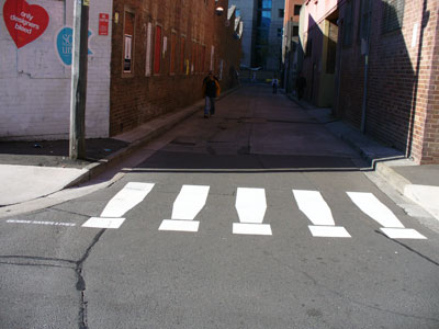
Images by meganix, taken in 2017 in Sydney: Stanmore, Circular Quay, Newtown and Strathfield.

Recapturing the magic

Parking space fly, Darlington, 2002.

Parking space fly, Darlington, 2002.

In my so-called office at home I am attempting to regain control. The room has been overtaken by stuff and progress is slow because I have neglected the fundamental rule: DON’T READ.

Amongst things that I have sinfully paused to read while culling superseded files, I found notes I took at the orientation day for new PhD students in the Division of Society, Culture, Media and Philosophy at Macquarie University in 2008. It was on that day, by the way, that I discovered I was not the oldest PhD student in the world, and that there were many other culmination-of-career candidates. Anyway, here’s one piece of advice I dutifully noted:

At the beginning, keep a journal of what you read and what you think about it. Your notes will be like Ariadne’s thread leading you through the maze. They will help you to solidify your thesis topic or even change your mind about what that might be.

"Suck shit up". Stanmore, 2003.

“Suck shit up”. Stanmore, 2003.

Well, I did start a journal, which became a series of A5 notebooks. The PhD has since been completed but, many volumes later, I still keep this journal, with notes on what I have read, seen, heard, talked about, and thought about. It is quite separate from my daily diary of appointments and humdrum domestic events. As a diversion from room-tidying I hunted out Volume 1 to re-read the first thing I had written in the journal. Here it is (slightly edited):

If I am going to do this project I am going to have to re-find my belief in the magical properties of the pavement. These last few years my writing and thinking have become prosaic. I have lost fun and wonder – beaten out of me by [my workplace]. When I first started photographing footpaths eight years ago, suddenly I could write poetry.

Over the next few years I did manage to recapture the magic as I enjoyed the luxury of exploring, photographing, reading, thinking and writing without the need to churn out memos, attend interminable meetings, play office politics, carry the dead weight of work-shy colleagues and endure the hysterics of others, attend to bureaucratic niceties and write formulaic justifications for every decision – and that was in what many (including myself) would have considered a dream job.

Once I left that job, how lovely it was on a nice sunny day to admire the sparkles in the asphalt and concrete, on a nice rainy day to enjoy the wavering reflections of the world on the ground, and on any day to seek out the messages people leave on the pavement and speculate why they leave them. And, in imaginary dialogue with scholars past and present, to discuss both the enchanting and the disheartening aspects of public places, and to consider what’s so special about the pavement.

"Bread is making birds sick". Enmore, 2010.

“Bread is making birds sick”. Enmore, 2010.

These days I’m a bit more relaxed about the pavement. I don’t feel I have to look at the ground all the time in case I miss something, but I’m still interested in what’s so special about other places in the urban landscape that are so obvious they’re invisible.

Poster history book. Petersham, 2014. All photos by meganix.

Poster history book. Petersham, 2014. All photos by meganix.

Body outlines

The 1950-60s television courtroom drama, Perry Mason, is said to have been the first detective show to feature either a tape or a chalk outline to mark the spot where a murder victim’s body had been found. The body outline made its first appearance in the episode ‘The case of the perjured parrot’. The writer of the show, Erle Stanley Gardner, had actually used this idea much earlier in the book, ‘Double or quits, which he wrote in 1941 under the pen name A.A.Fair (see Perry Mason TV series).

Ever since then the body outline has not only been used regularly in murder stories and television shows, but it is very often adaptively reused in illustrations alluding to all sorts of crime and fatality. It is a symbol — based on a fiction —  that is continually modified, re-invented and re-purposed. We recognise it in newspaper cartoons, TV commercials and political protests and we understand what is meant.

In New York I came across two instances of the symbolic body outline, both associated with the New York Public Library. The first was in an exhibition, Why we fight: remembering AIDS activism, which recently opened at  the New York Public Library on Fifth Avenue. One of the exhibits was this poster from the library’s archives. It was produced in 1988 by ACT UP (the AIDS Coalition to Unleash Power), a deliberately confrontational organisation that was formed to challenge government inaction over AIDS.

Poster_OneAidsDeath

The other body outline was on one of the plaques along the section of 41st Street known as Library Way. These sidewalk plaques carry inspirational quotes about reading, writing, and literature. The one I photographed reads:

… a great book should leave you with many experiences, and slightly exhausted at the end. You live several lives while reading it. William Styron (1935 –  ), Writers at Work.

To me, the embossed illustration on the plaque seems very odd. The reader of the book looks, not exhausted, but dead (presumably in a hiatus between two of those ‘several lives’).

13r-ncP1030817_LibraryWay


Chicken trail

13n-ncP1020742_ChickenClose

Apart from the Scallop Shell Trail for pilgrims I found another, less permanent trail on the footpaths of Antwerp. On Molenberg Straat these stencilled chickens and arrows led … where?

13n-NCP1020743_ChickenArrow

I think I might have found the answer on a sticker attached to a mooring bollard in another part of town. It is advertising ‘Ceci n.est past une galerie – a unique dinner concept’. Apparently this is a nomadic  ‘restaurant’ where a small number of people share a table to eat, converse and view artworks  in a private studio or house. The stencilled chickens I saw must have led to one of these locations. But was it the current one?

13n-ncP1020838_ChickBollard

The symbolism of pedestrian crossings

In built-up areas the pedestrian crossing is a familiar feature of the horizontal signscape. William Phelps Eno, sometimes known as the ‘father of traffic safety’ is credited with introducing the cross-walk to New York streets in the early 1900s. Once motorized vehicles became popular, something had to be done to protect pedestrians from reckless drivers.

Sydney was one of many cities that soon followed suit. As early as 1912 lines were painted on the road at busy Circular Quay to provide a safe crossing area.  Within a few years designated pedestrian crossings in the rest of the city were being marked out with metal studs or pairs of white lines. Designs for crossings have continued to change over the years.

A stopping line at the intersection of Market and Pitts Streets in Sydney, marked out with metal studs, 1929 (City of Sydney Archives photograph, SRC7806, file 034\034213).

A stopping line at the intersection of Market and Pitts Streets in Sydney, marked out with metal studs, 1929 (City of Sydney Archives photograph, SRC7806, file 034\034213).

For some people, pedestrian crossings represent order, civilization and safety. For others they represent repression and regimentation of people’s behaviour.

Fake pedestrian crossing, ‘Design saves lives’, an entrant in the Eye Saw exhibition in Omnibus Lane, Ultimo during Sydney Design Week, 2006 (photo by meganix).

Fanciful pedestrian crossing, ‘Design saves lives’, an entrant in the Eye Saw exhibition in Omnibus Lane, Ultimo during Sydney Design Week, 2006 (photo by meganix).

Some pedestrian crossings have achieved iconic status. The most famous is the crossing featured on the cover of the Beatle’s 1969 LP Abbey Road. Photographed by thousands of fans and tourists emulating the Fab Four crossing the road near their recording studio in single file, this ‘modest structure’ (to quote an official of English Heritage) has been given heritage listing for its ‘cultural and historical importance’.

The original photograph has been recently used in a pedestrian safety campaign in the Indian City of Calcutta.

Road safety poster using Ian Macmillan’s famous 1969 photograph, issued by the Kolkata [Calcutta] Traffic Police in February 2013.

Road safety poster using Ian Macmillan’s famous 1969 photograph, issued by the Kolkata [Calcutta] Traffic Police in February 2013.

And then there’s the Rainbow Crossing at Taylor Square in Sydney’s gay precinct of Darlinghurst. When it was removed by the State Government some people were glad, with one newspaper letter-writer declaring that ‘compulsory pieces of public infrastructure should not force upon pedestrians political views which contravene their religious or moral conscience’.

The disappeared Rainbow Crossing at Taylor Square and a notice about a rally for marriage equality, April 2013 (photo by meganix).

The disappeared Rainbow Crossing at Taylor Square and a notice about a rally for marriage equality, April 2013 (photo by meganix).

However such views were drowned out by the groundswell of outrage that manifested itself in the DIY Rainbow Crossing protest. It is significant that this is all going on at the same time as the parliament of Australia’s neighbour  New Zealand had done what no Australian government will do and legalised same-sex marriage.

A painted DIY Rainbow Crossing in Jones Street, Ultimo (Sydney), April 2013 (photo by meganix).

A painted DIY Rainbow Crossing in Jones Street, Ultimo (Sydney), April 2013 (photo by meganix).

Mind you, as Lawrence Gibbons in City News points out, having created a public relations coup with the DIY Rainbow Crossings, Lord Mayor Clover Moore is left with a dilemma. Under policies implemented during her nine-year tenure, any street art, graffiti or posters in the City of Sydney must be removed from any highly visible site within twenty four hours. Under this ruling, the council’s scrubbing machines should be out there right now removing the rainbows.


Christmas in Sydney Park

Sydney Park, December 2012

Sydney Park, December 2012.

It’s that time of year again – time to say thank you to all those people who have shown an interest in my pavement project. I hope your own projects, whatever they are, bring you satisfaction in the coming year.

Sydney Park in St Peters was formerly a brick pit and brickworks, then a garbage dump, and now it is an expansive park with great sky. Its footpaths have provided me with quite a few graffiti finds. So as my end-of-year gesture, here are a few relics from the archives.

Sydney Park, 2010.

Sydney Park, 2010.

10kP1090230X-BillBissett-bl

Sydney Park, 2010.

Princes Highway, St Peters, beside Sydney Park, 1999.

Sydney Park, 1999.

Sydney Park, 2000,

Sydney Park, 2000.

Best wishes to all from Megan.

Newtown


'I have a dream' Square, King Street, Newtown, 2008


A while ago I came across this description:

King Street, Newtown is always more or less busy, but on Saturday night it is seen at its best and brightest.  Fancy a double line, more than a mile long, of brilliantly lighted shops; and “side-walks” so inconveniently crowded that it is often a matter of some difficulty to push one’s way through the throng of people on business and on pleasure bent.

The description seems fairly accurate to me, although it does not mention the vehicles that crawl up and down King Street on a Saturday night while their occupants ogle the crowds on the footpath. But that would be because this passage comes from an article in the June 1889 issue of the Sydney Illustrated News. King Street has been a commercial success for more than 150 years while the demographics of Newtown have ebbed and flowed.

Readers of this blog will have noticed that many of the pavement graffiti examples that I mention were photographed in Newtown. There are two main reasons for this – I live close by; and Newtown is a hub of graffiti activity. In fact, it was small esoteric stencils on the footpaths of Newtown that sparked my interest and prompted me to start my collection of pavement graffiti photographs in 1999.

Stencil publicising The Blair Witch Project movie, King Street, Newtown, 1999

Newtown was incorporated as a municipality in 1862. Cast iron roof-water outlets set into the kerb In King Street still bear the letters NMC, even though Newtown Municipal Council ceased to exist in 1949. These days part of Newtown is included in the City of Sydney, while the remainder falls within the Marrickville local government area.

Roof water outlet to gutter with embossed letters ‘NMC’, King Street, Newtown, 1999

I have discovered that this kind of information and much more is available on the Newtown Project website, which has been created by the City of Sydney Archives and various volunteers to bring together historical information about the Municipality of Newtown. The information ranges from Council Minutes to the history of the street-art group Unmitigated Audacity, whose works included the I Have a Dream mural. There is a self-guided walking tour and plus lots of early photos of Newtown streets, buildings and people – and  contemporary photos as well. Definitely worth a look.

Elephants on parade

Shared path, College Street at Whitlam Square, Sydney, 2011


The relationships between cyclists, motorists and pedestrians are fraught and while some people are pleased with the new cycle lanes and shared pathways being installed by the City of Sydney, others are not. So it’s nice to see that some people have managed to keep their sense of humour.  Congrats  to the anonymous stenciller for this embellishment of a sign on the corner of College and Liverpool Streets, and thanks to the good sports in the Cycling Strategy department at the City of Sydney for drawing it to my attention.

And while pondering the similarities (if any) between an elephant’s thick skin and the wrinkled greyness of the asphalt, I thought I’d dig out a couple more pavement pachyderms from my archives.

Elefant Traks music label, King Street, Newtown, 1999

Asphalt elephant, Queens Parade, Wolllongong, 2003

Nabbed on the footpath

Pavement advertising in Sydney has moved on since 1904. In that year bootmaker Joe Gardiner was nabbed by the police for whitewashing advertisements for his shop on the asphalt in Oxford Street near the entrance to Hyde Park. Joe’s fate is recorded in a correspondence file in the City of Sydney archives.

These days the footpath is a billboard, not only for small shops and garage sales, but also for corporations. In recent months NAB (National Australia Bank) has discovered the transgressive frisson of stencilling the pavement. At Sculpture by the Sea in November, advertisements on the Bondi to Tamarama walk made it evident that NAB was a sponsor of the event. On Valentine’s Day in February, city pavements were enlisted in a multiple media campaign announcing that NAB had split up with the other banks (whatever that means). Although these commercially creative works soon faded in the rain, their smeary remains are still visible in some places.

Sculpture by the Sea, Bondi-Tamarama, November 2010. In the background is Lucy Barker's installation 'Sea Cells'.

Defacing the pavement with any kind of marker is still illegal in the City of Sydney but, as I noted in an earlier blog post, perhaps council rangers have given up bothering about graffiti drawn with chalk or quasi-chalk.

Valentine's Day 2011, Newtown Bridge.


You can read more about footpath decoration and pavement advertising in two articles I have written:
Hicks, Megan. 2009. Horizontal billboards: The commercialization of the pavement. Continuum: Journal of Media and Cultural Studies 23 (6):765-780.
Hicks, Megan. The decorated footpath. Dictionary of Sydney.

Arcades

The arcades of Paris (les passages couverts) were a shopping sensation in the 19th century and they are still famous, not least because Walter Benjamin’s great unfinished work The Arcades Project (Das Passagen-Werk) used a study of the arcades as a way of revealing insights into the realities of urban living.

There were some 150 of these arcades built between 1800 and 1850. In their day they offered a treasure-trove to shoppers in Paris away from the weather and the dirty, unpaved streets. Now there are fewer than 20 left, most of them in run-down condition but still offering a variety of shopping and eating experiences. The pavements – or floors – of the arcades carry the story of their decline (or sometimes their revival, as in the case of the almost-glamorous Galerie Vivienne).

In a stretch of the Passage des Panoramas that I photographed parts of the original paving had been replaced by asphalt, but there were some sections of flagstone and a few shops had remnants of the original coloured tiling – a different pattern for each shop, sometimes with the name of the original business spelt out in tiles. Others had rectangles of synthetic carpet outside their premises.