Graffiti in hiding

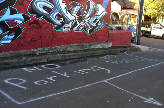
Sometimes graffiti is hidden in secret places, sometimes it is in plain sight but its meaning is hidden.

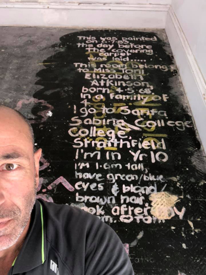
Not so long ago a Sydney builder was surprised when he pulled up an old carpet and found two large messages painted on the floorboards underneath – so surprised that he posted photos of them on his Facebook page.

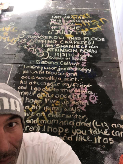
It’s not all that unusual for renovators and demolishers to find hidden graffiti left by tradespeople at some earlier date in a building’s life. But these personal statements composed by two young sisters in 1983 are extraordinary both for their size and for the detail of their content. They are like secret/not secret teenage diary entries concealed by floor covering.  Those girls wanted someone in the future to read all about them, but they could never have anticipated the mediatisation of their words via digital photography and social media.

Hidden graffiti can be revealed not only by accident but by determined sleuthing. Researcher Susan A. Phillips, for example, photographed pencil, charcoal, and scratched graffiti hidden under the bridges and in the drains and culverts of Los Angeles. Written mostly by people who were “transient, ethnic minorities, or queer” these marks were up to a century old. Phillips spent over twenty-five years collecting images and stories for her remarkable book The City Beneath.

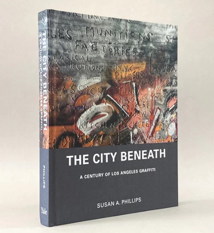
Phillips remarks on graffiti’s versatility as a clandestine form of expression. The condensed messages she found in hidden places were most often related to the name of someone or something, or were sexual words or drawings. But there was also enigmatic writing and what she called “odd hieroglyphics”.

Odd kinds of graffiti whose meaning is hidden are sometimes referred to as cryptic graffiti. These might be written in secret places, as Phillips’ examples were, but it are just as likely to be easily visible in public places. One practitioner of cryptic graffiti is the Hawaiian artist who rather unimaginatively calls himself Cryptik. This person hand-paints Eastern philosophy iconography on Western walls. His Cryptik Movement “is dedicated to helping humanity evolve towards greater awareness and understanding through public art”. While his walls are aesthetically pleasing they do not represent his philosophy in any obvious way.

A few years ago The Age journalist Tom Cowie wrote about some “cryptic drawings appearing on Melbourne footpaths”. When interviewed, the artist, Astral Nadir, explained that philosophy was his inspiration and that the theme of space and forests was a recurring motif.  Nadir called his marks ‘glyphs’ but, curiously, he maintained that his work was not graffiti. I would disagree – of course it is graffiti. But I do agree with the journalist that ‘cryptic’ is an appropriate term to describe Nadir’s work.

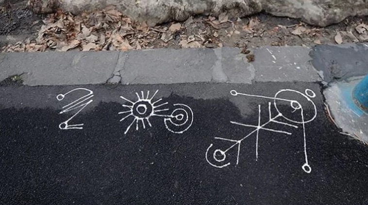
The origins of the word ‘cryptic’ ultimately lead back to the Greek kryptós, meaning hidden or secret. But since its first known usage in the English language in the 17th century, the term seems to have always carried connotations of ‘hidden meaning’ rather than ‘physically hidden’. Common synonyms offered by the Merriam-Webster Thesaurus are: ambiguous, dark, enigmatic, equivocal, obscure, and vague. But the thesaurus cautions that, while all these words mean ‘not clearly understandable’, ‘cryptic’ implies a purposely concealed meaning.

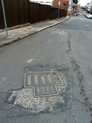
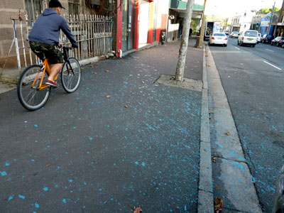
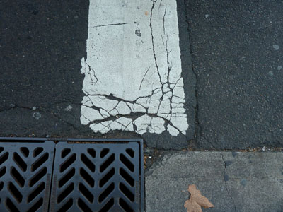
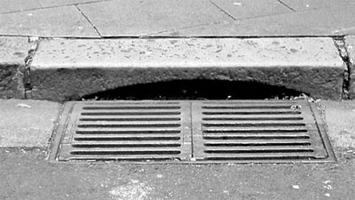
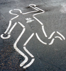
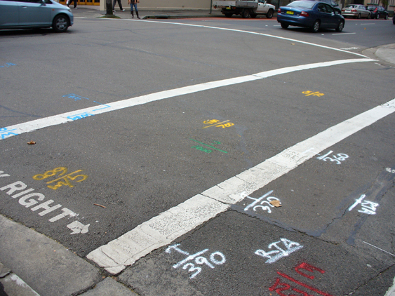
A common type of graffiti seen on roads and footpaths everywhere is made by surveyors who, aided by remote sensing devices, draw maps of the underground with fluoro spray-cans. I am tempted to use the word ‘cryptic’ for this writing because for most passersby like me it is meaningless. But for the government agencies and utility companies who need to know where tunnels, pipes and cables are buried, the survey marks impart important advice. They do not purposely conceal information but deliberately reveal it. They are not cryptic.

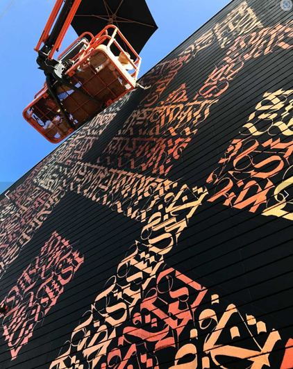
There is one more type of graffiti I want to mention that is cryptic. How could I not? The history of the worldwide phenomenon of ‘name’ graffiti that began as New York subway-style ‘writing’ in the 1960s is a history of encryption. Graffiti forms – including the ubiquitous ‘tag’ and the wall-sized ‘pieces’ that use highly stylised calligraphy – encode a graffiti artist’s street name or their ‘crew’ affiliation and make territorial statements. Their meanings are understood only by the cognoscenti.

Libraries of books have been written about these forms of graffiti, but I still like to quote Robert Reisner, an academic graffiti historian from the 1970s. Reisner was not interested in what graffiti looked like. His books were basically compendiums of old-fashioned graffiti transcribed by him and given some sort of sociological or linguistic explanation.   He dismissed the “recent phenomenon of the spray-can artist” because its content was “relatively unimportant”.

Reisner had no inkling that ‘name’ graffiti would become international, dominating worldwide public places for decades.  He complained that the spray-can art itself had become the message. He was right about that. But he did not understand that the message was meaningful, with the meaning intentionally hidden in the aesthetic possibilities of invented lettering and unconventional spelling.

Images and references

‘After pulling up some old carpet, Camperdown [Sydney, NSW]’, two photos by Vince Righi on VSR Construction Facebook page, 2020. 

Phillips, S. A. (2019) The city beneath: a century of Los Angeles graffiti, New Haven and London, Yale University Press.

POW!WOW!HAWAII 10 Year Anniversary, photo on Cryptik web page, 22 February 2020.

Peace on the streets, Vandalog – A Street Art Blog, 16 August 2012   

Cowie, T. (2018) The story behind the cryptic drawings appearing on Melbourne footpaths, The Age, Melbourne, 3 December 2018. 

Photo Instagram @astral_nadir

Merriam-Webster Thesaurus, ‘cryptic’ synonyms.  

Survey marks, Surry Hills, NSW, 2009, photo Megan Hicks.

Reisner, R. (1971) Graffiti: two thousand years of wall writing, New York, Cowles Book Co., Inc.

Reisner, R. & Wechsler, L. (1980) Encyclopedia of graffiti, New York, Galahad Books.                               

Hicks, M. (2013) Pavement graffiti: an exploration of roads and footways in words and pictures, PhD Thesis, Macquarie University, NSW.

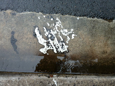
Juxtaposition of carefully explicit and extravagantly cryptic graffiti, Enmore, NSW, 2008, photo Megan Hicks.

The gendered underground

I cannot help liking manhole covers. In fact they feature in quite a few of my blog posts. In October 2010 I wrote: They are reminders that the pavement is not only a floor but a roof – the roof of a busy world of tunnels, tubes, chambers and canals; of light, electricity, water and workers. Manhole covers are shutters on the skylights in this roof.

Manhole cover holding together a dilapidated road in Camperdown (Sydney). Photo: meganix 2013.

Manhole cover holding together a dilapidated road in Camperdown (Sydney). Photo: meganix 2013.


But why do I persist in calling them manhole covers? I am usually careful about using gender-neutral language, and there are alternative terms available – service cover, access hatch, maintenance hole, for instance.

Although part of the answer is inertia – that’s what I’ve always called them – there is also the desire to align myself with a loose but international oddball fraternity of people who find aesthetic satisfaction in manhole covers. They admire the dull sheen of worn cast iron, remark upon the distinctive municipal manhole embellishments in Japan, take rubbings from old street covers and reproduce them in knitted bedcovers, and photograph tiny weed gardens growing in the patterned indentations.

If ‘manhole’ had not been part of my vocabulary I might have missed Mimi and Robert Selnick’s lovely book of black and white photographs, Manhole Covers. I certainly would not have found one of my all-time favourite websites, Tim Pitman’s Misplaced Manhole Covers. Worse still, people interested in manhole covers would never find my site.

LOOK RIG, Sydney. Photo: meganix 2010.

LOOK RIG, Sydney. Photo: meganix 2010.


Anyway, does it really matter that we call them manhole covers? It’s an established term in the English language. My copy of the Macquarie Dictionary (Revised edition 1985) defines ‘manhole’ as a hole, usu. with a cover, through which a man may enter a sewer, drain, steam boiler, etc. And there you have it. Why does their name need to be gender inclusive? It’s men who use manholes because it’s men who do the dirty work underground.

That was the entrenched opinion of many people when Andy Mitchell, the chief executive at Thames Tideway Tunnel, recently announced that he wanted to achieve gender parity by the time construction of London’s ‘super sewer’ was finished in 2023. There was a response of disbelief because, after all, this is a distinctly unglamorous construction project in a ‘man’s world’.

Andy Mitchell, chief executive of Thames Tideway Photo: Matthew Joseph/Thames Tideway in The Guardian 10 December 2014.

Andy Mitchell, chief executive of Thames Tideway Photo: Matthew Joseph/Thames Tideway in The Guardian 10 December 2014.


Browsing around a bit more I found a string on Yahoo! Answers/Social Science/Gender studies in response to the question ‘Why don’t women often choose jobs such as coal miner sewer worker etc. are these jobs unfeminine?’. While most replies were ill-informed, anti-woman and/or anti-feminist rants, there were some interesting thoughts amongst them.

One person wrote that those dirty, dangerous, unhealthy, jobs are called ‘glass cellar’ jobs. Feminists, he maintained, are only concerned with the ‘glass ceiling’, and look to the top in an attempt to shame society into giving women ‘positions of power’. They should also be looking at getting equal positions for women at the bottom. Men choose those jobs because they pay well as a trade-off for safety and comfort.

In reply to others who insisted that women won’t do dirty jobs, one man wrote, “In my former metropolitan area, the Labor Council and many of the individual unions sponsor a program to recruit and train more women for labor jobs. With no exceptions, whenever they open the books, every single available spot is grabbed by a woman looking to get in”.

A couple of years ago, the Daily Mail reported that two young women were to become the first females in Britain to start an apprenticeship in waste. The newspaper’s headline read ‘The pay’s OK but the hours stink’. Looking for an alternative to office work, these women applied for a position with South West Water where their jobs would involve visiting sewerage works, hand-raking raw sewage, taking samples for testing and using rods to clear blockages.

Change, of course, isn’t always easy. A New York Daily News article sub-headed ‘They work in the sewers all day, but they say the really nasty stuff wasn’t in the pipes – it was in the locker rooms’ tells the story of two woman laborers for the city’s Department of Environmental Protection, who have withstood years of threats and insults from male colleagues treating the agency as ‘a man’s world’. The pair claim that they were denied overtime and promotions, and that the few other women in the agency were driven out by constant harassment.

But, as Andy Mitchell continues in the Thames Tideway article, ” From my first day in the job, I knew this was a place where we could achieve something different which would leave a legacy for generations about how good the construction world can be. This is not really a man’s world: we need women, and we need diversity […] We are working to create a culture that finds out from women themselves what they want and how they think we can attract their counterparts. It’s not a bunch of blokes sat around a table making assumptions on why we think women don’t want to work in construction. We are finding out the true obstacles so that we can we try to overcome them”.

Cellar grate under front doorstep, Antwerp. Photo: meganix 2013.

Cellar grate under front doorstep, Antwerp. Photo: meganix 2013.


Back to manhole covers, then. Baden Eunson tells us that ‘manhole’ is a restricting name that reinforces traditional gender roles. Such terms are examples of the ways in which the English language reinforces patriarchy. Other examples include spotlighting (male nurse, career woman); dimunitivisation (actress, waitress); differential naming (Mr Smith and the girls from Accounting); and featurism (Prime Minister Julia Gillard wore a little black dress and a collarless blazer with olive green sleeves when she gave her farewell speech). Eunson’s article on ‘Gender-neutral communication: how to do it’ was published in a recent issue of The Conversation.

Amongst speakers (or writers) who persist with masculinely-loaded language, some do so because they are openly opposed to all this feminist nonsense and what they think it stands for. As for the rest, some are fuddy-duddies who do not want to put effort into changing old habits. Others do not want to sound conspicuous amongst peers who normally use non-inclusive language. Of course, even amongst these people, I think there are those whose resistance to gender-neutral language is really an indicator of their resistance to gender equality, even if they won’t admit it to themselves.

Where does that leave me and manhole covers? Down amongst the fuddy-duddies, I suppose. Since I intend to go on photographing these enduring items of street furniture, it is up to me to find a term for them that I can use consistently and comfortably – ‘cast iron street covers’, perhaps. But I will probably still include ‘manhole covers’ in the list of tags and keywords for relevant posts, in the needy hope that this will bring some extra hits and likes.

Last resting place for cast iron service covers -- Sydney Water's Movable Heritage Store, Potts Hill (Sydney). Photo: meganix 2015.

Last resting place for cast iron service covers — Sydney Water’s Movable Heritage Store, Potts Hill (Sydney). Photo: meganix 2015.

Reference

Melnick, Mimi & Robert Melnick, Manhole covers, Massachusetts Institute of Technology, 1994.

The demon blacktop

Paint splash, Botany Road, Redfern, 2013. Photo by meganix.

Paint splash, Botany Road, Redfern, 2013. Photo by meganix.

Glossy black dance floor or ashen skin or something else entirely? The asphalt pavement stirs the poetic imagination of some writers but the hard truth spoils the romance of the blacktop.

It was Vladimir Nabokov who wrote , ‘Voraciously we consumed those long highways, in rapt silence we glided over their glossy black dance floors’. Australian author Jessica Anderson says of one of her characters, ‘… in her visual memory of Sydney as a city predominantly blue and green and terra-cotta, there had been an element missing. And here it was, this ashen skin covering not only the road, but the footpaths as well’.

Unfortunately that dark covering is making Sydney hotter because it absorbs heat and radiates it back out. Sustainability campaigner Michael Mobbs has the figures to show that suburbs with black roads and few trees suffer badly during heatwaves. It’s called the urban heat island effect, and to counter it the City of Sydney is conducting trials in Chippendale using lighter-coloured surfaces on some roadways. The pale pavement is open grade asphalt filled with concrete slurry.

Pale pavement, Chippendale, 2014. Image from City of Sydney website.

Pale pavement, Chippendale, 2014. Image from City of Sydney website.

Mobbs has been monitoring the trial. He says it reduces the temperatures by two to four degrees on a hot day, and predicts that during heatwaves there may be six to eight degrees difference. Death rates rise in cities during heatwaves, so that difference could save lives. Glary though.

Vladimir Nabokov. Lolita. 1955.

Jessica Anderson. The impersonators. 1980.

Playground of memories

Children on a billycart with a trailer in the Melbourne suburb of Mount Waverley, 1961.

Children on a billycart with a trailer in the Melbourne suburb of Mount Waverley, 1961.

When I need a laugh I pull out my copy of Unreliable Memoirs by Australian ex-patriot polymath Clive James. The whole book is funny but one of my favourite passages involves concrete footpaths, billy carts and rubber tyre marks. Oh, and poppies.

The pavement often appears in people’s reminiscences of childhood. This is not remarkable, especially if they lived in inner city areas when they were young. After all, children are close to the pavement and playing on it is an everyday experience – or at least it was when children had more freedom. There were games like hopscotch and chalk chase that needed to be marked out on the hard surface, rhymes and chants about avoiding the cracks (or break your mother’s back), and hot sticky bitumen roads that were torture to cross in bare feet in the summertime.

Even in the sprawling suburbs where spacious backyards were the norm, streets served as a communal playground for ball games and competitive races that could only be staged on paved surfaces. Clive James played with neighbourhood kids on the footpaths of Kogarah, a suburb of Sydney.

James has been in the news lately. He is suffering from a terminal illness and The New Yorker has published an emotional new poem written by him as he contemplates his death. Also this fortnight there has been the two-part documentary Brilliant Creatures: Germaine, Clive, Barry and Bob on ABC-TV. So as a tribute to him I reproduce here an excerpt that introduces the episode of the billycarts and poppies. If you haven’t already read the book – or even if you have – I recommend you track down a copy.

Other children, most of them admittedly older than I, but some of them infuriatingly not, constructed billycarts of advanced design, with skeletal hard-wood frames and steel-jacketed ball-race wheels that screamed on the concrete footpaths like a diving Stuka. The best I could manage was a sawn-off fruit box mounted on a fence-paling spine frame, with drearily silent rubber wheels taken off an old pram … Carts racing down the footpath on the far side had a straight run of about a quarter of a mile all the way to the park … Carts racing down the footpath on the near side could only go half as far, although nearly as fast, before being faced with a right-angle turn into Irene Street. Here a pram-wheeled cart like mine could demonstrate its sole advantage. The traction of the rubber tyres made it possible to negotiate the corner in some style. I developed a histrionic lean-over of the body and a slide of the back wheels which got me round the corner unscathed, leaving black smoking trails of burnt rubber.

Clive James, Unreliable memoirs, London: Picador, 1981.

The billycart photograph is in the collection of Museum Victoria. Reg. No: MM 110102

Poetry and pavement marks


bill bisset is an experimental Canadian poet whose work attracts both praise and controversy. This photo was taken in the carpark at Sydney Park, St Peters (2010).

bill bisset is an experimental Canadian poet whose work attracts both praise and controversy. This photo was taken in the carpark at Sydney Park, St Peters (2010).

Pavement writers love poets, and poets love pavement writers. A blog about pavement graffiti might seem a prosaic sort of thing to write, but I am in good company. There are plenty of poets who have found inspiration in the marks on the paving. For poets these marks are associated with memories of childhood life, expressions of the inner life, the playing out of private life in public, and the sordidness of life in the gutter.

Today I offer you a selection of some favourite works by Australian poets, and one song. These are only excerpts. (The photos are from my archives)


If we went back to school

everything might seem small.

We could begin again. Pick it up.

Start over. Scribble initials

in a chalky love-heart

on melting asphalt

or something concrete …

Michael Brennan, ‘Postcard’, from The imageless world (2003)

A back lane in Newtown (2008).

A back lane in Newtown (2008).


Tar flowers is what grows best in Newtown

Tar Flowers

in concrete gardens

where we draw our best pictures

with bits of tile that fell off Mrs. O’Leary’s toilet roof …

Terry Larsen, ‘Tar flowers’, The Union Recorder (University of Sydney), 2 October 1969, p.49 (1969)

Eternity Boy, Enmore (2001).

Eternity Boy, Enmore (2001).


… ETERNITY he’d heard great preachers shout

And shook to hear, but say it he could not.

No, it must come like moonlight or like frost

Silent at night like mushrooms quietly growing

To wake the wicked and redeem the lost;

Like white feather in the dawn wind blowing,

Perfect and white, like copperplate in chalk …

And that was when Arthur Stace began to walk …

Douglas Stewart, ‘Arthur Stace’, (c.1969)


Enmore back lane (2008).

Enmore back lane (2008).


… All writers wait in patience for the chance

to etch their names before the concrete sets

they know that galaxies are speeding further

apart, and faster: that deep space

is overcrowded, that dark matter

spills over into skies …

Gloria B. Yates, ‘Before the concrete sets’, The Mozzie 10 (5), p.12 (2002)

On the street where you live, Marrickville (2010).

On the street where you live, Marrickville (2010).


So what I said is what I said

And what you said is what you meant

And when you left my house in the morning

You wrote your message on the cement

You put the letters and the numbers under people’s feet

You took all the dealings and feelings and wrote them on the street …

Megan Washington, ‘Cement’ on album I believe you, liar (2010)

Blood on the flagstones, King Street, Sydney (2011).

Blood on the flagstones, King Street, Sydney (2011).


… The boy on drugs, his bandages slipping,

argues and pleads all day with the parking meters.

The filthy children of Christ lie on mattresses in the sun,

the pavement scrawled with graffiti, in excrement and blood …

Dorothy Hewett, ‘Sanctuary’ from Rapunzel in suburbia (1975)


Disintegration

11f-ncP1000225_FrayedPedX

In an art gallery bookshop recently I came across a little book on a subject that interests me. It has taken me a long time to discover it, since it was first published in 1994. Wabi-sabi for artists, designers, poets and philosophers is by design philosopher, Leonard Koren.

It may have been Koren’s book that put the Japanese aesthetic of wabi sabi on Western curricula. These days most designers will have had some passing acquaintanceship with wabi sabi during their student years, although few have any real grasp of the concept. This is not surprising. Apparently author Marcel Theroux presented a program called ‘In Search of Wabi Sabi’ on BBC Four in 2006. In it he asked people on a Tokyo street to describe wabi sabi, but he was usually given a polite shrug and the explanation that wabi sabi is simply unexplainable. So, while I cannot possibly encapsulate Koren’s elegant little book in a blog post, I can give you an idea of some of the things he says about wabi sabi.

11f-ncP1000319_CrackedDrive

Peripherally associated with Zen Buddhism, and based on the idea that truth comes from the observation of nature, wabi sabi is a beauty of things imperfect, impermanent, and incomplete; a beauty of things modest and humble; a beauty of things unconventional.

Wabi sabi is an aesthetic appreciation of the evanescence of life, and its images force us to contemplate our own mortality. They evoke an existential loneliness and tender sadness mingled with bittersweet comfort, since we know all existence shares the same fate.

11f-ncP1000373_EveleighGutt

If things are described as having the quality of wabi sabi, it means that their appearance suggests natural processes. They are made of materials that are visibly vulnerable to the effects of weathering and human treatment, and they record these processes in a language of discolouration, rust, tarnish, stain, warping, shrinking, shrivelling and cracking. Their nicks, chips, bruises, scars, dents and peeling are testament to histories of use and abuse. Koren even says that “wabi-sabi comes in an infinite spectrum of grays”.

Now you can see why I might be interested in wabi sabi. Don’t these descriptions of the material qualities of wabi sabi fit so well the appearance of worn pavements! I am reminded of the chapter on ‘How to look at pavement’ in James Elkins’s book How to use your eyes. “Cracking, distortion, disintegration, ravelling, shoving, rutting – I love the terminology of distressed pavement,” says Elkins, “The utterly ordinary mangled surface of the road … is full of metaphors for human disaster”.

My interest in wabi sabi extends to the aesthetic appeal (or otherwise) of run-down parts of the city – old alleyways, derelict industrial sites, shabby shopping strips, crumbling houses. But I’ll save that discussion for another time.

11f-ncP1000388_BeginWilson

Elkins, James, How to use your eyes, New York, Routledge, 2009.

Green, Penelope, At home with Leonard Koren: an idiosyncratic designer, a serene new home, The New York Times, 22 September 2010.

Koren, Leonard, Wabi-sabi for artists, designers, poets & philosophers, Point Reynes, California, Imperfect Publishing, 2008.

Wabi-sabi, Wikipedia, http://en.wikipedia.org/wiki/Wabi_sabi

Hard rock

Service lane off York Street, Sydney.

Service lane off York Street, Sydney.

The remnants of asphalt and concrete, and the old paving stones underneath, give this laneway in central Sydney a pleasingly shabby appearance. The stones are not cobblestones – as I have been known to mistakenly call them – but pitchers, and in this case pitchers of trachyte. A pitcher is a rectangular stone paving block about 22 cm wide, 30 cm long and 15 cm deep. Trachyte – like granite – is a hard, impervious, igneous (volcanic) rock.

I learnt this from a recently published book, Sydney’s hard rock story: the cultural heritage of trachyte. With its many beautiful illustrations, the book tells a fascinating story.

Quarried from Mount Gibraltar (the Gib) near Bowral in the NSW Southern Highlands, trachyte was first used in the 1880s for paving cubes and for kerb and gutter stones in Sydney, replacing the sandstone flagging that was too easily worn away by the city’s increasing traffic.

But when the durability and imposing appearance of the Bowral trachyte was recognised it was soon incorporated into the design of many grand buildings and monuments, complementing Sydney’s characteristic golden sandstone and investing the buildings with a sense of strength, solidity and permanence. A special feature of Sydney’s hard rock story is its trachyte walk through central Sydney, which takes the curious ambler past over 30 buildings in just a few city blocks.

In parts of Sydney, such as the service lane I photographed, trachyte paving can still be found. And despite the efforts of recent City Councils to remove it, much of the original, roughly-dressed trachyte kerbing and guttering remains as well.

You can find out more about this lovely book at the website, Sydney’s Hard Rock Story. Here are a couple of photographic excerpts:

Trachyte1

The Sydney City Council began to use trachyte for kerbs and gutters in the 1880s and the kerbs at the edges of York Street, the ‘frames’ of the drainage inlets and the stormwater lintels are all made of cut trachyte blocks. Similar kerbs, still displaying the textures made by the masons’ tools, can still be seen in almost all of Sydney’s streets.

 Trachyte2

The former Bank of Australasia (now ‘Paspaley’), on the Martin Place and George Street corner. It was the American architect Edward Raht’s second Sydney building, designed in 1901. The entire building is faced in trachyte, with walls of rock-faced ashlar. The coat-of-arms and the sea-shell motif at the corner pediment represent some of the most detailed trachyte carving in Sydney. The building has two large basement levels which extend outwards for 5 metres beneath Martin Place.


Sydney’s hard rock story: the cultural heritage of trachyte, by Robert Irving, Ron Powell and Noel Irving, published by Heritage Publishing, Sydney and Leura, 2014.

Drift

'beneath the pavement, the beach' by Kate Riley

‘beneath the pavement, the beach’ by Kate Riley

It’s not many people who receive a commissioned artwork as a graduation present, especially one that is based on the topic of their thesis. How privileged am I!

beneath the pavement, the beach is the title of the work made for me by artist Kate Riley.

'beneath the pavement, the beach' by Kate Riley

‘beneath the pavement, the beach’ by Kate Riley

I had already admired Kate’s luminously detailed series of prints on paper that she called flotilla. Here are blue bottles (Portuguese men o’ war) stranded on the beach by a receding tide, their long tentacles drawing inky loops across the wet sand. So when Kate was approached by family members to create a work especially for me, she found inspiration at the intersection of our interests – the eyes-down scavenging for traces of life (and death) as we stroll along deserted beaches or busy streets.

Kate, it transpires, had enjoyed reading the post on my blogsite called Flotsam and jetsam. In that post I quoted author Tim Winton on the pleasures of beachcombing, because I found in his description strong resemblances to my own practice of combing the pavement for graffiti.

This is what Kate wrote to me:

‘I decided I would like to explore the “beneath the pavement lies the beach” idea … This segued beautifully into a consideration of how to use the structure of the work I had chosen, the small wooden boxes. By using both sides of the boxes I could use beach/ bluebottle/ seadrift imagery on one face of the box and pavement imagery on the other. The boxes can then be arranged and rearranged as desired. Using the ‘back’ of the box, as well as the front, also allows a push and pull of the surface that I find rather pleasing, and is suggestive of pigeon holes and display cabinets.

‘This piece is now a record of two of my favourite places and two of my favourite walks: the beach on the south coast of NSW on which I grew up, and the streets around Newtown where I live now. To build up a store of Newtown pavement images, I used the same process I used for my beach walk drawings:

‘I set aside a set period of time for a walk where I use my i-phone to take quick images of anything that catches my eye. In the studio I can then select and regroup the images to create a satisfying arrangement that captures the spirit of my walk. I know from your blog that you use the same, or a similar, process.

‘The ‘beach’ side of the work captures a moment in time. By the next tide the objects on the beach will be completely different. Any seadrift or bluebottles left will have dried, lost their colour and vibrancy. New marks and patterns will have emerged.


'beneath the pavement, the beach', Kate Riley (detail)

‘beneath the pavement, the beach’, Kate Riley (detail)

‘In contrast, the ‘pavement’ side is a glimpse of the layering of signs and markings that build up over time. Marks both intentional and meaningful (survey marks, messages official and unofficial …) and marks serendipitous and accidental (rust, cracks, wear and tear …) lie next to and over each other. Objects found there may be fleeting, but others can be (almost) permanent fixtures.

'beneath the pavement, the beach', Kate Riley (detail)

‘beneath the pavement, the beach’, Kate Riley (detail). All photographs by Kate Riley

‘Both sides were collected as virtual beachcombing to make a gift for you.’

Thank you Kate, and thank you to the family members who commissioned this most beautiful surprise. Thanks also to other family and friends for your gifts, both lovely and silly, your good wishes, and your company on what was the best graduation day I have ever had.


(beneath the pavement, the beach: charcoal pencil, pastel pencil, powdered graphite, ink, gesso and acrylic paint on seven wood panels, two of which are 15 x 15 cm, three 10 x 10 cm, and two 10 x 5 cm)

Your typical pedestrian

99dec29sc-StepSafelyJpunksA

My WordPress avatar is a pedestrian traversing the asphalt. Despite a continuous battering by passing traffic, you can see that my pedestrian still has a burning heart, thanks to an implant by the 90s band Junglepunks.

Pedestrian and Junglepunks stencils, Broadway (Sydney), 1999

Pedestrian and Junglepunks, Broadway (Sydney), 1999

I have met many such pavement people since I began my graffiti project way back in 1999, but I seem to have only mentioned them once on this blog site. A desire to revisit them has been prompted by some of the photographs in a new little book by Phil Smith, Enchanted things, where he writes:

‘The pedestrian figures here were all intended by some designer as generic representations; yet to the glad eye they display their eccentricities, amputations, stretch marks, wrinkles, prostheses and rearrangements. They serves as memento mutabis (“remember you will change”), a reminder of your body as unfinished business, inscribed into its path and subject to all that passes along it, a history made on the hoof.’

In this photo-essay Phil, an ambulant academic at Plymouth University, UK, urges us to undertake an ‘experimental pilgrimage without destinations’ where disfigured pedestrian figures are just a small sample of the absurd, ironic and accidental artworks in the urban landscape that, if we take the trouble to notice them, will rearrange our attitude to the world.

My Sydney pavement pedestrians serve to confirm that walking in the builtscape is no simple matter.  They don’t need Phil to tell them they should LOOK, LOOK RIGHT, LOOK LEFT. But even if they have an opinion about what they see, they are made to shut up. It is sometimes permissible for them to manifest their gender or age status, but more often than not they are stripped to their naked genderlessness, a mere shadow of their supposed selves.

Although exposed to assault from all sides, they can hardly complain they weren’t warned. Even so, when cautioned to THINK BEFORE YOU CROSS and STEP SAFELY they generally decide to make a dash for it. Some do so with a defiant display of insouciance but others are so terrified by the traffic they jump right out of their shoes.

Pedestrian whose comments have been censored, Summer Hill, 2010

Pedestrian whose comments have been censored, Summer Hill, 2010

Wise walkers, Stanmore, 2000

Wise walkers, Stanmore, 2000

Unwise street crosser, Newtown, 1999

Unwise street crosser, Newtown, 1999

Left and right shoes left behind, Newtown, 2000

Left and right shoes left behind, Newtown, 2000

The more purposeful striders who stick to the footpath find they are obliged to share their way with cyclists and sometimes even elephants. Hidden trenches and falling manhole covers are additional hazards.

Casualties are high and many pavements are haunted by the remains of hapless pedestrians, last seen in healthy condition maybe twenty years ago, now reduced to making ghostly appearances from between the cracks in the asphalt.

Pathway parade, College and Liverpool Streets, Sydney, 2011

Pathway parade, College and Liverpool Streets, Sydney, 2011


Pedestrian in trench, Newtown, 1999

Pedestrian in trench, Newtown, 1999

Pedestrian under manhole cover, Chatswood, 2007

Pedestrian under manhole cover, Chatswood, 2007

Traces of a pedestrian, Berry, NSW, 2007

Traces of a pedestrian, Berry, NSW, 2007


Like my flat mates, I find it hard to keep up with Phil’s ambulant ruminations. Nevertheless, the next item on my reading list is another recent book by him, larger in size and no doubt equally challenging.  It’s called On walking … and stalking Sebald and its cover features an array of pedestrian figures. How could I resist?


Smith, Phil, 2014, Enchanted things: signposts to a new nomadism, Axminster: Triarchy Press.

Smith, Phil, 2014, On walking … and stalking Sebald: a guide to going beyond wandering around looking at stuff, Axminster: Triarchy Press.

Body outlines

The 1950-60s television courtroom drama, Perry Mason, is said to have been the first detective show to feature either a tape or a chalk outline to mark the spot where a murder victim’s body had been found. The body outline made its first appearance in the episode ‘The case of the perjured parrot’. The writer of the show, Erle Stanley Gardner, had actually used this idea much earlier in the book, ‘Double or quits, which he wrote in 1941 under the pen name A.A.Fair (see Perry Mason TV series).

Ever since then the body outline has not only been used regularly in murder stories and television shows, but it is very often adaptively reused in illustrations alluding to all sorts of crime and fatality. It is a symbol — based on a fiction —  that is continually modified, re-invented and re-purposed. We recognise it in newspaper cartoons, TV commercials and political protests and we understand what is meant.

In New York I came across two instances of the symbolic body outline, both associated with the New York Public Library. The first was in an exhibition, Why we fight: remembering AIDS activism, which recently opened at  the New York Public Library on Fifth Avenue. One of the exhibits was this poster from the library’s archives. It was produced in 1988 by ACT UP (the AIDS Coalition to Unleash Power), a deliberately confrontational organisation that was formed to challenge government inaction over AIDS.

Poster_OneAidsDeath

The other body outline was on one of the plaques along the section of 41st Street known as Library Way. These sidewalk plaques carry inspirational quotes about reading, writing, and literature. The one I photographed reads:

… a great book should leave you with many experiences, and slightly exhausted at the end. You live several lives while reading it. William Styron (1935 –  ), Writers at Work.

To me, the embossed illustration on the plaque seems very odd. The reader of the book looks, not exhausted, but dead (presumably in a hiatus between two of those ‘several lives’).

13r-ncP1030817_LibraryWay


1 2 3