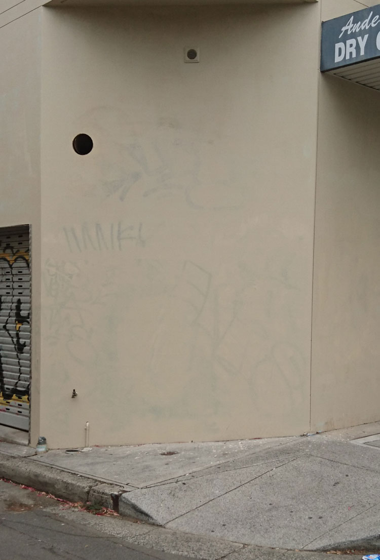
Body outlines (Watch this space)

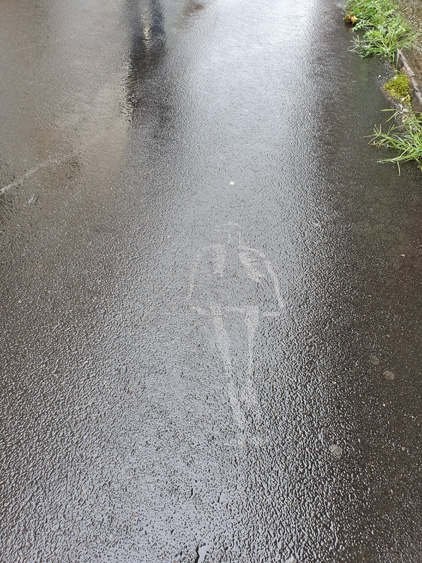
The chalked outline of a corpse is a crime fiction cliché. It is seldom used in real police investigations and yet the image has been assimilated into our everyday visual vocabulary. Advertisers, illustrators and safety authorities have appropriated the familiar shape to encapsulate their warnings about crime and violence. In Sydney’s inner west, young professionals are gradually replacing the students, activists and artists living in what used to be cheap accommodation there. But as I photograph the increasingly upmarket streets of Newtown, I find that graffitists still use its pavements to broadcast their protest messages and sometimes they make their point by filling in the blank forms of body outlines.
(This article was originally published in 2009 the first issue of Second Nature: International journal of creative media, produced by the School of Creative Media at RMIT. It was meant to be the first in a series of essays examining the pavement as a medium of expression. Unfortunately Second Nature did not continue and even that first issue is no longer available on-line.

As a blog post it fails miserably according to WordPress – it has too many long words, long sentences and long paragraphs, too much passive voice, and not enough subheadings. Surprisingly WordPress does not mention that the content is a little dated even though it is. Fortunately I am not trying to sell anything and I hope my literate readers enjoy the post despite these failings.)

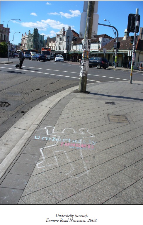
IT LOOKED AS IF THERE HAD BEEN A MASSACRE – the position of several corpses had been marked with outlines on the footpath near the railway station. It wasn’t the first time this sort of thing had happened in the area. I had seen crime-scene outlines on Newtown pavements about fifteen years before. I have seen them intermittently since then and these days I photograph them to preserve some permanent record of their existence. Chalked bodies fade quickly under the assault of passing feet; spray-painted versions last longer, but eventually these disappear as well. Newtown being the sort of place it is, they are inevitably replaced by fresh ones sooner or later.

As it turned out, this latest batch of outlines was evidence of a series of homicides that had happened, not here in Sydney’s inner west, but nearly 1000 km away. Recreated homicides, actually. The drawings were part of an outdoor marketing campaign for the 2008 television series Underbelly – a fictionalized memorial to Melbourne’s 10 year ‘gangland war’.

On the other hand, those first body outlines I had seen in Newtown many years previously were commemorating a different kind of wartime event – the bombing of Hiroshima on 6 August 1945. Every year peace activists around the world observe Hiroshima Day by holding rallies, and sometimes they draw bodies on their local pavements. These are supposed to simulate the marks left when people were vapourised by the bomb’s heat blast. Judging from the few photographs taken in Hiroshima that day, the real body shadows were blurred and formless, and yet it is the clichéd homicide silhouette that activists have chosen to use in their peace demonstrations. The outlines make the street look like a crime scene, and for anti-war protesters that is the point.

Newtown has a high rate of metaphorical crime. Body outlines are pressed into service for all sorts of causes.
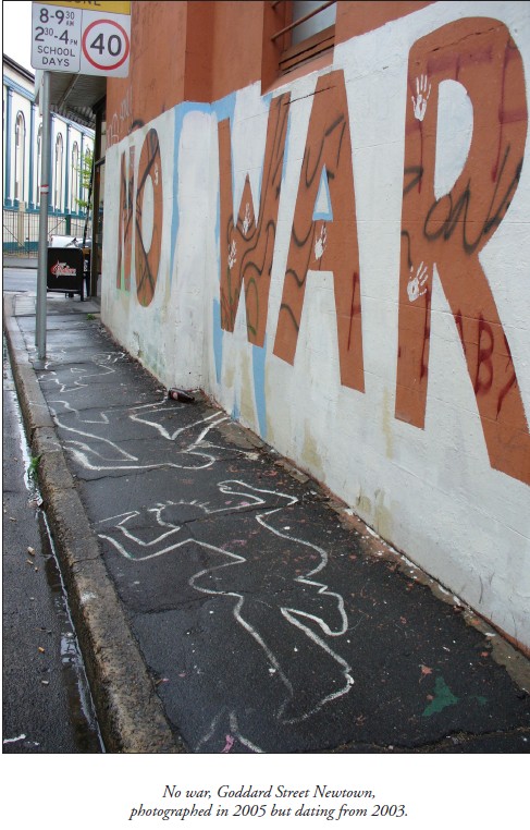
In peace protests their manifestation is not limited to 6 August. There was, for example, a spray-paint installation that appeared in Goddard Street early in 2003, when Australia joined the war in Iraq. ‘NO WAR’, written in huge letters on the side wall of a café, was accompanied by a slew of life-size figures on the footpath. Their stark remains decorated the asphalt in that tiny side street for several years.
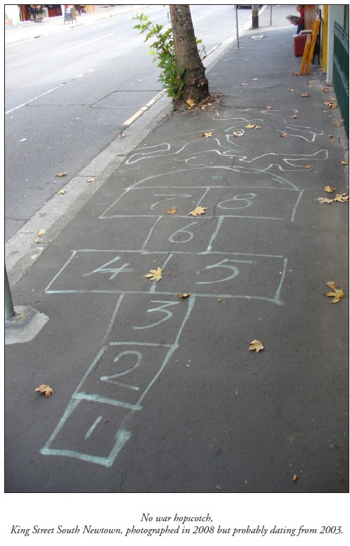
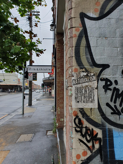
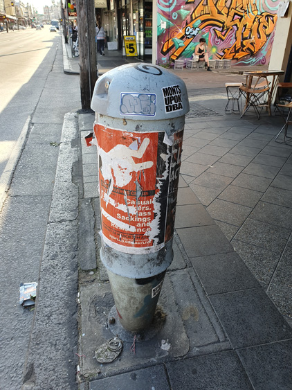
Around the corner, in the main street of Newtown, synthetic bluestone pavers are gradually replacing the asphalt footpaths, just as young professionals in renovated properties are gradually replacing the inner-city students, activists and artists living in what used to be cheap accommodation in the area. But despite the upward mobilization of Newtown, pockets of resistance still exist, from old leftie Bob Gould in his chaotic book arcade at one end of King Street, to young anarchists in crusty flats above the shops at the other. And although the gritty monochrome of old asphalt was more suitable for inscriptions in chalk and paint, protesters still manage to use the footpaths of King Street as a billboard for their messages, defying the unfriendliness of the new pavers’ neatly repetitive grooves and shiny mottled surfaces.

Take, for instance, the trail of crime-scene outlines that I photographed in September 2005. These marked the progress of a mobile street performance by students belonging to an anti-capitalist collective called 30A. Suited ‘capitalists’ had rolled a giant gold coin along the footpath in King Street, mowing down ‘workers’ as they went. Shapes were traced around the ‘victims’ and the space inside the outlines was filled with slogans like ‘Howard kills jobs’, and ‘Work is death’. It was all pre-publicity for a mass protest to be held later that week, not in Newtown, but outside the Forbes Global CEO Conference at Sydney Opera House.
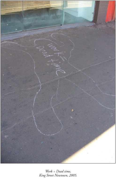
Newtown often acts as outrider for demonstrations happening elsewhere.

This explains another outbreak of body outlines in King Street in February 2004 – it coincided with a riot in Redfern a few kilometres away. Anti-police violence had erupted after Aboriginal teenager TJ Hickey came off his bicycle and was fatally impaled on a metal fence. Redfern locals claimed a police car had been stalking the boy. While the aftershocks of the riot were still happening, crudely chalked bodies appeared on Newtown pavements, accompanied by slogans such as ‘Stop racist police brutality’, ‘Cops kill children’, and ‘To kill an Aboriginal is to kill history’.

The grim form of a hastily circumscribed corpse is a crime fiction cliché. It is a recognizable image that has been appropriated, not only by social agitators, but by graphic artists everywhere who want to allude to crime or violent death in a metaphorical way. The pudgy, larger-than-life human form has become a regular symbol in our visual vocabulary, so familiar that it is available for parody. Newspaper artists exploit the image to illustrate feature articles. Cyber-crime? A chalked body holding a computer mouse. Car theft? The silhouette on the asphalt of a disappeared car. Advertisers have flogged it to death. Telstra MessageBank? A taped outline of a phone left off the hook by ‘flatmates murdering messages’. iiNet broadband? A forensic investigator drawing round a computer thrown to the ground by its frustrated owner.

The murder-scene outline has caught on as a pop-culture motif despite rarely being used in true police investigations. Old Sydney detectives are adamant that they never drew them, if only because the chalk dust would have contaminated evidence. Archival police photos seldom show them. The body outline is largely a construct of fiction thrillers and television dramas, but it has taken on a life of its own.

Its featureless form captures the essence of the human body – the shell that remains after the soul has departed. It evokes the murderous act but lacks the ugly complications of a real corpse. It is an empty space that allows room for the imagination. A thought bubble where the violent event can be visualised. Or a speech balloon that radical students can fill with slogans.

Although homicide detectives do not draw body outlines, police at motor vehicle accidents do, or at least they used to until fairly recently. Hardy crash investigators joke about the ‘gingerbread men’ spreadeagled at the scene of ‘fatals’, but admit that they were distracting to motorists and distressing for passers-by. These days they spray-paint the scene with esoteric patterns of lines and arrows instead.

But it was their very potential to distress passers-by that prompted traffic authorities to resurrect body outlines for a series of pedestrian safety campaigns around Sydney in the late 1990s.  The aim was to scare reckless road-crossers by stencilling a plague of flattened figures at danger spots on roadways. ‘Step safely’ warned the adjacent pavement signs, ‘Think before you cross’.
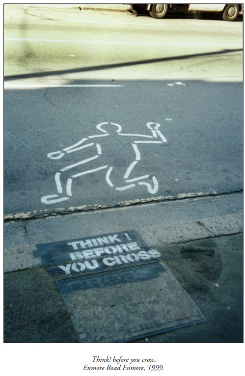
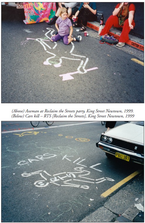
Newtown being the kind of place it is, it was not long before local culture jammers tampered with these spray-painted silhouettes. They were especially active during the annual Reclaim the Streets demonstration in 1999, when King Street was blocked to traffic and rebellious pedestrians commandeered the roadway. Challenging the safety campaign’s insinuation that pedestrians are responsible for road fatalities, RTS activists reanimated the stencilled corpses with painted hair and eyes, with Mickey Mouse ears and tomahawks. And they filled the empty outlines with slogans like ‘Cars kill’.
Sources

Adams, Cecil, ‘Do crime scene investigators really draw a chalk line around the body?’, The Straight Dope, 13 April 2001.

Campbell, Nerida, Curator, Justice and Police Museum, Sydney, pers.comm. 2005.

Gibson, Ross, University of Technology, Sydney, curator of ‘Crime Scene’ installation, Justice and Police Museum, Sydney, 1999-2000, pers.comm. 2005.

iiNet, ‘Don’t take it out on: your computer’, advertising brochure, c.2008.

Jenkins, Peter, Senior Sergeant, NSW Police Crash Investigation Unit, pers.comm. 2005.

Jones, Quentin, photographs for ‘Steal traps’ article by Bob Jennings, Drive, pp.1, 6-7, Sydney Morning Herald, 8 June 2001.

Members of 30a (Annonymous collective of streat theatre bandots [sic]), pers.comm. September 2005.

‘Photographs of Hiroshima and Nagasaki’, Gensuikin.

South Sydney Council, ‘J walking: deadly walking’, Babylon Creative postcard, c.1999.

‘Sydney prepares for Forbes Conference and 30A protest’, Wikinews, 30 August 2005.

Telstra, ‘Stop flatmates murdering messages’, AvantCard postcard, 1999.

Tremain, Cathryn, picture for ‘Catch me if you can’ article by James Hall, Next, p.1, Sydney Morning Herald, 11 March 2003.

‘Underbelly [Uncut]’, DVD, Nine Network, Australia, 2008. Walker, Emily, ‘Shadows of death. Atomic bomb hit Hiroshima 60 years ago’, Kalamazoo Gazette, 7 August 2005.

Original publication

Hicks, Megan, ‘Outlines (Watch this space)’, Second Nature, 1, March 2009.
The loser and his portable graffiti

There are forms of written communication in the street that speak only to the cognoscenti or the curious. And despite the dominance of e-communication, the disappearance of suburban newspapers and the degradation of postal services, print and handwritten messages still play a role in local conversation.

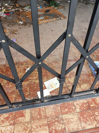
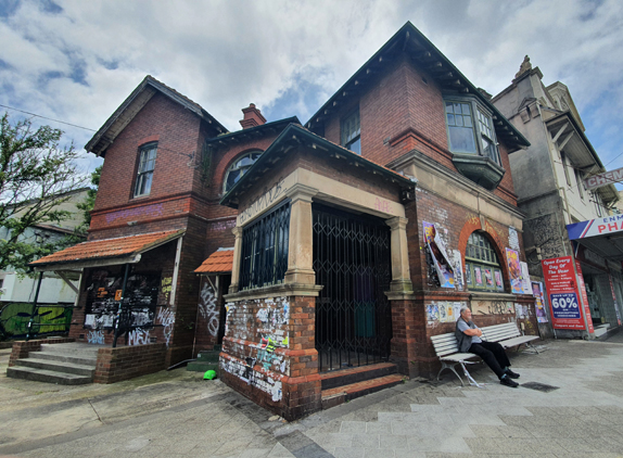
This lovely old post office in an inner suburb of Sydney is a participant in the evolution of communications. Built in 1895, it was decommissioned by Australia Post one hundred years later and replaced by a post office shop down the road. The building deteriorated even after a brother and sister bought it to use as a warehouse for the charity they ran.  After those people died it was vacant for many years. Although it is now up for auction it remains in an abandoned state, with windows broken and a metal grille across its front porch.

No letters pass across its heavy wooden counter, no stamps are sold, no mail can be collected from its post boxes. And yet this empty landmark building continues as a centre of communication. Its exterior walls are noticeboards where graffiti tags signal their writers’ transit. Where stickers hint at esoteric secrets. Where posters advertise performers, performances and protests – shredded by rain they are soon replaced by fresh news.

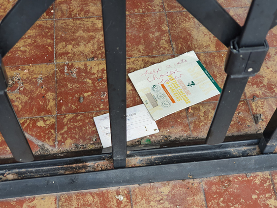
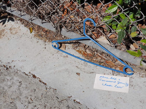
But not all the messages are vertical. On the floor of the gated porch there are always one or two puzzling calls of distress. Handwritten on random pieces of card or paper and carefully slipped under the metal grille, they are almost unnoticeable amongst other windblown detritus and pigeon droppings:

‘help a brokers chosen loser’  in the margins of a local government flyer

‘please help a Canaccord Genuity chosen loser’ on a scrap of paper weighted down with a Thomas the Tank Engine book

 ‘help a brokers chosen loser’ in a CD case.

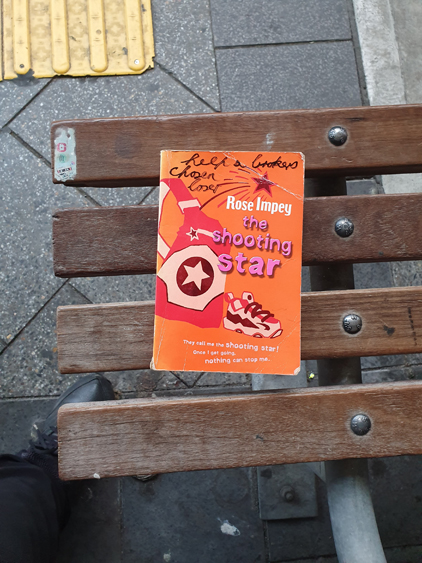
I have been photographing this person’s missives for several years now. They seem to be concentrated in the post office entrance these days, but I have also seen them at other spots close by – the lane at the back of the post office, the brick fence of a nearby church, a bus stop just around the corner. 

Curiosity finally sent me to Google and I’ve found that the grievances – and perhaps the street notes – date back to 2010 when there was a problem involving a stockbroker and this person’s inheritance. He has a community Facebook page that is ‘about people who always lose over time when attempt to invest thats not to say they have’. But he is the only person that posts and usually the only person who comments on his posts.

In his posts he reveals a great deal of personal information and airs his opinions on stockbrokers, bankers, vets, Christians, atheists, psychiatrists, podiatrists, socialists and vegans, none of whom, apparently, have any sympathy for ‘permanent savings losers’.

It’s interesting then, that with a limitless potential audience on social media, this person still chooses to complement his exposed Facebook identity with anonymous little street notes. Like a graffitist who asserts their presence in a locality with multiple tags, the ‘loser’ permeates the neighbourhood with his anguish. But unlike tags his portable graffiti works do not mark any fixed urban surfaces. Instead he ensures the permanency of his paper messages by constantly replacing them.

Still life with birds

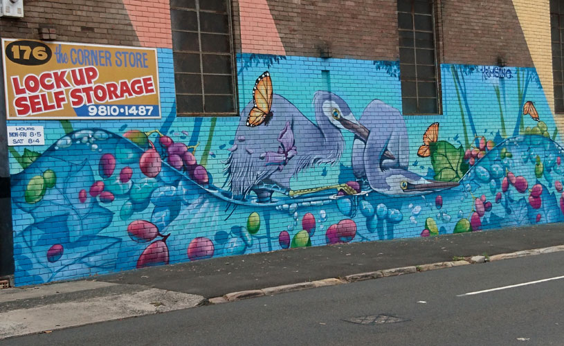
Krimsone (Janne Birkner), Herons, Rozelle

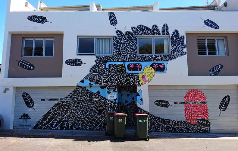
There has been an irruption of street art birds in Sydney and other cities of the world. For several years now, accumulations of avian fauna have been flattened and pinned to the walls of the open-air urban museum.

But why birds? In this post I canvass some thoughts about birds and humans, and birds and walls. I let Guy Debord have the last word.

Mulga (Joel Moore), Cockie, Marrickville

put a bird on it: Phrase exclaimed when placing an image of an avian creature on any item, especially one that was “handcrafted” or “thrifted” so as to make it totally adorable and artistic.
Urban Dictionary

Birds are everywhere. This prevalence ensures that images of our airborne friends are easy for an audience to connect to, making them as commonplace in artwork as they are in everyday life.
Unimelb, Birds and street art, Street Art de Tours

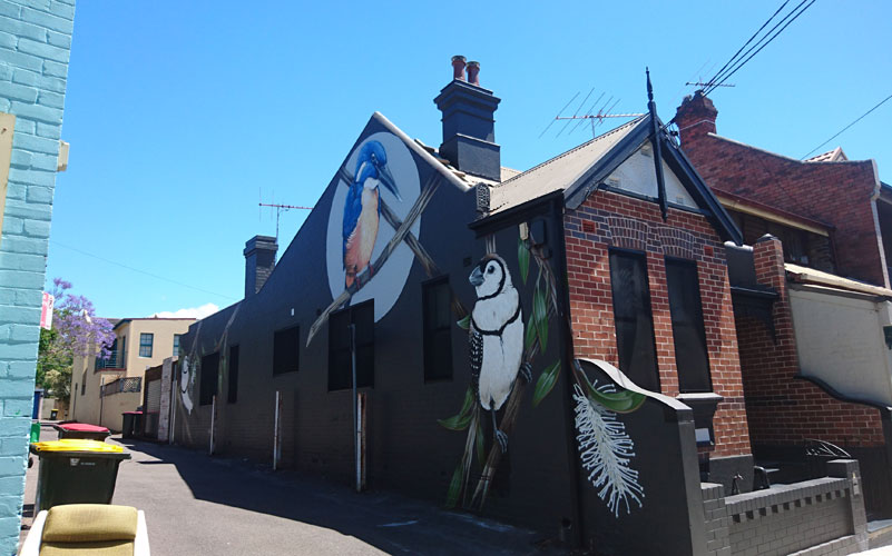
Thomas Jackson, Owl faced kings, Camperdown

Fascinated by the local animals and landscapes … Thomas Jackson puts a modern take on ‘Natural History Illustration’, painstakingly creating smaller scale works for galleries and translating these into large scale public murals.
Thomas Jackson website

In a culture of globalised brands and neo-liberal ideology, this new one-size fits all style of public mural art is ideal for clone developments & gentrification projects, it’s middle of the road, middle class and middle-brow. It is fast creating a culture that seeks nothing more than your uncritical attention and adoration.
Martyn Reed, nuart journal

Anthony Lister, Parrots, Alexandria

I imagine we’ll always fetishize birds. They fly, for one thing, and for us ground-bound mammals, all gangly limbs and big brains, their flight symbolizes something like freedom.
Erik Anderson, Bird

Freedom is a word closely associated with all forms of graffiti, urban and street art. Painting in the street offers a place to create away from the restraints of the studio and the gallery … Birds are a constant and popular theme to appear in murals. Perhaps street artists just happen to like birds a lot, or perhaps it comes back to this idea of freedom again. Who hasn’t watched a bird take to the air and wondered just how it would feel?
Steve Gray, Ten street artists who love to paint birds, Widewalls

Tracy Emin, The distance of your heart, Sydney

Birds are perched on buildings all around the city, but look carefully and you might find some that don’t fly away. Renowned British artist Tracey Emin has placed more than 60 bronze birds throughout the city centre. The artwork is called The Distance of Your Heart and is a reflection on feeling homesick.
City of Sydney News

Phibs (Tim de Haan), Seed bearers, Newtown

Two birds represents everything from freedom to animals that spread seeds across the world. This encourages new growth and plants, combined with a heart and hand represent the power we have in the world around us. My work signifies the symbolic, engaging the urban with the organic.
Phibs (Tim de Haan), Street Art Cities

Birds have always been small agents charged with carrying the burden of our feelings simply by following the logic of their own existence … Yet for all our emotional investment in them, we’ve never treated birds particularly well.
Delia Falconer, Signs and wonders: dispatches from a time of beauty and loss

Native animals offered a former “colony of miscreants” a powerful and inspiring metaphor for cultural evolution and burgeoning nationalism at a time when Australia was beginning to assert its separate political destiny.
Jazmina Cininas, Antipodean bestiary: reconstructions of native fauna and national identity in the work of eleven contemporary Australian artists, PAN : philosophy activism nature

Scott Marsh, Bin Kingz, Chippendale

No other animal encompasses the nature of Australia like the bin chicken, foraging it’s way into our bins, and our hearts. At the same time, no other artist extracts the essence of Aussie humour like Scott Marsh, with his iconic wall murals piercing the Australian sensibility like a six inch curved beak to a council bin bag.
Scott Marsh, Bin Kingz

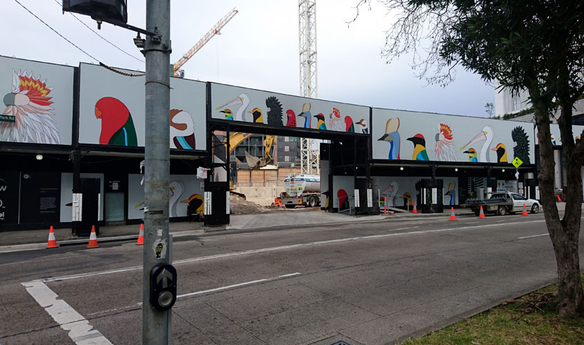
Egg Picnic (Camila de Gregorio and Christopher Macaluso), Birds of Australia, Glebe

Egg Picnic wants to be the Disney of conservation – they create illustrations to make us fall in love with, and feel compelled to protect, our beautiful fauna.
Egg Picnic with City of Sydney Creative Hoardings Program

And God said, Let us make man in our image, after our likeness: and let them have dominion over the fish of the sea, and over the fowl of the air, and over the cattle, and over all the earth …
King James Bible, Genesis 1:26

Nature is not an accessory, nor is it peripheral to our happiness. It is our happiness – civilization itself – that is an accessory, the four billion year continuum of life on the planet that is primary. But if the best we can do is to care about nature from the position of one equipped to redeem it , I’m not sure it’s worth saving.
Erik Anderson, Bird

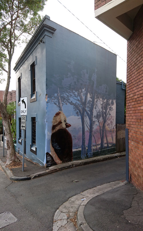
Knoswet (Xander Zee), Kookaburra sunrise, Surry Hills

This is one way of bringing the bush to the city. We found this gorgeous kookaburra down the back lanes of Surry Hills today.
The Daily Telegraph Home Magazine

 As urbanism destroys the cities , it recreates a pseudo-countryside devoid both of the natural relations of the traditional countryside and of the direct (and directly challenged) social relations of the historical city.
Guy Debord, The society of the spectacle

…………………………………………………………………………………….

(All photographs taken by Megan Hicks in and around Sydney, Australia)

Bill posters won’t be prosecuted

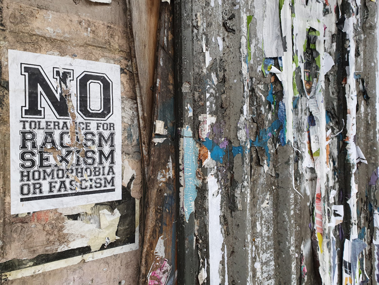
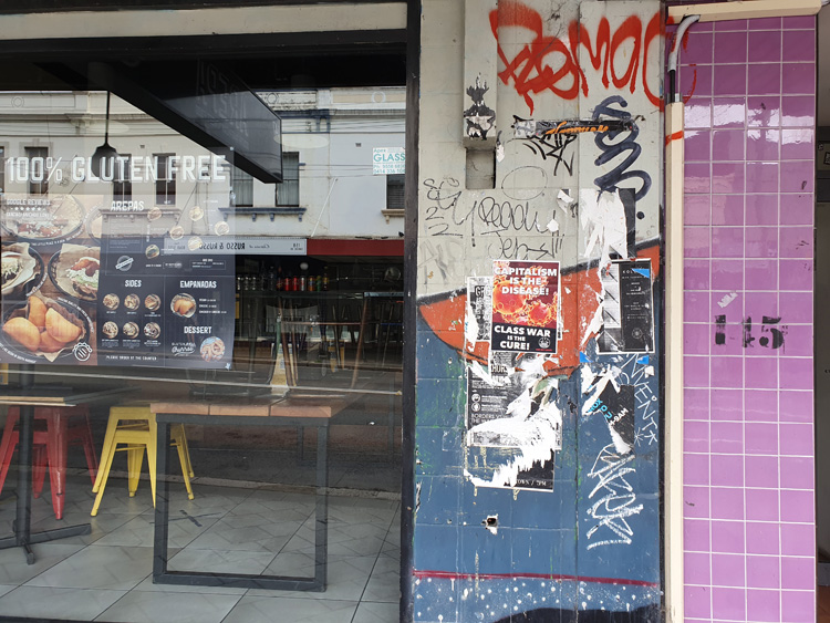
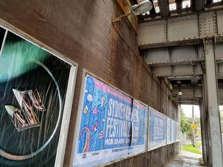
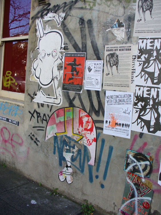
Despite galloping gentrification, the Newtown-Enmore ‘destination precinct’ of Sydney’s inner west retains remnants of its former underground student activism, most notably in the form of fly-posters promoting leftist and anarchist causes.

Bill posting is illegal, with the local Inner West Council defining posters as ‘visual pollution’, along with other forms of ‘unwanted graffiti’. However, unlike the City of Sydney, which administers the north-eastern end of Newtown, the Inner West Council does not carry out an aggressive program of graffiti and poster removal. This might mean the Inner West has a smaller budget for street beautification, but over the years I have come to realise that it also indicates an uneasy tolerance on the part of Council, and that this tolerance is based on ambivalence. 

Inner West Council trades on the image of Newtown-Enmore as a ‘vibrant’ and edgy area where there is always something to see and do. Its arts program, tellingly named EDGE, seeks to reinforce the area’s position as ‘the cultural engine of global Sydney’. It is noteworthy that the 2019 EDGE program was themed Art and Activism and that it included works of pseudo-graffiti, such as a series of giant paste-up illustrations celebrating the Reclaim the Streets activist movement, and trails of animal stencils on footpaths described as a ‘guerrilla pavement art project bearing witness to The Sixth Mass Extinction’.

With this kind of endorsement of graffiti and paste-ups it’s not surprising that unauthorised fly-posters have become an intrinsic element of Newtown-Enmore’s cultural capital. Political posters draw attention to the locality’s history as a seat of activism and this history is encouraged by Council’s arts programs to be regarded as an element of cultural ‘heritage’.

This blog post is an edited excerpt from:

HICKS, M. (2021) Flyposter graffiti and the change in a Sydney streetscape during the time of COVID-19. Visual Studies, 36, 141-146.
Concrete Creeks. Excursion 6. The source.

Friday 10 April 2020

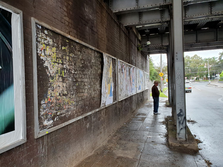
It is raining lightly and the urban currawongs are going joyously berserk as we set off. Having visited the mouth of Johnstons Creek we are now looking closer to home for its source, guided by an 1887 map of Sydney suburbs. We begin at the railway underpass in Liberty Street, Enmore, with its shredded posters. The Man Who Walks Ahead watches two bill posters posting on the opposite wall.

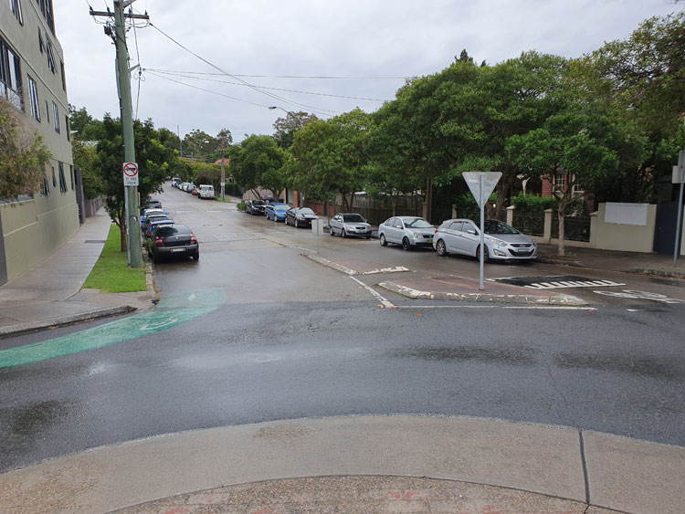
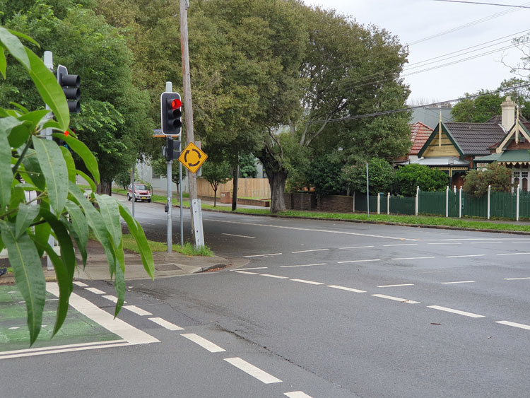
Crossing to the nearby roundabout I can see the spot that the map indicates as the beginning of the creek. It’s in a dip of what must have been a soggy paddock but is now Railway Avenue.

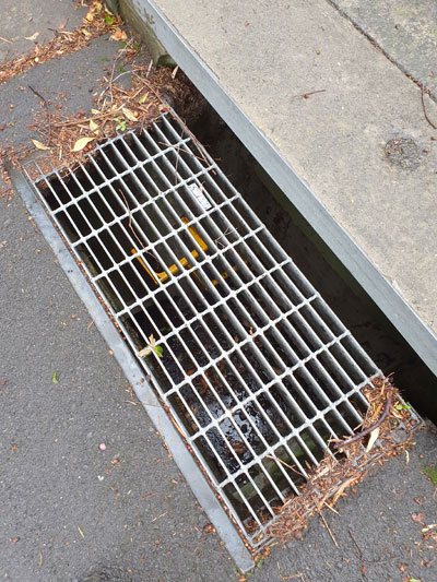
Tracing the creek from its source now becomes a matter of following the lie of the land and peering down grates in the roads to deep stormwater drains with yellow ladder rungs and sky glinting off water at the bottom.

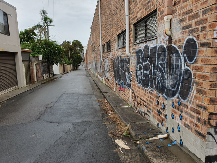
We come to a corner where we can look down Salisbury Road. In the dip there is the paling fence that screens off Johnstons Creek where it modestly emerges from underground and continues its journey cosseted by an open air canal. But we have been there before so instead turn up the hill to imagine how rainwater runs above and below ground down towards the concrete creek.  In a back lane a piece of wall-and-pavement graffiti helpfully depicts this process for us.

We get suspicious glances from people sipping at paper cups while accompanying their raincoated children out for a scooter ride. At the end of the lane is a little café where customers queue obediently for their permitted take-way coffee. 

Our long walk has taken us through corner country where four suburbs meet. As we circle back to our starting point we find that those bill posters have renovated both sides of the underpass.

Banksy, Newtown and ephemerality

ADDENDUM. This blog post was the seed for a more detailed article in Nuart Journal, published in September 2019. You can find it at ‘Wall story: an 11-year visual record of a street art site in Sydney’.

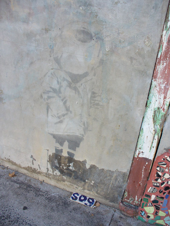
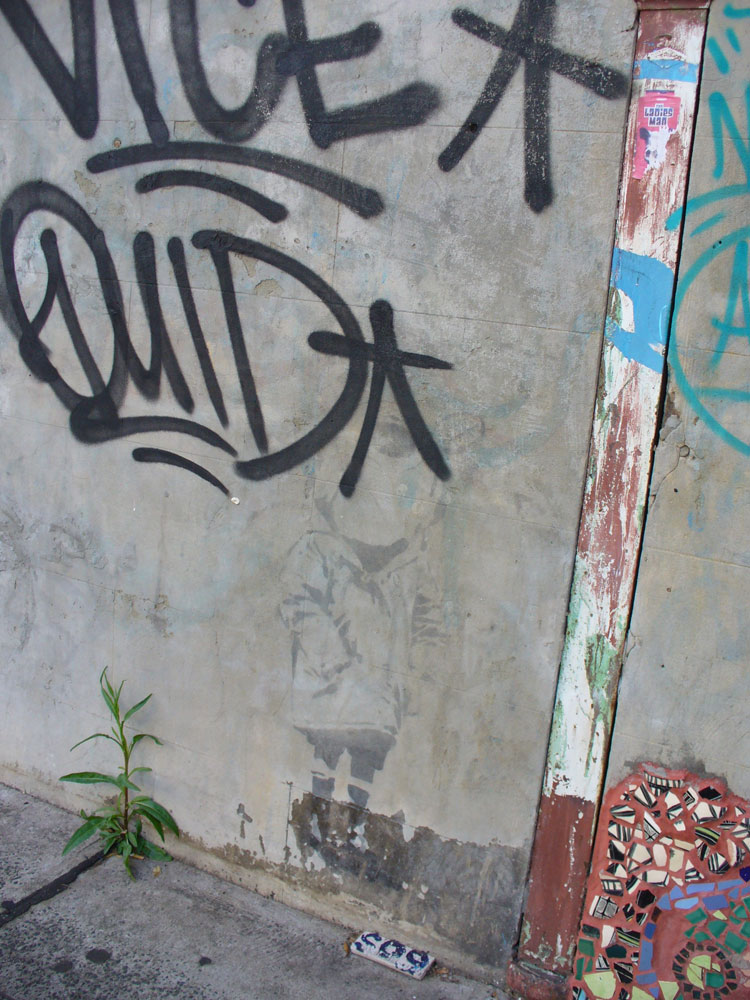
Eleven years ago I photographed a fading piece of Banksy graffiti in Newtown, an inner west suburb of Sydney. It’s a version of the UK artist’s ‘Diver’ stencil and would have been done in 2003 when he made a secretive visit to Sydney. Back then I was concentrating on pavement graffiti and was not much interested in Banksy. I’m still not that interested, but anyone who writes about graffiti of any sort must eventually pay attention to the Banksy Phenomenon.

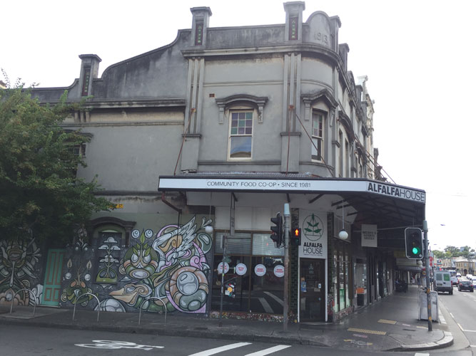
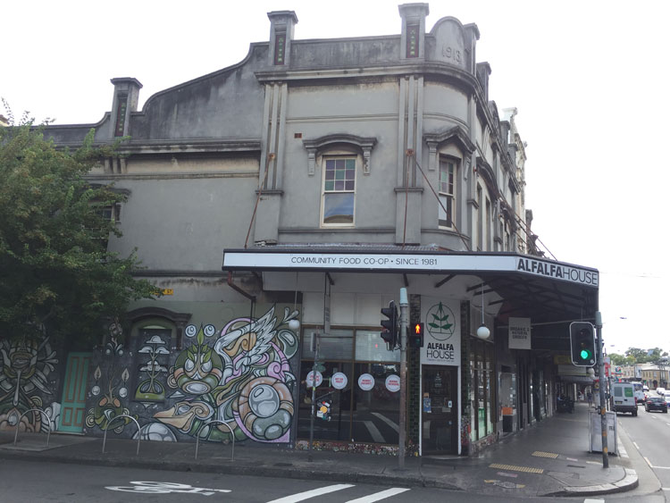
By 2008 Banksy was notorious enough for me to decide that I should photograph the Diver. It helped that there were two other types of graffiti nearby – a tile with hand-painted lettering fixed to the pavement (of course) and a mosaic of broken china stuck to the wall. All of these were along the side of Alfalfa House, an organic food cooperative that had been set up in 1981 at the corner of Enmore Road and Philip Street.

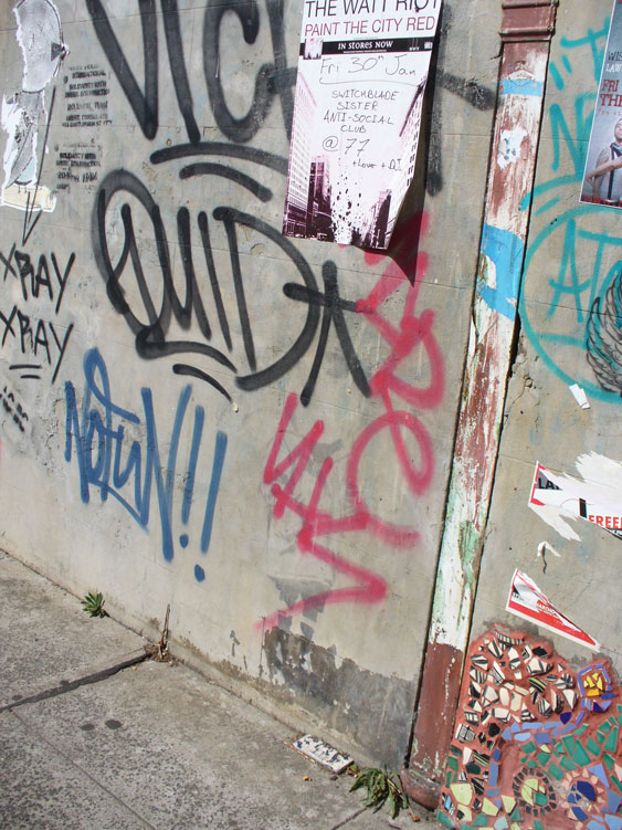
Only a few people knew about Banksy’s brief visit to Australia in 2003 and while the whereabouts of some of his stencils in Melbourne were known, I found it curious that so little attention had been paid to this one in a fairly busy street in Newtown, especially as one of his works on a wall in London had sold for some thousands of pounds early in 2008. But by the end of 2008 the Diver had finally received attention. The name ‘Vice Quid’ had been sprayed over it, whether out of ignorance or defiance I don’t know.

It’s possible an article in the Sydney Morning Herald had stirred up interest in the work. Even though the reporter had acknowledged that “Graffiti artists keep the whereabouts [of Banksy’s Sydney works] secret because there are fears the rocketing price of Banksy’s work means they might be broken out of the walls on which they are painted”,  nevertheless he had been quite specific about the location of the Diver.

When I privately expressed some dismay I was firmly told by a close acquaintance that it’s what should be expected. “It’s only graffiti. Graffiti’s not meant to last”. Not even Banksy’s. And it’s true. As I said in an earlier blog post – ‘Overpainting: order vs chaos’ – when taggers and spray-can artists paint over each other’s work, sometimes this is a display of disrespect and an assertion of territory, sometimes it’s a political act, and sometimes it is simply a natural progression in the world of informal street art, where the art is necessarily ephemeral.

Within a few months the wall was covered with tags, stencils, paste-ups and notices. The Diver, which had remained untouched for five years, was now barely visible.

A year later I couldn’t even be sure where the Banksy stencil was.

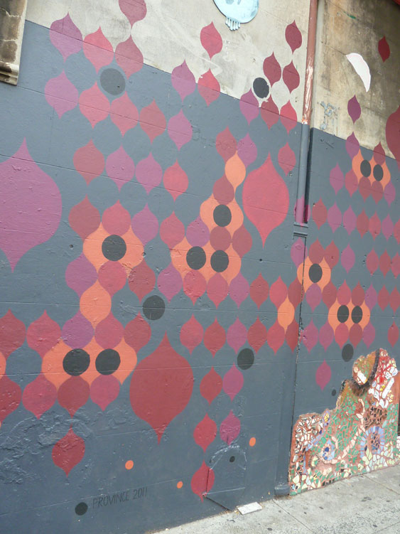
In 2011 Alfalfa House must have decided a makeover was in order. An artist was presumably organised to paint a mural on the side wall and it’s possible that someone, other than the artist themselves, thought this pattern was attractive. But, aesthetic qualities aside, in covering over what went before, the line had been crossed, from informal graffiti to commissioned art.

Notice, however, that the old wall mosaic and the pavement tile had escaped unscathed.

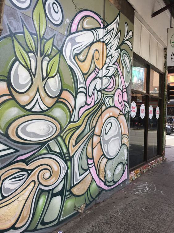
Fast forward to the present where the wall of Alfalfa House is now covered by a magnificent pastel-coloured work by well-known local street artist Phibs.  A remnant of the mosaic remains but the rest has been painted over. The pavement tile is gone, its lowly place now taken by a horizontal tag on the concrete.

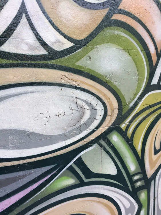
But not even Phibs is above being scribbled on. So far the attempts at defacement have only been tentative.

Banksy’s latest notorious stunt was the semi-self-destruction of one of his works seconds after it was sold at a London auction for more than one million pounds in October 2018. Originally titled ‘Girl with a Balloon’ the work was renamed ‘Love is in the Bin’ by Banksy. It does not take much imagination to see the metaphorical connection between the shredding of a graffiti-stencil-turned-framed-artwork and the ephemerality of art on the street.

References:

Jinman, Richard, ‘Details emerge of Banksy’s Sydney visit’, Sydney Morning Herald, 17 January 2008.

Wikipedia, ‘Banksy’.

‘Banksy’s Girl with a Balloon artwork self destructs after selling for almost $1.9 million at auction’, ABC News, 6 October 2018.

All photographs by meganix.

Graffiti tricks


This is going to take a lengthy search. I am looking for images and mentions of graffiti that pre-date the explosion of informal public writing in the 1970s and 1980s. I’m concentrating on Sydney, but even within that narrow scope it won’t be easy.


Before the mid-1900s the term ‘graffiti’ was used for writing that had survived on walls found at ancient archaeological sites. It hardly ever referred to contemporary inscriptions in public places. So there’s not going to be much point in using Trove to scan the newspapers for references to ‘graffiti’.

Nor will it be much use searching through the catalogues of digitized photograph collections. When cataloguers are annotating images of buildings and streetscapes they note all sorts of things that might be used as search terms, but they hardly ever notice graffiti.

So I will have to look at images one by one in the collections at, for example, the Mitchell Library and the City of Sydney Archives. In the meantime I scrutinize the blow-ups of historical photographs that are currently being used to decorate building-site hoardings around town.

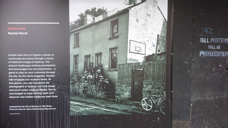
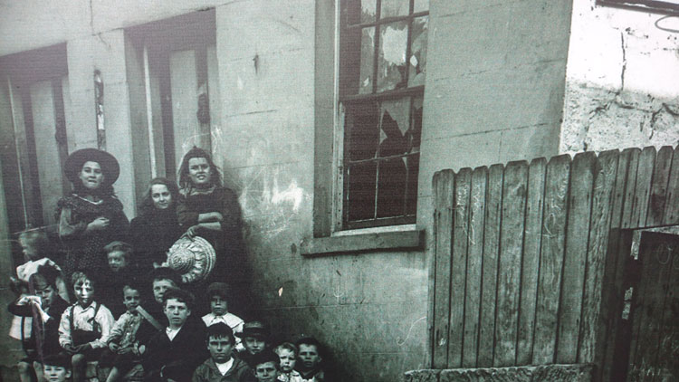
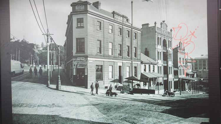
These blow-ups are not quite as they seem. Each of them is an element of an artwork called Double Take. Artist Rachel Harris has doctored the photographs by adding “unusual details”. There is a pair of them in King Street, Newtown. Look carefully and you’ll see that, alongside the shabby building and the stepload of kids, there is a modern bicycle, a basketball hoop, and … (no I’m not going to give away any more of the “hidden treasures”).

But what about the scribbles on the house and the paling fence? I am right to be excited because I’ve spotted historical examples of childish graffiti, or is this just another of Rachel Harris’s interventions?

Nevertheless, I’m on pretty solid ground regarding the graffiti on the accompanying photograph of the Hero of Waterloo Hotel. I’d say that pink scribble is definitely an early 21st century tag. And it post-dates Rachel’s digital trickery.

These are not block boys

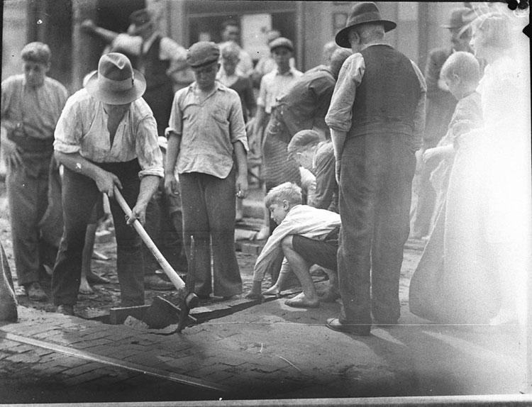
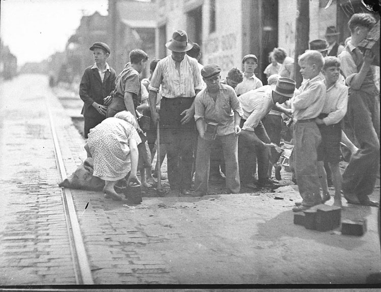
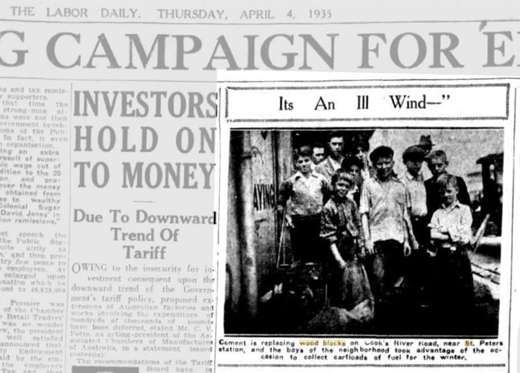
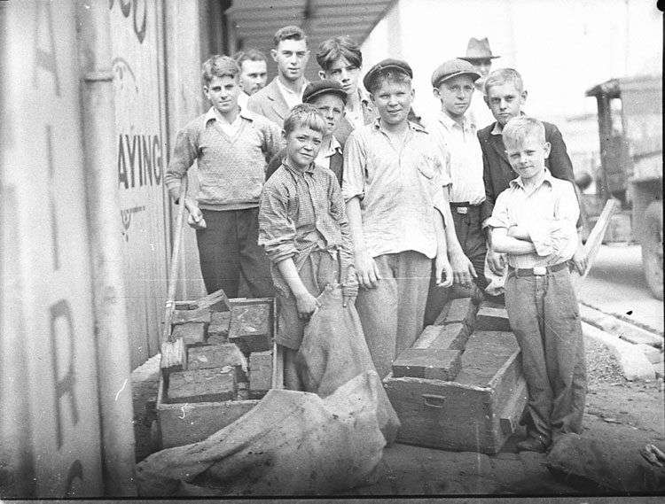
I would like to set the record straight about this picture of young boys taken by Sydney photographer Sam Hood in the 1930s. It is one of a set of three in the collection of the State Library of New South Wales all of which have been titled by the Library ‘Block boys at St Peters’. Because the boys are handling wood blocks, perhaps the label was originally written as some kind of pun, but it is entirely misleading. These are not block boys. That term belongs to another class of Sydney youths and I will come to them later.

The unfortunate labelling of this picture has been repeated by other cultural institutions (here and here, for example) and has even been expanded into erroneous explanations about what the boys are doing, which have then been broadcast – and not only on internet plagiarists’ sites. I was provoked into writing this blog post after seeing a beautifully mounted blow-up of the picture hanging in The Henson in Marrickville with a credit to the State Library of NSW. Nice addition to the décor but a pity the hotel has been provided with an incorrect description, which states that the boys ‘… are helping to build roads using a method called woodblocking’.

The real story is just as interesting, but without the connotations of child labour. The boys are not constructing a road. They are hanging round with their push carts and hessian bags to collect discarded wood blocks, which they will take home as fuel for the family fire or stove. Wood blocks were once widely used in Sydney for street paving. Until the late 1800s the city’s roads were generally unsealed but the 1890s saw woodblocking come into widespread use by municipal councils, with hardwood blocks steeped in tar being laid like bricks, hammered close together and top-dressed with more tar. But by the early 1930s this method of road building was no longer used and councils started ripping up the worn wood blocks on some roads and replacing them with asphalt or concrete, often in large-scale Depression-era programs that provided employment for out-of-work men.

Those tar-impregnated woodblocks would have burnt well. They were prized by householders as free fuel and were quickly purloined as soon as the road workers dug them up. The Sam Hood picture was taken during the hard times of the Great Depression and the local boys are contributing to their families’ wellbeing in a practical way.  The two other pictures taken by Hood in St Peters at the same time have been damaged a little, perhaps while the negatives were in storage but, with a bit of staging for the camera, they clearly show what is going on. In both of these there is also a girl collecting blocks alongside the boys.

And just to prove my point I searched for and found the photograph in question published in a contemporary newspaper. Sam Hood had his own commercial studio but also took press photographs, working full-time for a while in the 1930s for the Labor Daily.  On 4th April 1935 that newspaper printed his photo on page 8 under the heading Its an Ill Wind —  with the caption:

Cement is replacing wood blocks on Cook’s River Road, near St. Peters station, and the boys of the neighbourhood took advantage of the occasion to collect cartloads of fuel for the winter.

St Peters, by the way, is an inner suburb of Sydney and what was Cook’s River Road is now part of the Princes Highway.

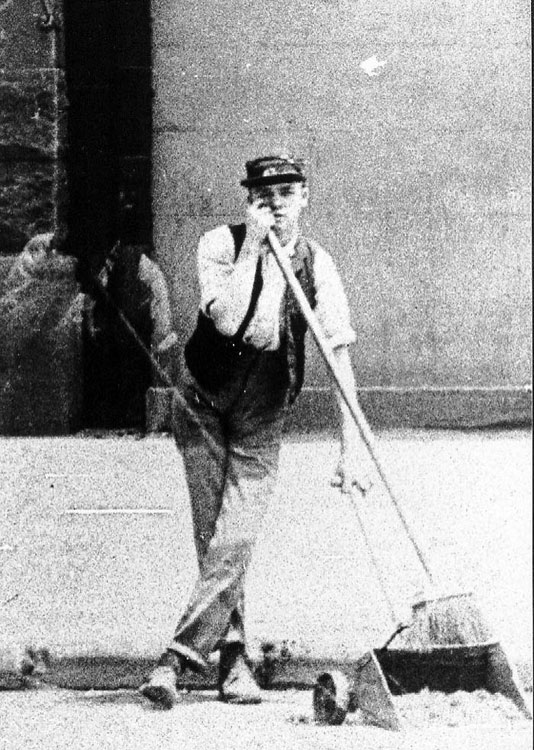
So who were the actual Block Boys? In the early 1900s the City of Sydney employed a small army of youths to sweep up the tons of manure deposited by horses on the city’s streets. Equipped with long-handled brooms and scoops, these block boys, or ‘sparrow starvers’ as they were jokingly called, were each assigned a city block to keep clean. But by the 1930s motorized vehicles were outnumbering horse-drawn vehicles in the city and street cleansing was subsumed into the more generalised duties of Council’s other outdoor workers. The coveted job of block boy was phased out.

Not many photographs were taken specifically of these youths, but they often turn up in photographs taken for other purposes. The picture below is a detail from a photograph in one of the Demolition Books kept at the City of Sydney Archives. The block boy leans on his broom in Sussex Street to watch as the photographer documents the building behind him, which is slated for demolition.


I have a large, framed copy of this picture hanging in my house. Left over from an exhibition at Sydney Town Hall, it was given to me by the city’s archivist some years ago as thanks for a small job I had done. I chose this particular photograph because it is a double exposure. The boy’s doppelganger is lounging beside him.

References:

Davies, Alan, Sydney exposures: through the eyes of Sam Hood and his studio, 1925-1950. Sydney: State Library of New South Wales, 1991.

Fitzgerald, Shirley, Sydney 1842-1992. Sydney: Hale & Iremonger, 1992.

Fitzgerald, Shirley, The sparrow-starvers: block boys 1890-1930, catalogue for an exhibition of documents from the City of Sydney Archives, Sydney Town Hall, June 1997.

Shepherd, Allan M., The story of Petersham 1793-1948, Sydney: The Council of the Municipality of Petersham, 1948.

The name

I am researching the history of a nineteenth century row of houses in Sydney’s inner west. It’s not my usual kind of writing gig but it has been interesting following the money. Wealth accumulated in good times by an enterprising immigrant from Yorkshire, shared with his son as a business partner, lost when the son’s extravagant ventures are caught out by a national financial depression.  What’s left is a smattering of properties that have been salvaged for heritage listing by repurposing – gentlemen’s residences divided into flatettes, a wool store fitted out as university outpost campus, a private mansion transformed into a Catholic educational institution.  

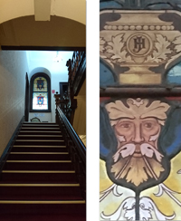
The buildings are notable for the need these colonial nouveau capitalists had to monogram their possessions. The firm’s name is embossed on the wool store – an understandable commercial imperative. But on the gateposts of the father’s 1860s villa his initials AH are stuccoed in botanical calligraphy so elaborate that they are barely legible.


The son’s entwined initials JH in more restrained but authoritative capitals decorate the interior of his opulent 1880s mansion. I can imagine the thrill of self-satisfaction this sleek young mayor experiences as he glimpses the stained glass panel on his way upstairs from the expansive vestibule of his domicile.


Fast forward to the late twentieth century and an upsurge of the monogram for marking property – though more likely someone else’s property or else a piece of public infrastructure. Taggers appropriate territory with marks that are generally illegible except to themselves or to cohorts that matter.

 I came across a graffiti supplies website recently, and this comment from a user:  ‘ I wrote the name test when i was in high school. I liked it cause every time i  saw the word test in a context totally unrelated to graff i creamed a little’.

 Here is the thrill of self-affirmation. This graffitist has gone for ordinariness over illegibility for his tag, and finds satisfaction when he sees,  not only the property he has marked,  but every single item where his moniker ‘test’ happens to appear – books, advertisements, notices, school whiteboards. His mind (and his member) believe that all these base are belong to him.

 At least what you don’t really own and have not mortgaged will not send you bankrupt.

Images by meganix, taken in 2017 in Sydney: Stanmore, Circular Quay, Newtown and Strathfield.

Overpainting: order vs chaos

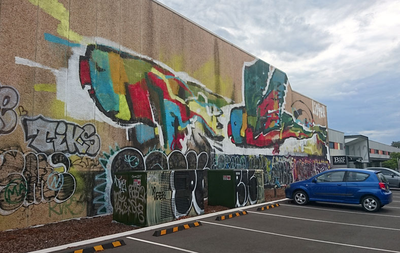
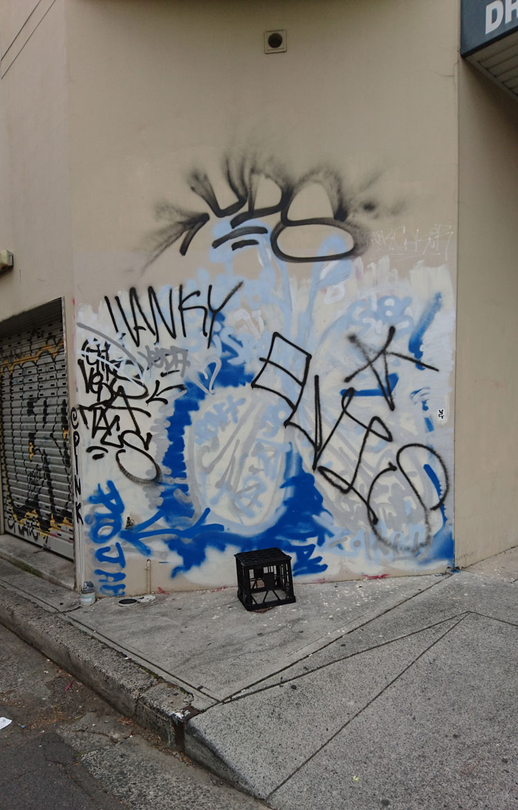
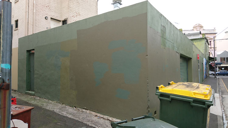
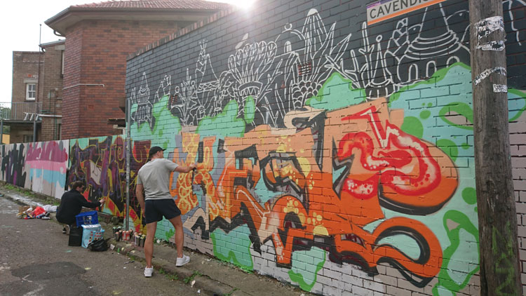
On this often-overpainted wall in Enmore the graffitists currently have the upper hand. I am inclined to think their tastefully colour co-ordinated composition is more interesting than the layers of creamish-fawn paint that preceded it.

 The subject of overpainting is fraught. Everyone has something to say on the matter – wall owners, local councils, concerned citizens, hip and tolerant inner city dwellers, and of course wall artists and graffitists themselves. And as far as people making their opinions known, in this case actions often speak louder than words.

 In his blog post on the aesthetics of anti-graffiti interventions, Kurt Iveson categorises the patches of overpainting in not-quite-matching colours as ‘the new urban swatchwork’. This swatchwork does not produce any aesthetic integrity of its own, he says, and is just a visible indicator of the desperation of authorities to assert their authority. They’re not actually too fussed what the wall looks like, so long as it doesn’t have graffiti.


In the decades-long war against graffiti, overpainting can evolve into an entertaining competition between graffitist and the paintbrush-wielding authority. A series of photos of a wall in Mt Druitt is still funny, although it has been around for some while. Eventually one or other of the competitors gives up, which is, of course, the aim of this type of anti-graffiti measure – to wear the graffitists down.

 And of course it is not only wall owners and local authorities who paint over graffiti. Taggers and spray-can artists also paint over each other’s work. Sometimes this is a display of disrespect and an assertion of territory. Sometimes it is simply a natural progression in the world of informal street art, where the art is necessarily ephemeral.


But disfigurement of street art, and in particular legal street art, can also be a political act perpetrated by graffiti activists who regard street artists as the complicit foot soldiers of gentrification. Such street artworks, as people like academic Stephen Pritchard maintain, have a role in what is called ‘creative placemaking’, and as such are ‘the harbingers of redundancy, displacement, social cleansing, colonialism and racism’.

 In 2009 the daubing of a Banksy mural with red paint caused something of a public uproar in Bristol, UK, but a group called Appropriate Media claimed responsibility, declaring on its website that ‘graffiti artists are the performing spray-can monkeys for gentrification’. Perhaps it was similar – although unarticulated – sentiments that saw a genuine Banksy stencil in Enmore defaced with tags around 2008. Or maybe it was just ignorance.


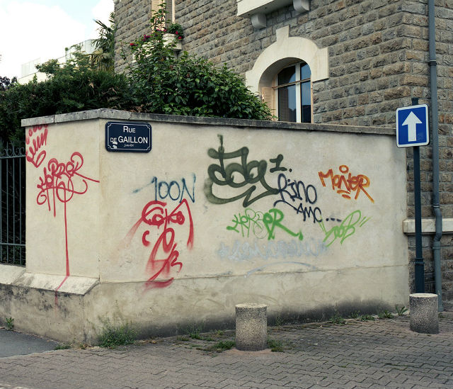
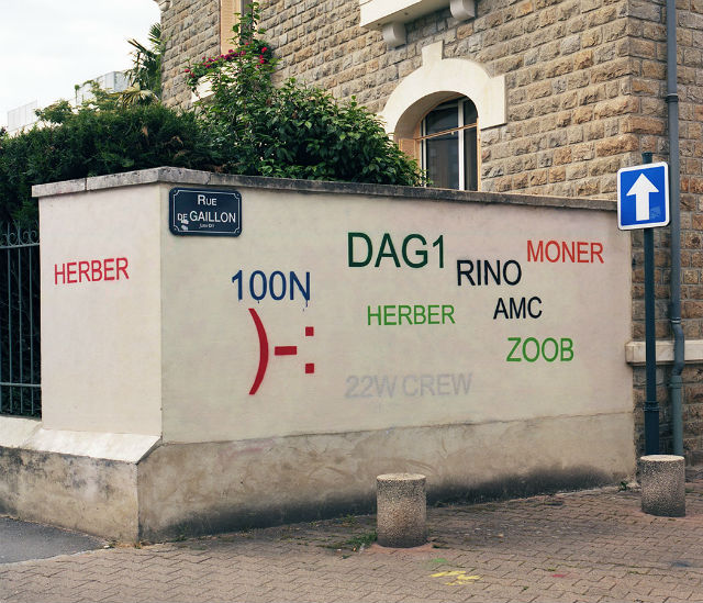
So, in the light of all this, what is to be made of French artist Mathieu Tremblin’s street installations, which he called ‘Tag Clouds’? This series of artworks was executed in 2010, but in 2016 Tremblin’s photographs went viral, often reposted under one reblogger’s heading ‘Guy Paints Over Shit Graffiti and Makes It Legible’. For me they touched a chord and I happily shared the images on my Facebook page, commenting that the work reminds me of the process of writing. The original wall is like my first draft of an article, the ‘legible’ wall is my final version. It still doesn’t make sense but at least it looks neat and is kind of approachable


Some Facebook friends found them playful and funny, but I was surprised when some friends of friends appeared incensed. “Why digitise expressive arty jottings?” wrote one. Without anything but the photographs to go on, another declared, “The point of the art is to cover up the unwanted, messy, illegal graffiti and take away their meaning to discourage it”.

 I was inclined to dismiss these kinds of comment as the try-hard opinions of would-be ‘tolerant’ middle-class, middle-aged inner city dwellers. But then I decided to find out more about Tremblin’s work and I discovered an interview with him on The Creators Project site. It turns out that Tremblin’s work referenced tag clouds (remember them?), those visual representations of text data, typically used to depict keyword metadata (tags) on websites.

 As Tremblin says, tag clouds were still the main way to draw personal paths through contents, websites and blogs in 2010. In the early 2000s street writers used to share their work on homemade websites and CMS blogs that used tag clouds.

 But these days the big search engines and social media sites use algorithms to dictate the kind of content we see. Tag clouds are to a large extent a thing of the past, and the original meaning of Tremblin’s work became lost. Then in mid-2016 his images went viral when the website Design You Trust, reproduced them with their own interpretation, ‘Guy Paints Over Shit Graffiti and Makes It Legible’.

 Tremblin sadly reflects, “They made me look like the emissary of a solution against graffiti, whereas my intent was actually totally the opposite—I’m pro-name writing as I’m a former writer … They transformed my simple gesture of ‘turning a hall of fame of tags into tag clouds’ into an anti-graffiti hygienist lampoon”.

 Comments on the Design You Trust post ranged, as you might expect, from abusive to cynical, and were more about graffitists (artists vs vandals) than about Tremblin’s work itself.  Those that did comment on his interventions generally found them condescending and disrespectful, with the ‘corrected typeface’ turning organic graffiti into something that is ugly and tacky.  Much like the small sample of commentators on my Facebook page, they somehow missed the point.

 But even though I now know Tremblin’s original intentions, I still think his Tag Clouds are funny and clever. Maybe my interpretation was not so far distant from Tremblin’s intent because he proposes that “Tag Clouds is just a default aesthetic generated by computers where graffiti is expressing individual alterity; man vs computer; order vs chaos… Chaos is life!”

 Postscript. It has taken me a while to draft this blog post and during that time the wall pictured at the top of the page has once again been thinly overpainted with a shade of creamish-fawn. One up for the wall owner.


Apart from the images of the Tag Clouds installation, taken by the artist Mathieu Tremblin (2010), all images are by meganix and were taken in Enmore and Newtown in 2008 (Banksy stencil) and 2016.

1 2 3 4 5