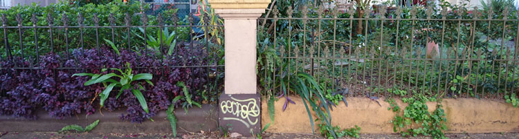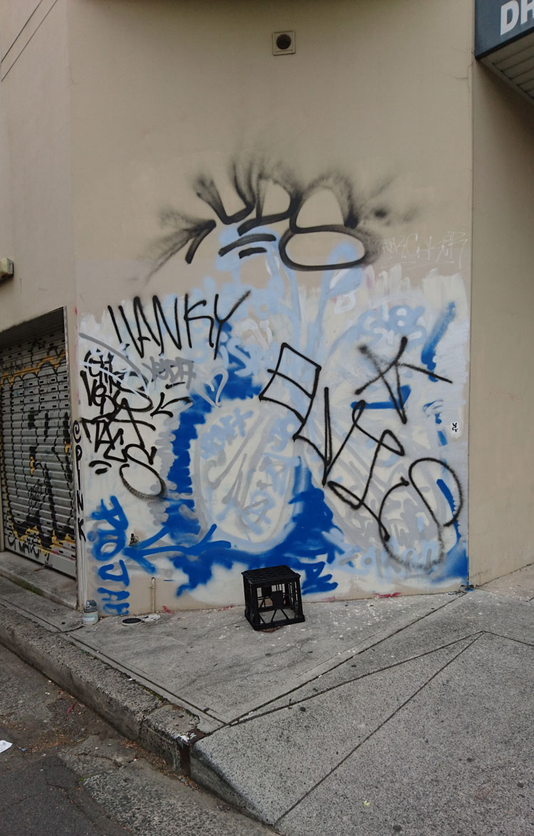
On this often-overpainted wall in Enmore the graffitists currently have the upper hand. I am inclined to think their tastefully colour co-ordinated composition is more interesting than the layers of creamish-fawn paint that preceded it.
 The subject of overpainting is fraught. Everyone has something to say on the matter – wall owners, local councils, concerned citizens, hip and tolerant inner city dwellers, and of course wall artists and graffitists themselves. And as far as people making their opinions known, in this case actions often speak louder than words.
 In his blog post on the aesthetics of anti-graffiti interventions, Kurt Iveson categorises the patches of overpainting in not-quite-matching colours as ‘the new urban swatchwork’. This swatchwork does not produce any aesthetic integrity of its own, he says, and is just a visible indicator of the desperation of authorities to assert their authority. They’re not actually too fussed what the wall looks like, so long as it doesn’t have graffiti.
In the decades-long war against graffiti, overpainting can evolve into an entertaining competition between graffitist and the paintbrush-wielding authority. A series of photos of a wall in Mt Druitt is still funny, although it has been around for some while. Eventually one or other of the competitors gives up, which is, of course, the aim of this type of anti-graffiti measure – to wear the graffitists down.
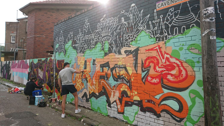
 And of course it is not only wall owners and local authorities who paint over graffiti. Taggers and spray-can artists also paint over each other’s work. Sometimes this is a display of disrespect and an assertion of territory. Sometimes it is simply a natural progression in the world of informal street art, where the art is necessarily ephemeral.
But disfigurement of street art, and in particular legal street art, can also be a political act perpetrated by graffiti activists who regard street artists as the complicit foot soldiers of gentrification. Such street artworks, as people like academic Stephen Pritchard maintain, have a role in what is called ‘creative placemaking’, and as such are ‘the harbingers of redundancy, displacement, social cleansing, colonialism and racism’.
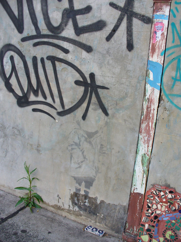
 In 2009 the daubing of a Banksy mural with red paint caused something of a public uproar in Bristol, UK, but a group called Appropriate Media claimed responsibility, declaring on its website that ‘graffiti artists are the performing spray-can monkeys for gentrification’. Perhaps it was similar – although unarticulated – sentiments that saw a genuine Banksy stencil in Enmore defaced with tags around 2008. Or maybe it was just ignorance.
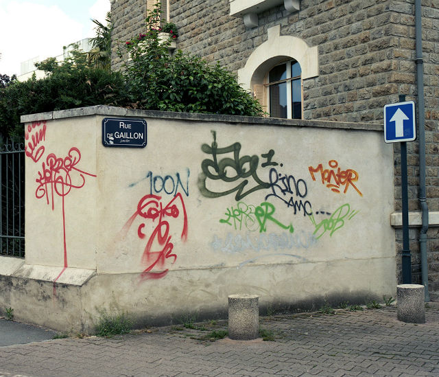
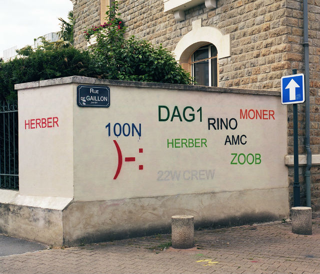
So, in the light of all this, what is to be made of French artist Mathieu Tremblin’s street installations, which he called ‘Tag Clouds’? This series of artworks was executed in 2010, but in 2016 Tremblin’s photographs went viral, often reposted under one reblogger’s heading ‘Guy Paints Over Shit Graffiti and Makes It Legible’. For me they touched a chord and I happily shared the images on my Facebook page, commenting that the work reminds me of the process of writing. The original wall is like my first draft of an article, the ‘legible’ wall is my final version. It still doesn’t make sense but at least it looks neat and is kind of approachable
Some Facebook friends found them playful and funny, but I was surprised when some friends of friends appeared incensed. “Why digitise expressive arty jottings?” wrote one. Without anything but the photographs to go on, another declared, “The point of the art is to cover up the unwanted, messy, illegal graffiti and take away their meaning to discourage it”.
 I was inclined to dismiss these kinds of comment as the try-hard opinions of would-be ‘tolerant’ middle-class, middle-aged inner city dwellers. But then I decided to find out more about Tremblin’s work and I discovered an interview with him on The Creators Project site. It turns out that Tremblin’s work referenced tag clouds (remember them?), those visual representations of text data, typically used to depict keyword metadata (tags) on websites.
 As Tremblin says, tag clouds were still the main way to draw personal paths through contents, websites and blogs in 2010. In the early 2000s street writers used to share their work on homemade websites and CMS blogs that used tag clouds.
 But these days the big search engines and social media sites use algorithms to dictate the kind of content we see. Tag clouds are to a large extent a thing of the past, and the original meaning of Tremblin’s work became lost. Then in mid-2016 his images went viral when the website Design You Trust, reproduced them with their own interpretation, ‘Guy Paints Over Shit Graffiti and Makes It Legible’.
 Tremblin sadly reflects, “They made me look like the emissary of a solution against graffiti, whereas my intent was actually totally the opposite—I’m pro-name writing as I’m a former writer … They transformed my simple gesture of ‘turning a hall of fame of tags into tag clouds’ into an anti-graffiti hygienist lampoon”.
 Comments on the Design You Trust post ranged, as you might expect, from abusive to cynical, and were more about graffitists (artists vs vandals) than about Tremblin’s work itself. Those that did comment on his interventions generally found them condescending and disrespectful, with the ‘corrected typeface’ turning organic graffiti into something that is ugly and tacky.  Much like the small sample of commentators on my Facebook page, they somehow missed the point.
 But even though I now know Tremblin’s original intentions, I still think his Tag Clouds are funny and clever. Maybe my interpretation was not so far distant from Tremblin’s intent because he proposes that “Tag Clouds is just a default aesthetic generated by computers where graffiti is expressing individual alterity; man vs computer; order vs chaos… Chaos is life!”
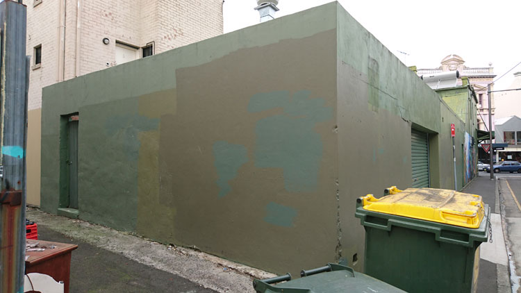
 Postscript. It has taken me a while to draft this blog post and during that time the wall pictured at the top of the page has once again been thinly overpainted with a shade of creamish-fawn. One up for the wall owner.
Apart from the images of the Tag Clouds installation, taken by the artist Mathieu Tremblin (2010), all images are by meganix and were taken in Enmore and Newtown in 2008 (Banksy stencil) and 2016.