Body outlines (Watch this space)

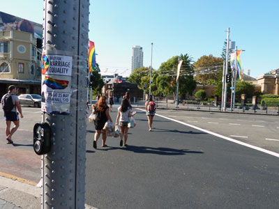
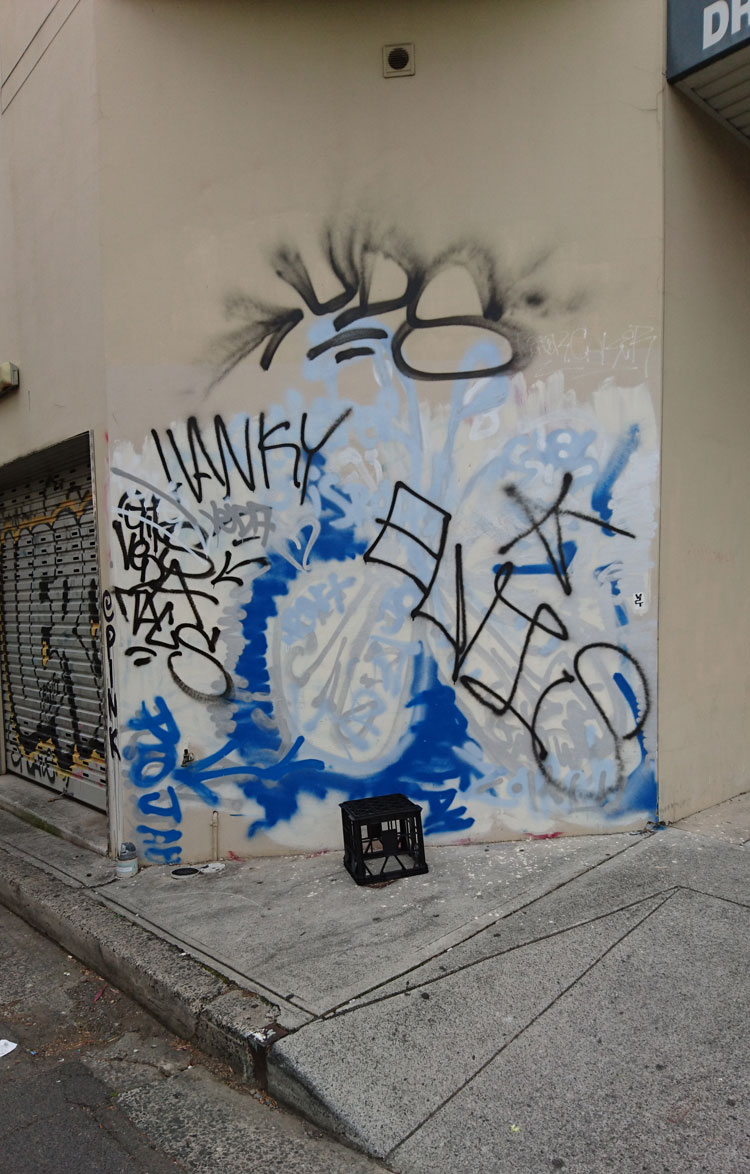
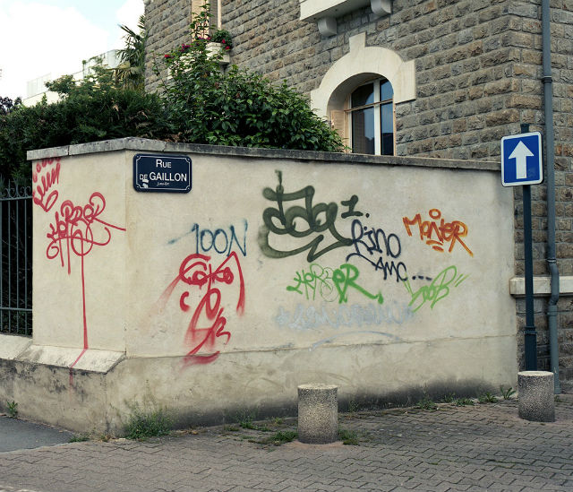
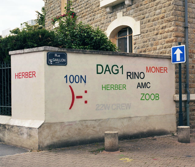
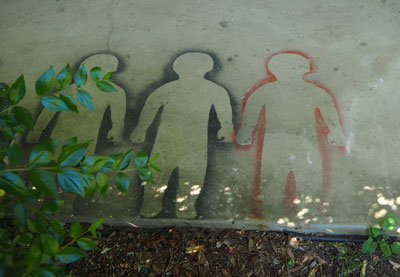
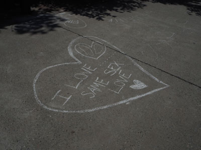
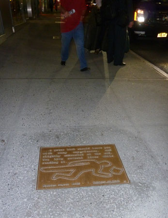
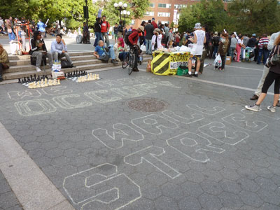
The chalked outline of a corpse is a crime fiction cliché. It is seldom used in real police investigations and yet the image has been assimilated into our everyday visual vocabulary. Advertisers, illustrators and safety authorities have appropriated the familiar shape to encapsulate their warnings about crime and violence. In Sydney’s inner west, young professionals are gradually replacing the students, activists and artists living in what used to be cheap accommodation there. But as I photograph the increasingly upmarket streets of Newtown, I find that graffitists still use its pavements to broadcast their protest messages and sometimes they make their point by filling in the blank forms of body outlines.

(This article was originally published in 2009 the first issue of Second Nature: International journal of creative media, produced by the School of Creative Media at RMIT. It was meant to be the first in a series of essays examining the pavement as a medium of expression. Unfortunately Second Nature did not continue and even that first issue is no longer available on-line.

As a blog post it fails miserably according to WordPress – it has too many long words, long sentences and long paragraphs, too much passive voice, and not enough subheadings. Surprisingly WordPress does not mention that the content is a little dated even though it is. Fortunately I am not trying to sell anything and I hope my literate readers enjoy the post despite these failings.)

IT LOOKED AS IF THERE HAD BEEN A MASSACRE – the position of several corpses had been marked with outlines on the footpath near the railway station. It wasn’t the first time this sort of thing had happened in the area. I had seen crime-scene outlines on Newtown pavements about fifteen years before. I have seen them intermittently since then and these days I photograph them to preserve some permanent record of their existence. Chalked bodies fade quickly under the assault of passing feet; spray-painted versions last longer, but eventually these disappear as well. Newtown being the sort of place it is, they are inevitably replaced by fresh ones sooner or later.

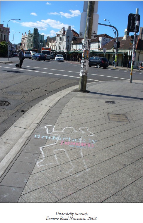
As it turned out, this latest batch of outlines was evidence of a series of homicides that had happened, not here in Sydney’s inner west, but nearly 1000 km away. Recreated homicides, actually. The drawings were part of an outdoor marketing campaign for the 2008 television series Underbelly – a fictionalized memorial to Melbourne’s 10 year ‘gangland war’.

On the other hand, those first body outlines I had seen in Newtown many years previously were commemorating a different kind of wartime event – the bombing of Hiroshima on 6 August 1945. Every year peace activists around the world observe Hiroshima Day by holding rallies, and sometimes they draw bodies on their local pavements. These are supposed to simulate the marks left when people were vapourised by the bomb’s heat blast. Judging from the few photographs taken in Hiroshima that day, the real body shadows were blurred and formless, and yet it is the clichéd homicide silhouette that activists have chosen to use in their peace demonstrations. The outlines make the street look like a crime scene, and for anti-war protesters that is the point.

Newtown has a high rate of metaphorical crime. Body outlines are pressed into service for all sorts of causes.

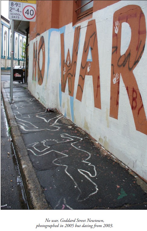
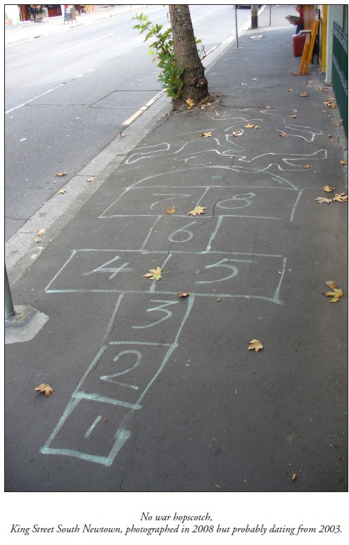
In peace protests their manifestation is not limited to 6 August. There was, for example, a spray-paint installation that appeared in Goddard Street early in 2003, when Australia joined the war in Iraq. ‘NO WAR’, written in huge letters on the side wall of a café, was accompanied by a slew of life-size figures on the footpath. Their stark remains decorated the asphalt in that tiny side street for several years.

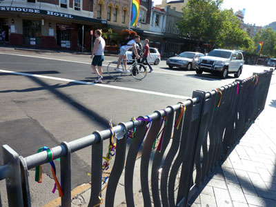
Around the corner, in the main street of Newtown, synthetic bluestone pavers are gradually replacing the asphalt footpaths, just as young professionals in renovated properties are gradually replacing the inner-city students, activists and artists living in what used to be cheap accommodation in the area. But despite the upward mobilization of Newtown, pockets of resistance still exist, from old leftie Bob Gould in his chaotic book arcade at one end of King Street, to young anarchists in crusty flats above the shops at the other. And although the gritty monochrome of old asphalt was more suitable for inscriptions in chalk and paint, protesters still manage to use the footpaths of King Street as a billboard for their messages, defying the unfriendliness of the new pavers’ neatly repetitive grooves and shiny mottled surfaces.

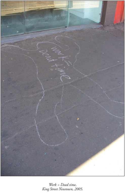
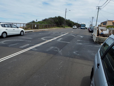
Take, for instance, the trail of crime-scene outlines that I photographed in September 2005. These marked the progress of a mobile street performance by students belonging to an anti-capitalist collective called 30A. Suited ‘capitalists’ had rolled a giant gold coin along the footpath in King Street, mowing down ‘workers’ as they went. Shapes were traced around the ‘victims’ and the space inside the outlines was filled with slogans like ‘Howard kills jobs’, and ‘Work is death’. It was all pre-publicity for a mass protest to be held later that week, not in Newtown, but outside the Forbes Global CEO Conference at Sydney Opera House.

Newtown often acts as outrider for demonstrations happening elsewhere.

This explains another outbreak of body outlines in King Street in February 2004 – it coincided with a riot in Redfern a few kilometres away. Anti-police violence had erupted after Aboriginal teenager TJ Hickey came off his bicycle and was fatally impaled on a metal fence. Redfern locals claimed a police car had been stalking the boy. While the aftershocks of the riot were still happening, crudely chalked bodies appeared on Newtown pavements, accompanied by slogans such as ‘Stop racist police brutality’, ‘Cops kill children’, and ‘To kill an Aboriginal is to kill history’.

The grim form of a hastily circumscribed corpse is a crime fiction cliché. It is a recognizable image that has been appropriated, not only by social agitators, but by graphic artists everywhere who want to allude to crime or violent death in a metaphorical way. The pudgy, larger-than-life human form has become a regular symbol in our visual vocabulary, so familiar that it is available for parody. Newspaper artists exploit the image to illustrate feature articles. Cyber-crime? A chalked body holding a computer mouse. Car theft? The silhouette on the asphalt of a disappeared car. Advertisers have flogged it to death. Telstra MessageBank? A taped outline of a phone left off the hook by ‘flatmates murdering messages’. iiNet broadband? A forensic investigator drawing round a computer thrown to the ground by its frustrated owner.

The murder-scene outline has caught on as a pop-culture motif despite rarely being used in true police investigations. Old Sydney detectives are adamant that they never drew them, if only because the chalk dust would have contaminated evidence. Archival police photos seldom show them. The body outline is largely a construct of fiction thrillers and television dramas, but it has taken on a life of its own.

Its featureless form captures the essence of the human body – the shell that remains after the soul has departed. It evokes the murderous act but lacks the ugly complications of a real corpse. It is an empty space that allows room for the imagination. A thought bubble where the violent event can be visualised. Or a speech balloon that radical students can fill with slogans.

Although homicide detectives do not draw body outlines, police at motor vehicle accidents do, or at least they used to until fairly recently. Hardy crash investigators joke about the ‘gingerbread men’ spreadeagled at the scene of ‘fatals’, but admit that they were distracting to motorists and distressing for passers-by. These days they spray-paint the scene with esoteric patterns of lines and arrows instead.

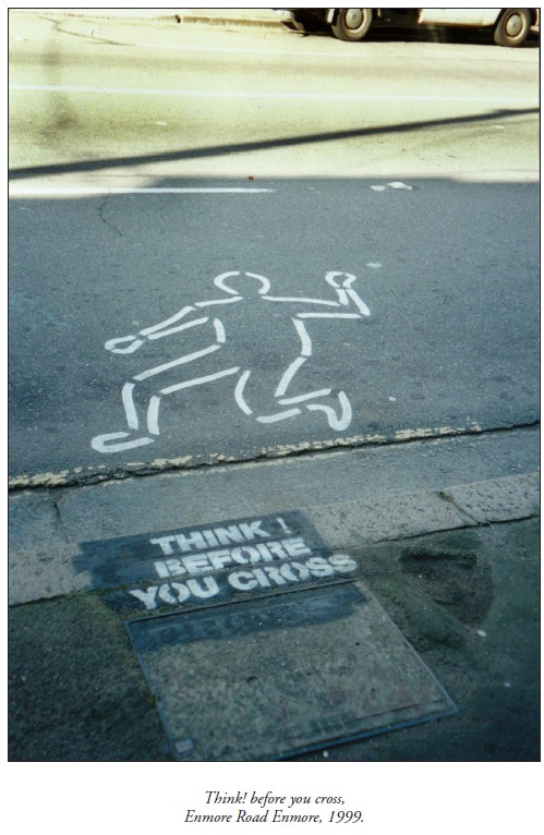
But it was their very potential to distress passers-by that prompted traffic authorities to resurrect body outlines for a series of pedestrian safety campaigns around Sydney in the late 1990s.  The aim was to scare reckless road-crossers by stencilling a plague of flattened figures at danger spots on roadways. ‘Step safely’ warned the adjacent pavement signs, ‘Think before you cross’.

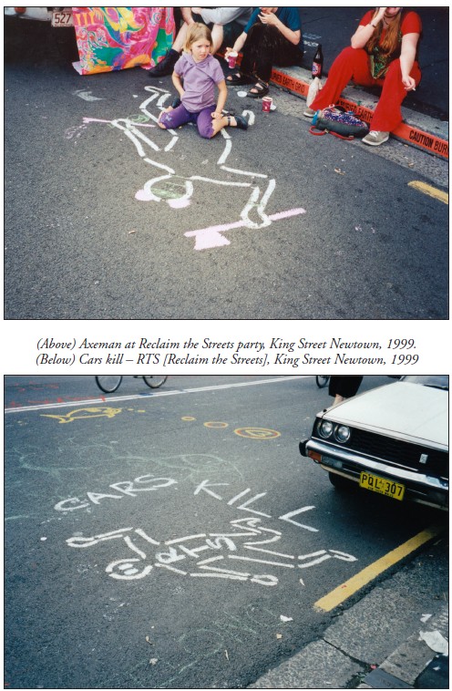
Newtown being the kind of place it is, it was not long before local culture jammers tampered with these spray-painted silhouettes. They were especially active during the annual Reclaim the Streets demonstration in 1999, when King Street was blocked to traffic and rebellious pedestrians commandeered the roadway. Challenging the safety campaign’s insinuation that pedestrians are responsible for road fatalities, RTS activists reanimated the stencilled corpses with painted hair and eyes, with Mickey Mouse ears and tomahawks. And they filled the empty outlines with slogans like ‘Cars kill’.

Sources

Adams, Cecil, ‘Do crime scene investigators really draw a chalk line around the body?’, The Straight Dope, 13 April 2001.

Campbell, Nerida, Curator, Justice and Police Museum, Sydney, pers.comm. 2005.

Gibson, Ross, University of Technology, Sydney, curator of ‘Crime Scene’ installation, Justice and Police Museum, Sydney, 1999-2000, pers.comm. 2005.

iiNet, ‘Don’t take it out on: your computer’, advertising brochure, c.2008.

Jenkins, Peter, Senior Sergeant, NSW Police Crash Investigation Unit, pers.comm. 2005.

Jones, Quentin, photographs for ‘Steal traps’ article by Bob Jennings, Drive, pp.1, 6-7, Sydney Morning Herald, 8 June 2001.

Members of 30a (Annonymous collective of streat theatre bandots [sic]), pers.comm. September 2005.

‘Photographs of Hiroshima and Nagasaki’, Gensuikin.

South Sydney Council, ‘J walking: deadly walking’, Babylon Creative postcard, c.1999.

‘Sydney prepares for Forbes Conference and 30A protest’, Wikinews, 30 August 2005.

Telstra, ‘Stop flatmates murdering messages’, AvantCard postcard, 1999.

Tremain, Cathryn, picture for ‘Catch me if you can’ article by James Hall, Next, p.1, Sydney Morning Herald, 11 March 2003.

‘Underbelly [Uncut]’, DVD, Nine Network, Australia, 2008. Walker, Emily, ‘Shadows of death. Atomic bomb hit Hiroshima 60 years ago’, Kalamazoo Gazette, 7 August 2005.

Original publication

Hicks, Megan, ‘Outlines (Watch this space)’, Second Nature, 1, March 2009.

Overpainting: order vs chaos

On this often-overpainted wall in Enmore the graffitists currently have the upper hand. I am inclined to think their tastefully colour co-ordinated composition is more interesting than the layers of creamish-fawn paint that preceded it.

 The subject of overpainting is fraught. Everyone has something to say on the matter – wall owners, local councils, concerned citizens, hip and tolerant inner city dwellers, and of course wall artists and graffitists themselves. And as far as people making their opinions known, in this case actions often speak louder than words.

 In his blog post on the aesthetics of anti-graffiti interventions, Kurt Iveson categorises the patches of overpainting in not-quite-matching colours as ‘the new urban swatchwork’. This swatchwork does not produce any aesthetic integrity of its own, he says, and is just a visible indicator of the desperation of authorities to assert their authority. They’re not actually too fussed what the wall looks like, so long as it doesn’t have graffiti.


In the decades-long war against graffiti, overpainting can evolve into an entertaining competition between graffitist and the paintbrush-wielding authority. A series of photos of a wall in Mt Druitt is still funny, although it has been around for some while. Eventually one or other of the competitors gives up, which is, of course, the aim of this type of anti-graffiti measure – to wear the graffitists down.

 And of course it is not only wall owners and local authorities who paint over graffiti. Taggers and spray-can artists also paint over each other’s work. Sometimes this is a display of disrespect and an assertion of territory. Sometimes it is simply a natural progression in the world of informal street art, where the art is necessarily ephemeral.


But disfigurement of street art, and in particular legal street art, can also be a political act perpetrated by graffiti activists who regard street artists as the complicit foot soldiers of gentrification. Such street artworks, as people like academic Stephen Pritchard maintain, have a role in what is called ‘creative placemaking’, and as such are ‘the harbingers of redundancy, displacement, social cleansing, colonialism and racism’.

 In 2009 the daubing of a Banksy mural with red paint caused something of a public uproar in Bristol, UK, but a group called Appropriate Media claimed responsibility, declaring on its website that ‘graffiti artists are the performing spray-can monkeys for gentrification’. Perhaps it was similar – although unarticulated – sentiments that saw a genuine Banksy stencil in Enmore defaced with tags around 2008. Or maybe it was just ignorance.


So, in the light of all this, what is to be made of French artist Mathieu Tremblin’s street installations, which he called ‘Tag Clouds’? This series of artworks was executed in 2010, but in 2016 Tremblin’s photographs went viral, often reposted under one reblogger’s heading ‘Guy Paints Over Shit Graffiti and Makes It Legible’. For me they touched a chord and I happily shared the images on my Facebook page, commenting that the work reminds me of the process of writing. The original wall is like my first draft of an article, the ‘legible’ wall is my final version. It still doesn’t make sense but at least it looks neat and is kind of approachable


Some Facebook friends found them playful and funny, but I was surprised when some friends of friends appeared incensed. “Why digitise expressive arty jottings?” wrote one. Without anything but the photographs to go on, another declared, “The point of the art is to cover up the unwanted, messy, illegal graffiti and take away their meaning to discourage it”.

 I was inclined to dismiss these kinds of comment as the try-hard opinions of would-be ‘tolerant’ middle-class, middle-aged inner city dwellers. But then I decided to find out more about Tremblin’s work and I discovered an interview with him on The Creators Project site. It turns out that Tremblin’s work referenced tag clouds (remember them?), those visual representations of text data, typically used to depict keyword metadata (tags) on websites.

 As Tremblin says, tag clouds were still the main way to draw personal paths through contents, websites and blogs in 2010. In the early 2000s street writers used to share their work on homemade websites and CMS blogs that used tag clouds.

 But these days the big search engines and social media sites use algorithms to dictate the kind of content we see. Tag clouds are to a large extent a thing of the past, and the original meaning of Tremblin’s work became lost. Then in mid-2016 his images went viral when the website Design You Trust, reproduced them with their own interpretation, ‘Guy Paints Over Shit Graffiti and Makes It Legible’.

 Tremblin sadly reflects, “They made me look like the emissary of a solution against graffiti, whereas my intent was actually totally the opposite—I’m pro-name writing as I’m a former writer … They transformed my simple gesture of ‘turning a hall of fame of tags into tag clouds’ into an anti-graffiti hygienist lampoon”.

 Comments on the Design You Trust post ranged, as you might expect, from abusive to cynical, and were more about graffitists (artists vs vandals) than about Tremblin’s work itself.  Those that did comment on his interventions generally found them condescending and disrespectful, with the ‘corrected typeface’ turning organic graffiti into something that is ugly and tacky.  Much like the small sample of commentators on my Facebook page, they somehow missed the point.

 But even though I now know Tremblin’s original intentions, I still think his Tag Clouds are funny and clever. Maybe my interpretation was not so far distant from Tremblin’s intent because he proposes that “Tag Clouds is just a default aesthetic generated by computers where graffiti is expressing individual alterity; man vs computer; order vs chaos… Chaos is life!”

 Postscript. It has taken me a while to draft this blog post and during that time the wall pictured at the top of the page has once again been thinly overpainted with a shade of creamish-fawn. One up for the wall owner.


Apart from the images of the Tag Clouds installation, taken by the artist Mathieu Tremblin (2010), all images are by meganix and were taken in Enmore and Newtown in 2008 (Banksy stencil) and 2016.

Rainbow politics

 BourkeRainbow_P1020080X_blo

“The removal of the Taylor Square rainbow crossing created an even bigger stir than its original installation. To mark its passing, people attached unofficial rainbow flags to poles in Taylor Square and tied rainbow ribbons to safety fences. But performer and activist James Brechney had a fresh idea for an alternate location that somehow captured the zeitgeist.”

My exquisitely objective article on the history of the DIY Rainbow Crossing is now available to read in the Dictionary of Sydney.

Some time ago I wrote a blog post on the symbolism of pedestrian crossings. It’s here.

PermanentRainbow_IMAG2868

(Photos by meganix, taken in Darlinghurst in 2013 and Summer Hill 2015)

Parramatta Girls Home

15eP9012116_PmattaBodiesP

Writing graffiti can be a way of claiming or re-claiming territory. That is what has happened at the former Parramatta Girls Home, as I found when I visited the site this week. I did not go with the intention of photographing pavement graffiti, but I unexpectedly came across the letters ILWA and the silhouettes of children sprayed on footpaths and concrete verandahs there.

The former girls’ home is part of the Parramatta Female Factory Precinct whose history of incarceration and ‘care’ of women and children extends from 1821 to 2008. Numbers of inmates at the Parramatta Girls Home peaked in the 1950s, 60s and 70s, as courts committed hundreds of girls every year to spend months or years in the facility.

Sent to this institution at the age of 15 for being ‘in moral danger’, Bonney Djuric is now an artist, activist and historian. In 2006 she founded the support group Parragirls and was inundated by responses from women still living with memories of the physical, sexual and psychological abuse they suffered there. Now the Director of the Parramatta Female Factory Memory Project, Bonney has been instrumental in the campaign to preserve and dedicate the Parramatta Girls Home and the adjacent Female Factory as a Living Memorial to the Forgotten Australians and others who have been marginalised by society.

15eP9012109_BonneyBodiesV

One of the buildings, renamed Kamballa in the 1970s, is now the centre of the Parramatta Female Factory Precinct Memory Project, and it was Bonney who sprayed the ghostly silhouettes on the concrete in 2013 as a way of reasserting the presence of those forgotten children who passed through the institutions on this site.

15eP9012097_ILWA_V

More puzzling is the symbol ILWA, also sprayed by Bonney at the same time. It mimics graffiti scratched into the woodwork at the Parramatta Girls Home, she tells me, and stands for ‘I Love Worship and Adore’. Bonney showed me examples of the original graffiti, some of it dating to the 1940s, on doors that have been preserved. Not only a message of affection, it also represented solidarity and resilience amongst the girls. It was a way of asserting ‘I am here’.

15eP9012111_DoorGraffiti

In a blog post several years ago I wrote that all inscription is about the politics of turf. Back in the days of the Parramatta Girls Home, the girls who scraped their messages into the woodwork would have understood that theirs were assertive acts of defiance, but they could not possibly have imagined that years later their marks would be regarded as significant documents that offer an interpretation of the site that is as important as official archival material. Nor would they have imagined that their marks would be deliberately copied as a way of reclaiming territory on their behalf.

15eP8291998_CatholicOrphans

Asphalt rules

Man in the moon, Broadway Shopping Centre car park (Sydney), April 2015 (photo: meganix)

Man in the moon, Broadway Shopping Centre car park (Sydney), April 2015 (photo: meganix)

Today is the anniversary of the launch of this blog. It was on 3 May 2009 that I wrote the first post and welcomed readers to Pavement Graffiti, “where asphalt rules and grey is good. The focus is on roadways and footpaths, and ‘graffiti’ means anything written, drawn, scrawled or stencilled on them”.

Centennial Park labyrinth (Sydney), November 2014 (photo: meganix)

Centennial Park labyrinth (Sydney), November 2014 (photo: meganix)

Back then I had embarked on a PhD at Macquarie University, also titled Pavement Graffiti. Six years on, the PhD has been achieved, there is a gallery of images on-line at Pavement Appreciation and a Facebook page of the same name, academic articles have been published, magazine articles too. From time to time journalists stumble upon the blog and ask my opinion about graffiti, Eternity or, as happened this week, walkable cities. The blog does not have a huge following but I am grateful to those who have given long-standing support or have simply shown a fleeting interest.

'Happy BDay Lolz Grace', Watsons Bay (Sydney), December 2014 (photo: meganix)

‘Happy BDay Lolz Grace’, Watsons Bay (Sydney), December 2014 (photo: meganix)

My interests have broadened to encompass a concern for the disappearance of strange spaces, areas of decay, and layered sites under the pressure of urban renewal (or urban homogenization). I am now an Adjunct Fellow of the Urban Research Centre at the University of Western Sydney.

'Go vegan', Queen Victoria Building (Sydney), October 2014 (photo: meganix)

‘Go vegan’, Queen Victoria Building (Sydney), October 2014 (photo: meganix)

But I still retain my fascination for the pavement and am currently waiting to hear if my article on ‘Imagining the pavement: a search through everyday texts for the symbolism of an everyday artefact’ has been accepted for publication. Watch this space.

'I love same sex love', Sydney Park, St Peters, February 2015 (photo: meganix)

‘I love same sex love’, Sydney Park, St Peters, February 2015 (photo: meganix)

And do, please, continue to enjoy the literary adventure of reading the street beneath your feet.

14l-ocPC170663_MartinPlace

Tributes outside site of Martin Place siege (Sydney), December 2014 (photo: meganix)


Asphalt and umbrellas

This week I have been thinking about the role the pavement can play in our thoughts and feelings about particular places and times in our lives. Long after the Hong Kong pro-democracy protest is over, and whatever the outcome, the gritty surface of the city’s public spaces will figure largely in the memories of the people who took part. The asphalt has been a major player in the drama of the so-called Umbrella Revolution.

pgTwoUmbrellas_140929_FOR_H

Slate.com

pgPoliceDemonstrator_141003

NBC News

pgGroup_hong-kong-umbrella_

The Telegraph (UK)

pgSolitary_hong-kong-umbrel

The Telegraph (UK)

pgChalk_hong-kong-umbrella_

The Telegraph (UK)

pgThreeSleepHK_456326578

Global Grind

pgGraffitiScrubHK_456449864

Protestors themselves remove slogans and graffiti from the street. Getty Images


Body outlines

The 1950-60s television courtroom drama, Perry Mason, is said to have been the first detective show to feature either a tape or a chalk outline to mark the spot where a murder victim’s body had been found. The body outline made its first appearance in the episode ‘The case of the perjured parrot’. The writer of the show, Erle Stanley Gardner, had actually used this idea much earlier in the book, ‘Double or quits, which he wrote in 1941 under the pen name A.A.Fair (see Perry Mason TV series).

Ever since then the body outline has not only been used regularly in murder stories and television shows, but it is very often adaptively reused in illustrations alluding to all sorts of crime and fatality. It is a symbol — based on a fiction —  that is continually modified, re-invented and re-purposed. We recognise it in newspaper cartoons, TV commercials and political protests and we understand what is meant.

In New York I came across two instances of the symbolic body outline, both associated with the New York Public Library. The first was in an exhibition, Why we fight: remembering AIDS activism, which recently opened at  the New York Public Library on Fifth Avenue. One of the exhibits was this poster from the library’s archives. It was produced in 1988 by ACT UP (the AIDS Coalition to Unleash Power), a deliberately confrontational organisation that was formed to challenge government inaction over AIDS.

Poster_OneAidsDeath

The other body outline was on one of the plaques along the section of 41st Street known as Library Way. These sidewalk plaques carry inspirational quotes about reading, writing, and literature. The one I photographed reads:

… a great book should leave you with many experiences, and slightly exhausted at the end. You live several lives while reading it. William Styron (1935 –  ), Writers at Work.

To me, the embossed illustration on the plaque seems very odd. The reader of the book looks, not exhausted, but dead (presumably in a hiatus between two of those ‘several lives’).

13r-ncP1030817_LibraryWay


Tax Wall Street

On 42nd Street, near the New York Public Library, I spotted fresh chalk notices. Of course I had to photograph them even though I didn’t get a chance to read them properly because it was the evening rush hour and the sidewalks were crowded with people on their way home from work.

13o-ncP1030311_TaxWall

Then I noticed there were more police about than usual and suddenly I realised there was a protest march coming down the avenue, timed to disrupt the maximum number of people. Marchers were confined to the sidewalk and were accompanied by a phalanx of police motor cycles in the kerbside traffic lane. It was quite a sight.

The issue was the ‘Robin Hood Tax’ or, more properly, a Financial Speculation (or Transaction) Tax. Supporters of such a tax maintain it is a way to raise funds to meet human needs, like protecting public services, tackling poverty and dealing with climate change. The date was 17 September, the two-year anniversary of Occupy Wall Street.

13o-ncP1030318_TaxMarch

It was good to see a strong showing from Occupy Wall Street. The previous weekend a small group claiming to be Occupy Wall Street was occupying space amongst all the weekend goings-on in Union Square. Their presence was not very impressive.

13o-ncP1030163_occupyUSq

The symbolism of pedestrian crossings

In built-up areas the pedestrian crossing is a familiar feature of the horizontal signscape. William Phelps Eno, sometimes known as the ‘father of traffic safety’ is credited with introducing the cross-walk to New York streets in the early 1900s. Once motorized vehicles became popular, something had to be done to protect pedestrians from reckless drivers.

Sydney was one of many cities that soon followed suit. As early as 1912 lines were painted on the road at busy Circular Quay to provide a safe crossing area.  Within a few years designated pedestrian crossings in the rest of the city were being marked out with metal studs or pairs of white lines. Designs for crossings have continued to change over the years.

A stopping line at the intersection of Market and Pitts Streets in Sydney, marked out with metal studs, 1929 (City of Sydney Archives photograph, SRC7806, file 034\034213).

A stopping line at the intersection of Market and Pitts Streets in Sydney, marked out with metal studs, 1929 (City of Sydney Archives photograph, SRC7806, file 034\034213).

For some people, pedestrian crossings represent order, civilization and safety. For others they represent repression and regimentation of people’s behaviour.

Fake pedestrian crossing, ‘Design saves lives’, an entrant in the Eye Saw exhibition in Omnibus Lane, Ultimo during Sydney Design Week, 2006 (photo by meganix).

Fanciful pedestrian crossing, ‘Design saves lives’, an entrant in the Eye Saw exhibition in Omnibus Lane, Ultimo during Sydney Design Week, 2006 (photo by meganix).

Some pedestrian crossings have achieved iconic status. The most famous is the crossing featured on the cover of the Beatle’s 1969 LP Abbey Road. Photographed by thousands of fans and tourists emulating the Fab Four crossing the road near their recording studio in single file, this ‘modest structure’ (to quote an official of English Heritage) has been given heritage listing for its ‘cultural and historical importance’.

The original photograph has been recently used in a pedestrian safety campaign in the Indian City of Calcutta.

Road safety poster using Ian Macmillan’s famous 1969 photograph, issued by the Kolkata [Calcutta] Traffic Police in February 2013.

Road safety poster using Ian Macmillan’s famous 1969 photograph, issued by the Kolkata [Calcutta] Traffic Police in February 2013.

And then there’s the Rainbow Crossing at Taylor Square in Sydney’s gay precinct of Darlinghurst. When it was removed by the State Government some people were glad, with one newspaper letter-writer declaring that ‘compulsory pieces of public infrastructure should not force upon pedestrians political views which contravene their religious or moral conscience’.

The disappeared Rainbow Crossing at Taylor Square and a notice about a rally for marriage equality, April 2013 (photo by meganix).

The disappeared Rainbow Crossing at Taylor Square and a notice about a rally for marriage equality, April 2013 (photo by meganix).

However such views were drowned out by the groundswell of outrage that manifested itself in the DIY Rainbow Crossing protest. It is significant that this is all going on at the same time as the parliament of Australia’s neighbour  New Zealand had done what no Australian government will do and legalised same-sex marriage.

A painted DIY Rainbow Crossing in Jones Street, Ultimo (Sydney), April 2013 (photo by meganix).

A painted DIY Rainbow Crossing in Jones Street, Ultimo (Sydney), April 2013 (photo by meganix).

Mind you, as Lawrence Gibbons in City News points out, having created a public relations coup with the DIY Rainbow Crossings, Lord Mayor Clover Moore is left with a dilemma. Under policies implemented during her nine-year tenure, any street art, graffiti or posters in the City of Sydney must be removed from any highly visible site within twenty four hours. Under this ruling, the council’s scrubbing machines should be out there right now removing the rainbows.


A colourful story

This is a story about vindictiveness and vindication. On the face of it, it’s about gay pride and support for the gay and lesbian (LGBTQI) community. But it’s also about me, me, me and my Pavement graffiti project.

It all started with a pedestrian crossing at Taylor Square on Oxford Street that the City of Sydney Council painted in rainbow colours for the 2013 Gay and Lesbian Mardi Gras in February-March. It was supposed to be temporary but Sydneysiders wanted it to stay.

Rainbow crossing, Taylor Square, Sydney, March 2013

Rainbow crossing, Taylor Square, Sydney, March 2013

The State Government declared it was a safety hazard and during the night on 10 April it sent in a crew to rip up the rainbow and repave the road. This is where the vindictiveness comes in. Many people saw this action as part of an ongoing campaign by  State Premier Barry O’Farrell to ‘Get Clover’ – Clover Moore, that is, the longstanding Lord Mayor of Sydney. Asphalt used as a political weapon. Here’s a newspaper report and video of the dastardly deed.

Rainbow crossing at Taylor Square replaced by grey asphalt, April 2013

Rainbow crossing at Taylor Square replaced by grey asphalt, April 2013

By the end of the week there were rainbow ribbons and flags flying around Taylor Square to mark the passing of the crossing.

Memorial rainbow ribbons, Taylor Square, 14 April 2013

Memorial rainbow ribbons, Taylor Square, 14 April 2013

But even more astounding, in protest against the Government’s action, a viral campaign to draw DIY rainbow crossings in chalk took off in Sydney, around Australia, and in other parts of the world.

DIY rainbow crossing, Forbes Street, just a few metres from Taylor Square, 14 April 2013

DIY rainbow crossing, Forbes Street, just a few metres from Taylor Square, 14 April 2013

Around where I live you can’t walk up the street without tripping over a rainbow.

Rainbow crossing outside Goulds Book Arcade, King Street, Newtown, 14 April 2013

Rainbow crossing outside Goulds Book Arcade, King Street, Newtown, 14 April 2013

And this is the vindication part. ‘Pavement graffiti’ may seem like an obscure and even unworthy subject on which to base a PhD and many people just don’t get it. But in the very week that I finish writing the thesis, along comes this hotly debated story to demonstrate that PAVEMENT MARKS MATTER. (It’s also left me wondering whether I should open up the thesis again and add an epilogue about rainbow crossings.)


1 2 3