Concrete Creeks. Excursion 1. The sandstone bridge.

Thursday 12 March 2020

It is the beginning of social isolation and I have devised a plan that involves, not staying in, but getting out into the customarily deserted streets of suburbia. To keep me exercised and interested, but distanced, I will try tracing the paths of local waterways, most of them now hidden underground or confined to canals that lurk around back lanes. My Journal of the Plague Year will document a watery wander.

I start with Johnstons Creek, a notable watercourse on the inner western fringe of central Sydney.  It is named after Lieutenant George Johnston, who arrived as a marine on the First Fleet in 1788. Within a few years of the colony being established Johnston was granted a parcel of land and this creek formed the eastern boundary of his property.

My first excursion takes me to Parramatta Road, which crosses Johnstons Creek part the way along its course. Peering over a railing I can see the creek still flowing way down in the bottom of its ovoid stormwater canal. Before writing up this journal entry I learn from someone close to me that her graffiti crew used to spray here. But that was many years ago. I doubt there’s anything of hers visible now.

A Bicentennial plaque set into the concrete footpath tells me that a wooden bridge was built here in 1839. There are remnants of a subsequent sandstone bridge on the other side of Parramatta Road. More graffiti, including the name of a well known street artist who’s just recently been charged with sexual assault.

Pedestrian vs Pedestrian

There are still people in Sydney who pine for the line painted down the centre of city footpaths to separate pedestrians moving in opposite directions.

Much has been written about the historical battle between pedestrians and motorists when the car took over from horse-drawn vehicles and commandeered the road. And in contemporary times, with the resurgence of bicycle riding, much is being written about the battles between cyclists and motorists on the road, and between cyclists and pedestrians on the footpaths.

But I have been interested for a while in the civil war amongst walking citizens, and the boundary lines that have, from time to time, been drawn up in an attempt to keep the peace.  Turning up photographs of these lines has been difficult but, in a current museum exhibition I found what I have been looking for.

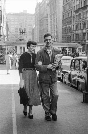
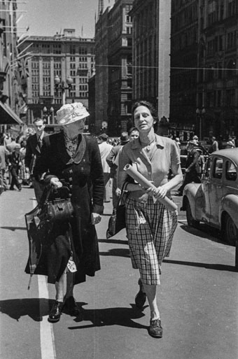
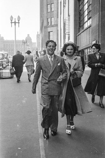
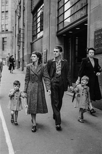
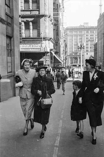
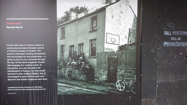
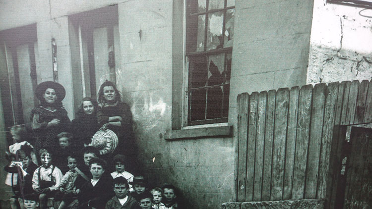
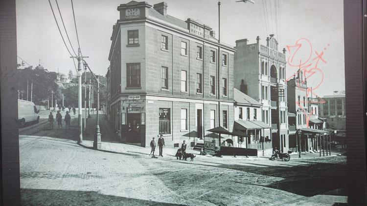
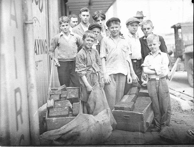
Street photography at the Museum of Sydney displays photographs taken by the men who, from the Depression 1930s to the Post-war 1960s, used to stand in licensed positions and take snaps of city footpath walkers then press upon them a ticket with the address of a nearby studio where they could purchase same-day prints.

For people who bought them it was perhaps the best photo they had of themselves, the best photo their families had to remember them by. But the exhibition’s curators also invite visitors to see what else they can find beside the main subjects of the photos – items of clothing or accessories that date the pictures, figures in the background, still-recognisable locations in Sydney. I looked for and found the centre lines.


A by-law requiring foot passengers to ‘keep to the right’ on footways existed in Sydney from around 1900 but it was largely ignored. In a letter to the Mayor in 1902 a Mr George Richards fumed that ‘the people walking in our city are like a lot of cattle that has got into a barn and wander about looking for a place to get out. Surely you can do something to prevent this sort of thing’.

The City of Sydney Archives and clippings books reveal that Mr Richards was not the only one infuriated by the unruly users of Sydney’s footpaths. One columnist in 1911, for example, complained about there being ‘no visible admonition to keep to the right’.

Somewhere along the way the rule changed to ‘keep to the left’ so that pedestrians did not have their backs to the traffic if they stepped off the footpath onto the roadway. By the mid-1920s authorities in Melbourne had not only copied this rule but had painted white centre lines.

But it was not until 1948, after two years of to-ing and fro-ing between Sydney City Council, the Police Department and the Department of Motor Transport, that Sydney had a trial of centre lines on parts of George, Market, Pitt and King Streets, along with the stencil ‘KEEP LEFT’ at appropriate locations.

The trial was a success and the area of the city with lines down the middle of footpaths was extended. They were regularly repainted by the Department of Motor Transport but the KEEP LEFT stencils were not maintained because they were considered to be of little value.


In 1961 the Council wanted to extend the scheme further from Sydney Central to Haymarket and Railway Square, but the Department of Motor Transport had had enough, thanks to restricted finance and a heavy volume of work. The existing lines, which by then were painted yellow, were allowed to wear away.

They were not re-introduced and, in justification, the City Planner pointed out that ‘pedestrian traffic by its nature is unpredictable and it is not considered feasible that pedestrians can be controlled in the same way as vehicular traffic, nor is it considered desirable that they should be’.

Nevertheless, in the following years a steady stream of letter-writers pleaded for the return of the centre line. Mr Byott of Belfield’s 1974 letter was typical: ‘After suffering another Christmas shopper’s charge on the footpaths in the City its about time something was done about it. Please bring back the “YELLOW LINE” that adorned Sydney City footpaths a decade ago, so at least the poor employees in the city area (like myself) get a bit of a “fair go” at all times’.

Council toyed with the idea of reintroducing the centre lines but, apart perhaps from a period in the 1980s (something I’ve been unable to confirm) they never have.

However newspaper letter writers like Ms Alicia Dawson of Balmain have not forgotten. In 2015 she complained about the ‘very frustrating pace of stop/sidestep/duck and weave’ on city streets and cried, ‘Bring back the white line up the middle of the footpath or otherwise I might well be driven to march around the city carrying a large hot dog smothered in tomato sauce on a stick while yelling “keep left, keep left” at the top of my voice.

In 2017 Ms Dawson was still harping on the subject and others agreed, urging the City of Sydney to ‘reinstate the system of the 1940s and 50s, when Sydney footpaths had a painted line down the centre’. Yet others were incredulous: ‘Are you serious? What a waste of time and money to paint lines down the centre of footpaths. Will we have to use hand signals if we wish to overtake?’

Ms Dawson may consider that ‘other people’ on city streets lack manners, but letter writers and columnists who hold similar sentiments are not particularly polite themselves. Mobile phone zombies, they growl about fellow footpath users. Self-absorbed texters. Oblivious to the swirling tide around them. Cursing into mobile phones.  Smombies. Large contingents of residents walking shoulder to shoulder. A phone-twiddling human wall. Dopey dawdlers. The swayer describing a zigzag path. All over the place.  Crisscrossing. A free-for-all.  Dawdling tourists. Heel steppers. Sudden stops and turns. Slowcoaches. Slow old people with huge, boxy Volvo bums. Running groups and other pavement irritants. Window shoppers. People who bash into others with a backpack. Gophers that nearly run you over. And the worst pavement tyrants, those mothers with bigger-than- Texas prams.

So the indignation, the jostling and the sledging continue, and the keep-left rule is all but forgotten. There are some who still believe that the thin yellow line would have a calming effect but probably, as the City Engineer said back in 1974, the reintroduction of marked centrelines on footways would be of doubtful value.

Images

The photographs were all taken by a street photographer in Martin Place, Sydney, between May and December 1950.  The have been reproduced courtesy of the Caroline Simpson Library & Research Collection, Sydney Living Museums.

References:

Brown-May, Andrew, ‘The highway of civilisation and common sense’, Urban Research Program Working Paper No.49, ANU, 1995.

City of Sydney Archives 1902/0068 (1902); 268/60 (1960-1978); CRS 1083/14/70 (2011)

Sydney Morning Herald letters to the editor and columnists 2003-2017 (details available)

Banksy, Newtown and ephemerality

ADDENDUM. This blog post was the seed for a more detailed article in Nuart Journal, published in September 2019. You can find it at ‘Wall story: an 11-year visual record of a street art site in Sydney’.

Eleven years ago I photographed a fading piece of Banksy graffiti in Newtown, an inner west suburb of Sydney. It’s a version of the UK artist’s ‘Diver’ stencil and would have been done in 2003 when he made a secretive visit to Sydney. Back then I was concentrating on pavement graffiti and was not much interested in Banksy. I’m still not that interested, but anyone who writes about graffiti of any sort must eventually pay attention to the Banksy Phenomenon.

By 2008 Banksy was notorious enough for me to decide that I should photograph the Diver. It helped that there were two other types of graffiti nearby – a tile with hand-painted lettering fixed to the pavement (of course) and a mosaic of broken china stuck to the wall. All of these were along the side of Alfalfa House, an organic food cooperative that had been set up in 1981 at the corner of Enmore Road and Philip Street.

Only a few people knew about Banksy’s brief visit to Australia in 2003 and while the whereabouts of some of his stencils in Melbourne were known, I found it curious that so little attention had been paid to this one in a fairly busy street in Newtown, especially as one of his works on a wall in London had sold for some thousands of pounds early in 2008. But by the end of 2008 the Diver had finally received attention. The name ‘Vice Quid’ had been sprayed over it, whether out of ignorance or defiance I don’t know.

It’s possible an article in the Sydney Morning Herald had stirred up interest in the work. Even though the reporter had acknowledged that “Graffiti artists keep the whereabouts [of Banksy’s Sydney works] secret because there are fears the rocketing price of Banksy’s work means they might be broken out of the walls on which they are painted”,  nevertheless he had been quite specific about the location of the Diver.

When I privately expressed some dismay I was firmly told by a close acquaintance that it’s what should be expected. “It’s only graffiti. Graffiti’s not meant to last”. Not even Banksy’s. And it’s true. As I said in an earlier blog post – ‘Overpainting: order vs chaos’ – when taggers and spray-can artists paint over each other’s work, sometimes this is a display of disrespect and an assertion of territory, sometimes it’s a political act, and sometimes it is simply a natural progression in the world of informal street art, where the art is necessarily ephemeral.

Within a few months the wall was covered with tags, stencils, paste-ups and notices. The Diver, which had remained untouched for five years, was now barely visible.

A year later I couldn’t even be sure where the Banksy stencil was.

In 2011 Alfalfa House must have decided a makeover was in order. An artist was presumably organised to paint a mural on the side wall and it’s possible that someone, other than the artist themselves, thought this pattern was attractive. But, aesthetic qualities aside, in covering over what went before, the line had been crossed, from informal graffiti to commissioned art.

Notice, however, that the old wall mosaic and the pavement tile had escaped unscathed.

Fast forward to the present where the wall of Alfalfa House is now covered by a magnificent pastel-coloured work by well-known local street artist Phibs.  A remnant of the mosaic remains but the rest has been painted over. The pavement tile is gone, its lowly place now taken by a horizontal tag on the concrete.

But not even Phibs is above being scribbled on. So far the attempts at defacement have only been tentative.

Banksy’s latest notorious stunt was the semi-self-destruction of one of his works seconds after it was sold at a London auction for more than one million pounds in October 2018. Originally titled ‘Girl with a Balloon’ the work was renamed ‘Love is in the Bin’ by Banksy. It does not take much imagination to see the metaphorical connection between the shredding of a graffiti-stencil-turned-framed-artwork and the ephemerality of art on the street.

References:

Jinman, Richard, ‘Details emerge of Banksy’s Sydney visit’, Sydney Morning Herald, 17 January 2008.

Wikipedia, ‘Banksy’.

‘Banksy’s Girl with a Balloon artwork self destructs after selling for almost $1.9 million at auction’, ABC News, 6 October 2018.

All photographs by meganix.

Graffiti tricks


This is going to take a lengthy search. I am looking for images and mentions of graffiti that pre-date the explosion of informal public writing in the 1970s and 1980s. I’m concentrating on Sydney, but even within that narrow scope it won’t be easy.


Before the mid-1900s the term ‘graffiti’ was used for writing that had survived on walls found at ancient archaeological sites. It hardly ever referred to contemporary inscriptions in public places. So there’s not going to be much point in using Trove to scan the newspapers for references to ‘graffiti’.

Nor will it be much use searching through the catalogues of digitized photograph collections. When cataloguers are annotating images of buildings and streetscapes they note all sorts of things that might be used as search terms, but they hardly ever notice graffiti.

So I will have to look at images one by one in the collections at, for example, the Mitchell Library and the City of Sydney Archives. In the meantime I scrutinize the blow-ups of historical photographs that are currently being used to decorate building-site hoardings around town.

These blow-ups are not quite as they seem. Each of them is an element of an artwork called Double Take. Artist Rachel Harris has doctored the photographs by adding “unusual details”. There is a pair of them in King Street, Newtown. Look carefully and you’ll see that, alongside the shabby building and the stepload of kids, there is a modern bicycle, a basketball hoop, and … (no I’m not going to give away any more of the “hidden treasures”).

But what about the scribbles on the house and the paling fence? I am right to be excited because I’ve spotted historical examples of childish graffiti, or is this just another of Rachel Harris’s interventions?

Nevertheless, I’m on pretty solid ground regarding the graffiti on the accompanying photograph of the Hero of Waterloo Hotel. I’d say that pink scribble is definitely an early 21st century tag. And it post-dates Rachel’s digital trickery.

These are not block boys

I would like to set the record straight about this picture of young boys taken by Sydney photographer Sam Hood in the 1930s. It is one of a set of three in the collection of the State Library of New South Wales all of which have been titled by the Library ‘Block boys at St Peters’. Because the boys are handling wood blocks, perhaps the label was originally written as some kind of pun, but it is entirely misleading. These are not block boys. That term belongs to another class of Sydney youths and I will come to them later.

The unfortunate labelling of this picture has been repeated by other cultural institutions (here and here, for example) and has even been expanded into erroneous explanations about what the boys are doing, which have then been broadcast – and not only on internet plagiarists’ sites. I was provoked into writing this blog post after seeing a beautifully mounted blow-up of the picture hanging in The Henson in Marrickville with a credit to the State Library of NSW. Nice addition to the décor but a pity the hotel has been provided with an incorrect description, which states that the boys ‘… are helping to build roads using a method called woodblocking’.

The real story is just as interesting, but without the connotations of child labour. The boys are not constructing a road. They are hanging round with their push carts and hessian bags to collect discarded wood blocks, which they will take home as fuel for the family fire or stove. Wood blocks were once widely used in Sydney for street paving. Until the late 1800s the city’s roads were generally unsealed but the 1890s saw woodblocking come into widespread use by municipal councils, with hardwood blocks steeped in tar being laid like bricks, hammered close together and top-dressed with more tar. But by the early 1930s this method of road building was no longer used and councils started ripping up the worn wood blocks on some roads and replacing them with asphalt or concrete, often in large-scale Depression-era programs that provided employment for out-of-work men.

Those tar-impregnated woodblocks would have burnt well. They were prized by householders as free fuel and were quickly purloined as soon as the road workers dug them up. The Sam Hood picture was taken during the hard times of the Great Depression and the local boys are contributing to their families’ wellbeing in a practical way.  The two other pictures taken by Hood in St Peters at the same time have been damaged a little, perhaps while the negatives were in storage but, with a bit of staging for the camera, they clearly show what is going on. In both of these there is also a girl collecting blocks alongside the boys.

And just to prove my point I searched for and found the photograph in question published in a contemporary newspaper. Sam Hood had his own commercial studio but also took press photographs, working full-time for a while in the 1930s for the Labor Daily.  On 4th April 1935 that newspaper printed his photo on page 8 under the heading Its an Ill Wind —  with the caption:

Cement is replacing wood blocks on Cook’s River Road, near St. Peters station, and the boys of the neighbourhood took advantage of the occasion to collect cartloads of fuel for the winter.

St Peters, by the way, is an inner suburb of Sydney and what was Cook’s River Road is now part of the Princes Highway.

So who were the actual Block Boys? In the early 1900s the City of Sydney employed a small army of youths to sweep up the tons of manure deposited by horses on the city’s streets. Equipped with long-handled brooms and scoops, these block boys, or ‘sparrow starvers’ as they were jokingly called, were each assigned a city block to keep clean. But by the 1930s motorized vehicles were outnumbering horse-drawn vehicles in the city and street cleansing was subsumed into the more generalised duties of Council’s other outdoor workers. The coveted job of block boy was phased out.

Not many photographs were taken specifically of these youths, but they often turn up in photographs taken for other purposes. The picture below is a detail from a photograph in one of the Demolition Books kept at the City of Sydney Archives. The block boy leans on his broom in Sussex Street to watch as the photographer documents the building behind him, which is slated for demolition.


I have a large, framed copy of this picture hanging in my house. Left over from an exhibition at Sydney Town Hall, it was given to me by the city’s archivist some years ago as thanks for a small job I had done. I chose this particular photograph because it is a double exposure. The boy’s doppelganger is lounging beside him.

References:

Davies, Alan, Sydney exposures: through the eyes of Sam Hood and his studio, 1925-1950. Sydney: State Library of New South Wales, 1991.

Fitzgerald, Shirley, Sydney 1842-1992. Sydney: Hale & Iremonger, 1992.

Fitzgerald, Shirley, The sparrow-starvers: block boys 1890-1930, catalogue for an exhibition of documents from the City of Sydney Archives, Sydney Town Hall, June 1997.

Shepherd, Allan M., The story of Petersham 1793-1948, Sydney: The Council of the Municipality of Petersham, 1948.

The name

I am researching the history of a nineteenth century row of houses in Sydney’s inner west. It’s not my usual kind of writing gig but it has been interesting following the money. Wealth accumulated in good times by an enterprising immigrant from Yorkshire, shared with his son as a business partner, lost when the son’s extravagant ventures are caught out by a national financial depression.  What’s left is a smattering of properties that have been salvaged for heritage listing by repurposing – gentlemen’s residences divided into flatettes, a wool store fitted out as university outpost campus, a private mansion transformed into a Catholic educational institution.  

The buildings are notable for the need these colonial nouveau capitalists had to monogram their possessions. The firm’s name is embossed on the wool store – an understandable commercial imperative. But on the gateposts of the father’s 1860s villa his initials AH are stuccoed in botanical calligraphy so elaborate that they are barely legible.


The son’s entwined initials JH in more restrained but authoritative capitals decorate the interior of his opulent 1880s mansion. I can imagine the thrill of self-satisfaction this sleek young mayor experiences as he glimpses the stained glass panel on his way upstairs from the expansive vestibule of his domicile.


Fast forward to the late twentieth century and an upsurge of the monogram for marking property – though more likely someone else’s property or else a piece of public infrastructure. Taggers appropriate territory with marks that are generally illegible except to themselves or to cohorts that matter.

 I came across a graffiti supplies website recently, and this comment from a user:  ‘ I wrote the name test when i was in high school. I liked it cause every time i  saw the word test in a context totally unrelated to graff i creamed a little’.

 Here is the thrill of self-affirmation. This graffitist has gone for ordinariness over illegibility for his tag, and finds satisfaction when he sees,  not only the property he has marked,  but every single item where his moniker ‘test’ happens to appear – books, advertisements, notices, school whiteboards. His mind (and his member) believe that all these base are belong to him.

 At least what you don’t really own and have not mortgaged will not send you bankrupt.

Images by meganix, taken in 2017 in Sydney: Stanmore, Circular Quay, Newtown and Strathfield.

Overpainting: order vs chaos

On this often-overpainted wall in Enmore the graffitists currently have the upper hand. I am inclined to think their tastefully colour co-ordinated composition is more interesting than the layers of creamish-fawn paint that preceded it.

 The subject of overpainting is fraught. Everyone has something to say on the matter – wall owners, local councils, concerned citizens, hip and tolerant inner city dwellers, and of course wall artists and graffitists themselves. And as far as people making their opinions known, in this case actions often speak louder than words.

 In his blog post on the aesthetics of anti-graffiti interventions, Kurt Iveson categorises the patches of overpainting in not-quite-matching colours as ‘the new urban swatchwork’. This swatchwork does not produce any aesthetic integrity of its own, he says, and is just a visible indicator of the desperation of authorities to assert their authority. They’re not actually too fussed what the wall looks like, so long as it doesn’t have graffiti.


In the decades-long war against graffiti, overpainting can evolve into an entertaining competition between graffitist and the paintbrush-wielding authority. A series of photos of a wall in Mt Druitt is still funny, although it has been around for some while. Eventually one or other of the competitors gives up, which is, of course, the aim of this type of anti-graffiti measure – to wear the graffitists down.

 And of course it is not only wall owners and local authorities who paint over graffiti. Taggers and spray-can artists also paint over each other’s work. Sometimes this is a display of disrespect and an assertion of territory. Sometimes it is simply a natural progression in the world of informal street art, where the art is necessarily ephemeral.


But disfigurement of street art, and in particular legal street art, can also be a political act perpetrated by graffiti activists who regard street artists as the complicit foot soldiers of gentrification. Such street artworks, as people like academic Stephen Pritchard maintain, have a role in what is called ‘creative placemaking’, and as such are ‘the harbingers of redundancy, displacement, social cleansing, colonialism and racism’.

 In 2009 the daubing of a Banksy mural with red paint caused something of a public uproar in Bristol, UK, but a group called Appropriate Media claimed responsibility, declaring on its website that ‘graffiti artists are the performing spray-can monkeys for gentrification’. Perhaps it was similar – although unarticulated – sentiments that saw a genuine Banksy stencil in Enmore defaced with tags around 2008. Or maybe it was just ignorance.


So, in the light of all this, what is to be made of French artist Mathieu Tremblin’s street installations, which he called ‘Tag Clouds’? This series of artworks was executed in 2010, but in 2016 Tremblin’s photographs went viral, often reposted under one reblogger’s heading ‘Guy Paints Over Shit Graffiti and Makes It Legible’. For me they touched a chord and I happily shared the images on my Facebook page, commenting that the work reminds me of the process of writing. The original wall is like my first draft of an article, the ‘legible’ wall is my final version. It still doesn’t make sense but at least it looks neat and is kind of approachable


Some Facebook friends found them playful and funny, but I was surprised when some friends of friends appeared incensed. “Why digitise expressive arty jottings?” wrote one. Without anything but the photographs to go on, another declared, “The point of the art is to cover up the unwanted, messy, illegal graffiti and take away their meaning to discourage it”.

 I was inclined to dismiss these kinds of comment as the try-hard opinions of would-be ‘tolerant’ middle-class, middle-aged inner city dwellers. But then I decided to find out more about Tremblin’s work and I discovered an interview with him on The Creators Project site. It turns out that Tremblin’s work referenced tag clouds (remember them?), those visual representations of text data, typically used to depict keyword metadata (tags) on websites.

 As Tremblin says, tag clouds were still the main way to draw personal paths through contents, websites and blogs in 2010. In the early 2000s street writers used to share their work on homemade websites and CMS blogs that used tag clouds.

 But these days the big search engines and social media sites use algorithms to dictate the kind of content we see. Tag clouds are to a large extent a thing of the past, and the original meaning of Tremblin’s work became lost. Then in mid-2016 his images went viral when the website Design You Trust, reproduced them with their own interpretation, ‘Guy Paints Over Shit Graffiti and Makes It Legible’.

 Tremblin sadly reflects, “They made me look like the emissary of a solution against graffiti, whereas my intent was actually totally the opposite—I’m pro-name writing as I’m a former writer … They transformed my simple gesture of ‘turning a hall of fame of tags into tag clouds’ into an anti-graffiti hygienist lampoon”.

 Comments on the Design You Trust post ranged, as you might expect, from abusive to cynical, and were more about graffitists (artists vs vandals) than about Tremblin’s work itself.  Those that did comment on his interventions generally found them condescending and disrespectful, with the ‘corrected typeface’ turning organic graffiti into something that is ugly and tacky.  Much like the small sample of commentators on my Facebook page, they somehow missed the point.

 But even though I now know Tremblin’s original intentions, I still think his Tag Clouds are funny and clever. Maybe my interpretation was not so far distant from Tremblin’s intent because he proposes that “Tag Clouds is just a default aesthetic generated by computers where graffiti is expressing individual alterity; man vs computer; order vs chaos… Chaos is life!”

 Postscript. It has taken me a while to draft this blog post and during that time the wall pictured at the top of the page has once again been thinly overpainted with a shade of creamish-fawn. One up for the wall owner.


Apart from the images of the Tag Clouds installation, taken by the artist Mathieu Tremblin (2010), all images are by meganix and were taken in Enmore and Newtown in 2008 (Banksy stencil) and 2016.

Rainbow politics

 BourkeRainbow_P1020080X_blo

“The removal of the Taylor Square rainbow crossing created an even bigger stir than its original installation. To mark its passing, people attached unofficial rainbow flags to poles in Taylor Square and tied rainbow ribbons to safety fences. But performer and activist James Brechney had a fresh idea for an alternate location that somehow captured the zeitgeist.”

My exquisitely objective article on the history of the DIY Rainbow Crossing is now available to read in the Dictionary of Sydney.

Some time ago I wrote a blog post on the symbolism of pedestrian crossings. It’s here.

PermanentRainbow_IMAG2868

(Photos by meganix, taken in Darlinghurst in 2013 and Summer Hill 2015)

Back lanes

IMAG3524_blog750px

In the inner suburbs of a city that is undergoing renewal and gentrification, some of the last remaining places of grotty charm are the back lanes. This is despite the fact that corrugated iron fences have long since been replaced by roller doors and high brick walls, and showy bougainvilleas hang where once there were vines laden with chokos free for the taking.

In the main street old-style hairdressing salons run by one lady for over fifty years are transformed into dinky diners, but round the back leaky pipes still ooze a permanently green and greasy trickle into the gutter of the rear lane. In side streets, tiny terrace houses are supersized with architect-designed extensions upwards and outwards, but outside the back fence the garbage bins, now made of colour-coded plastic rather than galvanized iron, smell much the same as they always did.

Close to the city centre, civic planners reinvent laneways as pseudo-hipster destinations. Their surfaces are recobbled, their spaces commercialised with coffee cart umbrellas, and their walls redecorated with commissioned art pieces. In suburbs on the urban fringe, some back lanes that were once the rat runs of the dunny man have been spruced up to match the tidy rear ends of new apartment blocks and town houses.

But beyond the reach of the pre-dawn street-washing truck, there are still lanes that resist trendification or homogenisation. Morning strolls down such insalubrious urban remnants reveal evidence of unsanitary night-time activities – broken bottles, a clump of cat fur, a limp condom, a squashed rat, a syringe, a rivulet of piss, a splatter of curry or sweet and sour – fresh or regurgitated, it’s hard to tell the difference.

IMAG3499_blog750

 Amongst this pure grunge though, such lanes can also yield up visual surprises and take-away treasures. There are accidental artworks to admire, in the form of paint spills and rubbish stacks. There are unpotted pot plants with concrete root balls, and illegally dumped junk piles to pick through or kick through for additions to your domestic decor. Or you might collect a milk crate for standing on as you pass through on your way to the Mardi Gras parade. And in old industrial precincts, where owners allow their businesses to run down in the hope of getting rich when the area is rezoned for residential development, there is always the possibility of finding a replica of Duchamp’s Bottle Rack.

The side walls of little old factories and those new brick fortifications on residential properties are perfect canvases for real graffiti and spontaneous wall art. Some pieces stay in place for decades, others are subject to constant renewal in keeping with the revolving door of current issues and social media topics.

 What all this means is that within our evolving cities there are still recalcitrant places that resist the facadism of new civic planning and design. Behind the scenes, the messiness of back lanes contributes to the urban/suburban landscape in ways that reflect the actual complexity of human lives.

IMAG3530_blog750

(Photos by meganix, taken in Marrickville and Enmore, 2016)


The blog ‘Pavement Graffiti’ was created in 2009. In March 2016 I changed its appearance. Posts written before March 2016 did not handle the change well and so may look a little peculiar.


Recapturing the magic

Parking space fly, Darlington, 2002.

Parking space fly, Darlington, 2002.

In my so-called office at home I am attempting to regain control. The room has been overtaken by stuff and progress is slow because I have neglected the fundamental rule: DON’T READ.

Amongst things that I have sinfully paused to read while culling superseded files, I found notes I took at the orientation day for new PhD students in the Division of Society, Culture, Media and Philosophy at Macquarie University in 2008. It was on that day, by the way, that I discovered I was not the oldest PhD student in the world, and that there were many other culmination-of-career candidates. Anyway, here’s one piece of advice I dutifully noted:

At the beginning, keep a journal of what you read and what you think about it. Your notes will be like Ariadne’s thread leading you through the maze. They will help you to solidify your thesis topic or even change your mind about what that might be.

"Suck shit up". Stanmore, 2003.

“Suck shit up”. Stanmore, 2003.

Well, I did start a journal, which became a series of A5 notebooks. The PhD has since been completed but, many volumes later, I still keep this journal, with notes on what I have read, seen, heard, talked about, and thought about. It is quite separate from my daily diary of appointments and humdrum domestic events. As a diversion from room-tidying I hunted out Volume 1 to re-read the first thing I had written in the journal. Here it is (slightly edited):

If I am going to do this project I am going to have to re-find my belief in the magical properties of the pavement. These last few years my writing and thinking have become prosaic. I have lost fun and wonder – beaten out of me by [my workplace]. When I first started photographing footpaths eight years ago, suddenly I could write poetry.

Over the next few years I did manage to recapture the magic as I enjoyed the luxury of exploring, photographing, reading, thinking and writing without the need to churn out memos, attend interminable meetings, play office politics, carry the dead weight of work-shy colleagues and endure the hysterics of others, attend to bureaucratic niceties and write formulaic justifications for every decision – and that was in what many (including myself) would have considered a dream job.

Once I left that job, how lovely it was on a nice sunny day to admire the sparkles in the asphalt and concrete, on a nice rainy day to enjoy the wavering reflections of the world on the ground, and on any day to seek out the messages people leave on the pavement and speculate why they leave them. And, in imaginary dialogue with scholars past and present, to discuss both the enchanting and the disheartening aspects of public places, and to consider what’s so special about the pavement.

"Bread is making birds sick". Enmore, 2010.

“Bread is making birds sick”. Enmore, 2010.

These days I’m a bit more relaxed about the pavement. I don’t feel I have to look at the ground all the time in case I miss something, but I’m still interested in what’s so special about other places in the urban landscape that are so obvious they’re invisible.

Poster history book. Petersham, 2014. All photos by meganix.

Poster history book. Petersham, 2014. All photos by meganix.

1 2 3 4 5 6 19